반응형

30+ High Performing HTML5 Templates for Web Design

image

HTML5 templates have become very popular and for a good reason. HTML5 is still a work in process standard, but it has brought a lot of new features to the table. Recent versions of the major browsers support many of them already, and they continue to add new features.

The new tags available in HTML5 includes the <canvas> element for 2D drawing, the <video> and <audio> elements for media playback, the new content-specific elements, like <article>, <footer>, <header>, <nav>, <section> and new form controls, like calendar, date, time, email, url, search. In addition, the arrival of CSS3 adds even more power in the hands of web designers.

The benefits of HTML5 are many and new tags will help web designers build stunning future proof websites without need for proprietary plugins like e.g. Flash.

In this article I share with you high quality HTML5 templates to provide inspiration and insights about HTML5 based web design. Hopefully, this collection will help in creating your own HTML5 powered website.


SmartStart – Responsive HTML5 Template – MORE INFO

smartstart-hml5-template

This is a professional theme with a clean and simple attitude. It is designed for portfolio or business websites. SmartStart has been crafted with the latest CSS3 and HTML5 techniques. It will easily adjust to any browsing device, including mobile phones and tablets, because of its responsive feature. You can also get this template in the WordPress version.

Perspective – Responsive HTML5 Template – MORE INFO

perspective-hml5-template

Perspective is a template that is ideal for all kinds of business websites. It is packed with plenty of HTML shortcodes and jQuery plugins like accordion, sliders and tabs. The design is responsive, and it can be edited easily.

Agora HTML5 Template – MORE INFO

agora-hml5-template

This is a nice HTML5 template that is ideal for showcasing fashion, studios and creative. It can be customized easily with 13 pages and powerful full screen gallery that can showcase big sized works on the homepage directly. The customization process can be enhanced by the Serif and Sans Serif styles that are included with the template. In addition, the themes is mobile friendly.

VividPhoto HTML5 and CSS3 Template (free) – MORE INFO

vivid-photo-hml5-template

VividPhoto is a stunning photography HTML5 and CSS3 template that is designed to showcase a portfolio of images.

Vega HTML5 Responsive Template – MÒRE INFO

vega-hml5-template

Vega is a HTML5 template that is dynamic, stylish and creative. It is easy to customize and user friendly. Vega is a great way of showcasing your media.

Popular – Responsive HTML5 Theme – MORE INFO

popular-hml5-template

This template was designed with HTML5 and CSS3, and has a corporate and agency appearance. It’s fully responsive feature is created with Bootstrap.

Royale’ Creative HTML5 Template – MORE INFO

royale-hml5-template

This is a creative template that can enhance your video or photography showcase. The complete page template set will provide the possibility to showcase your work and brand in a professional and refined manner.

Minimalism HTML5 and CSS3 Template (free) – MORE INFO

minimalism-hml5-template

Minimalism is an HTML5 and CSS3 template that is minimal and beautiful in its simplicity. Combines multiple-column groupings and newspaper style column.

Harmony – Multipurpose HTML5 Template – MORE INFO

harmony-hml5-template

Harmony is packed with easy to use and built in features that will make user experience an exciting, pleasant and intuitive one. The package includes 4 Home page sliders , 16 color schemes, a working contact form with validation and more. IT is not responsive though.

Chromatron HTML5 Admin Backend – MORE INFO

chromatron-hml5-template

This is a professional and simple HTML5 template that can be used for both desktop and mobile devices. Chromatron has a lot of features and build in jQuery. There are 4 default colors available, each packed with popular and basic user interface widgets.

Folder (free) – MORE INFO

folder-hml5-template

Folder is a free HTML5 portfolio theme with responsive design.

Neutron – HTML5 Templat – MORE INFO

neutron-hml5-template

This HTML5 template is modern and clean. It is great for any portfolio or business website. It has jQuery features available and 12 page templates.

Retro – HTML5 Template – MORE INFO

retro-hml5-template

This is a modern and clean template that is best suited for business or portfolio websites. Easy and fast to set up, Retro also has a WordPress version.

NeoArts (free) – MORE INFO

neoarts-hml5-template

NeoArts is a modern and elegant web template designed for Design/Studio websites. All-in-One page with an animated theme.

Qreator – Corporate HTML5 template – MORE INFO

qreator-hml5-template

Almost anything can be changed in this template. You can make your own creative design and set up color for all site elements using CSS. It includes 5 preset Home page layouts, Google webfont directory support (320+ Fonts) and more.

Limitless – Multipurpose HTML5 Template – MORE INFO

limitless-hml5-template

Limitless HTML5 template is packed full of user friendly features and plenty of PSD and HTML files. Limitless was designed with SEO in mind.

Responsive Brownie (Free) Html5 Template – MORE INFO

brownie-hml5-template

An awesome free, responsive HTML5 template aimed at businesses and portfolios.

Simplex – Responsive HTML5 Template – MORE INFO

simplex-hml5-template

Clean, responsive and simple would be the perfect words to describe Simplex HTML5 template. Simplex has been designed with mobile devices in consideration and is well suited for studios and digital agencies. The template will adjust its size automatically on different devices, ensuring a nice experience for every visitor.

Projection – Responsive HTML5 Template – MORE INFO

projection-hml5-template

This template is entirely responsive and designed with an elegant and minimal look. The package includes CSS3 and HTML5 codes.

Manifest – Premium HTML5 Template – MORE INFO

manifest-hml5-template

Manifest is a HTML5 template that is very flexible and clean. It has a minimalist and modern design that is ideal for galleries, creative blogs, portfolios and other types of websites. The package includes 6 predefined skins to customize your website easily.

Muro (free) HTML5 Template – MORE INFO

muro-hml5-template

Muro is a brilliantly designed web template that comes with 3 different skins, 7 page layouts as well as jQuery functionality.

Energetic – Responsive HTML5 Template – MORE INFO

energetic-hml5-template

This is a professional and clean template that is ideal for portfolio, business and hosting websites. It has a responsive design that was created with HTML5 and CSS3, making it compatible with all kinds of devices including iPhone, iPad and Androids.

White Noise – HTML5 Template – MORE INFO

white-noise-hml5-template

This template is easy to customize and full of features. Show off your work with this easy-to-customize and fully featured Site Template.

Basix – Premium HTML5 Template – MORE INFO

basix-hml5-template

This theme is easy to customize and use. Basix is a minimal HTML 5 template that is full of features like unlimited colors, jQuery, 960 grid system and working contact form. The portfolio section is filtered using Isotope. In addition, this theme is also well documented, with a lot of shortcodes and features for creating your own pages.

Moderna Responsive HTML5 Template – MORE INFO

moderna-hml5-template

A clean and responsive HTML5 template. Moderna is ideal for both creative personal portfolio and professional business websites. The theme has two skins, which are stretched and boxed. The boxed version has 15 patterns so that you can have unlimited options in managing and organizing your contents.

LEFT HTML5 Theme (free) – MORE INFO

left[5]-hml5-template

LEFT web template is designed in HTML5 and offers more than 6 page layouts with a unique skin system.

Weiss – Responsive HTML5 Template – MORE INFO

weiss-hml5-template

If you are looking for a responsive and clean theme that is suitable for a wide variety of uses, Weiss HTML5 template would be a great choice.

Canopus – Responsive HTML5 Template – MORE INFO

canopus-hml5-template

This is a responsive HTML5 template that is ideal for business and portfolio websites. It was created using the best web design practices such as Microformats. Canopus is ideal for iPhone, iPad and other mobile devices.

Oreva Business HTML5 Template – MORE INFO

oreva-hml5-template

Oreva is very minimal and clean HTML5 business template that can be used for all kinds of personal and business websites. The template has 2 color variations that can fulfill all the requirements of modern web development.

Impromptu – Responsive HTML5 Template – MORE INFO

impromptu-hml5-template

Classy and responsive, Impromptu HTML5 template is perfect for portfolio blog or business websites.

Magazine HTML5 Responsive Template – MORE INFO

magazine-hml5-template

This minimalist and clean HTML5 template was created for WordPress. It is ideal for blogs, magazine, personal and news websites.

Responsy – Responsive HTML5 Portfolio – MORE INFO

responsy-hml5-template

This responsive HTML5 template is most suited for creative agency and portfolio websites. The solid responsive layout is flexible and can scale down from 1170 pixels to 320 pixels.

Mustach – Responsive Html5 Theme – MORE INFO

mustach-hml5-template

Simple yet packed with a lot of options, Mustach can be used for personal portfolio and small business sites. The template comes with a clean and neat code, making it easy to understand when making variations in the template.

반응형
반응형

Style : http://tympanus.net/codrops/

Flipboard Effect
 : http://tympanus.net/Development/FlipboardPageLayout/?page=0

Annotation Overlay Effect with CSS3
 : http://tympanus.net/Tutorials/CSS3AnnotationOverlayEffect/

Animated 3D Bar Chart with CSS3
 : http://tympanus.net/Tutorials/Animated3DBarChart/

3D Bouncing Ball with CSS3
 : http://tympanus.net/Tutorials/CSS3BouncingBall/

Full Screen Slit Slider
 : http://tympanus.net/Tutorials/FullscreenSlitSlider/

Vertical Showcase Slider
 : http://tympanus.net/Tutorials/VerticalShowcaseSlider/

반응형
반응형

15 Online HTML5 Tools for Web Designers

by Andy on October 10, 2012

image

Online HTML5 tools are quite useful for web designers who wants to forge ahead of the competition, and have more satisfied clients. It is of course important to follow developments and keep an eye on new tools that emerge.

HTML5 is the new version of the markup language HTML that has been used for presenting and structuring online contents since the early 90s. It is an internet core technology that was proposed originally by Opera Software. If you want to learn more of it’s background and history these HTML5 infographics can help you. HTML has been standing in the shadow of other frameworks like Flash and IE, but the word is, that this is going to change with the arrival of HTML5. As of today, HTML5 is still being developed, but believe me, it is here to stay.

HTML5 has opened a window of opportunities for web designers. Online web design tools based on HTML5 makes it easier to incorporate audio, video, drag and drop, fonts, animations and graphics into web pages. HTML5 also helps web designers build mobile friendly website themes to ensure excellent user-experience when surfing the Internet on mobile devices. However, since such tools are fairly new, some people may still be unaware of their true potentials. Also, some web designers still want to use Flash and other popular framework as their primary tool set.

Below, I have listed 10 useful online HTML5 tools. They can provide developers and web designers with manoeuvrability in making websites more convenient, productive and attractive.


Moqups – HTML5 App For Creating Wireframes

Moqups is a HTML5 web app for creating wireframes, mockups or UI concepts. You can go to their blog and read more about this highly popular project.

moqups

Fontdragr – Online Font Testing Tool

If you are a designer, you might find it difficult to choose a decent font. However, using this online font testing tool can make the process much easier. You can view any font you want in a webpage without changing its CSS or HTML code.

fontdragr

Liveweave – HTML5, CSS3 & JavaScript Playground

Liveweave is a new playground for developers and designers to test HTML, CSS and Javascript. Liveweave editor has built-in context-sensitive autocompletion for HTML4/HTML5 and CSS2/CSS3, that makes life a lot easier.

liveweavwe

Adobe Edge Animate

Edge Animate will allow you to create animated and interactive web contents. It has an easy to use and intuitive interface, precise control, broad reach and more.

adobe-edge

HTML KickStart

HTML KickStart is not really a tool, it is a set of HTML5, CSS, and jQuery building blocks for website development. It includes files, layouts, and elements that will give you a headstart and save you hours on your projects.

html5-kickstART

Stitches – An HTML5 Sprite Sheet Generator

Stitches is a really easy-to-use HTML5 sprite sheet generator. Simply drag and drop image files onto the app, click “Generate” and your sprite and stylesheet will be good to go. Currently compatible only with the latest version of Firefox and Chrome.

stitches

Create – Web Editing Interface

Create is a new web editing interface that uses a browser-based HTML5 environment for managing your content. It can be adapted for use with virtually any content management backend.

create

SpriteBox Online HTML5 Tool

These days, compressing images seems to be the rage. By placing your photos in a Sprite, you can increase the rate of your loading times as well as image transitions. Online Sprite Box Tool will aid in designing photos into sprites with the use of HTML5, CSS3 and jQuery.

sprite-box

Online Velocity Sketch Tool

This unique HTML 5 online canvas drawing tool can make creative, strange looking creations. Use this HTML5 tool to come up with something really awesome for your designs.

velocity-sketch

On/Off Flipswitch HTML5/CSS3 Generator

A beautifully designed and super-easy-to-use tool for generating your own HTML5/CSS3 “On and Off” flipswitches with optional animated transitions.

on-off-switch-generator

Online SVG to HTML5 Canvas Tool

Most vector art packages such as Inkscape and Illustrator can export SVG or Scalable Vector Graphics elements. This tool will allow you to convert SVG files into its HTML 5 canvas equivalent.

svg-to-html5

Online 3D Sketch Tool

This sketch tool uses the capability of HTML canvas in creating 3D drawing. The tool will allow you to draw with dashed lines and vibrate your drawing. You can also rotate the 3D canvas by dragging with the cursor horizontally while pressing down the Space Bar.

sketch-tool

Online Pattern Generator Tool

This is an online tool that can be quite useful for creating header and page backgrounds. Designers can even use the tool to create heading backgrounds. The tool will allow you to try out any pattern you want in just a few seconds.

pattern-tool

Online XRay Tool

Online XRay Tool allows designers to quickly view the details of various page elements that are present in any webpage with just a few clicks of the mouse. Just drag the website bookmarklet into your own book bookmarks, go to the webpage you like to analyze, click on the XRay bookmark and then click on any element of the page. The tool can take care of HTML5 elements like canvas and give you the design data you need. online-Xray-tool

Online HTML5 Audio Maker Tool

Among the best features of HTML5 is the introduction of the audio tag. This tool will help designers get familiar with the newest audio features being offered by HTML5. Even more interesting is the fact that designers can play, not just with audio, but also with video integration using this HTML5 online tool.

html5-audio

Group Discussion!

Please tell us what you think of these HTML5 tools by adding your comments below. And please, if you have considerable experience with an online HTML 5 tool not included in my list, let me know about it. You are also welcome to share this article to your friends and colleagues.

반응형
반응형

Chrome Dev Tools: Markup and Style

브라우저, 개발자 도구, 스타일가이드

http://net.tutsplus.com/tutorials/tools-and-tips/chrome-dev-tools-markup-and-style/


Browser Developer Tools

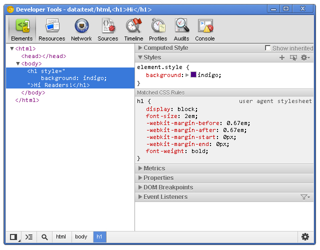
Before digging into Chrome’s developer tools, I want to give you just a brief look at the development tools provided by the major browsers. Note that this isn’t a comprehensive look at these tools and their features, but I do provide basic information for each tool.

Chrome Developer Tools

You can use the developer tools within Chrome, Chrome Canary and even Chromium.

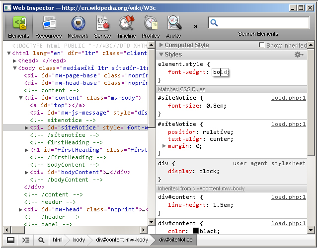
Safari WebKit Inspector

Safari uses code from the Web Inspector repository; however, you may find that it’s not updated as often as Chrome.

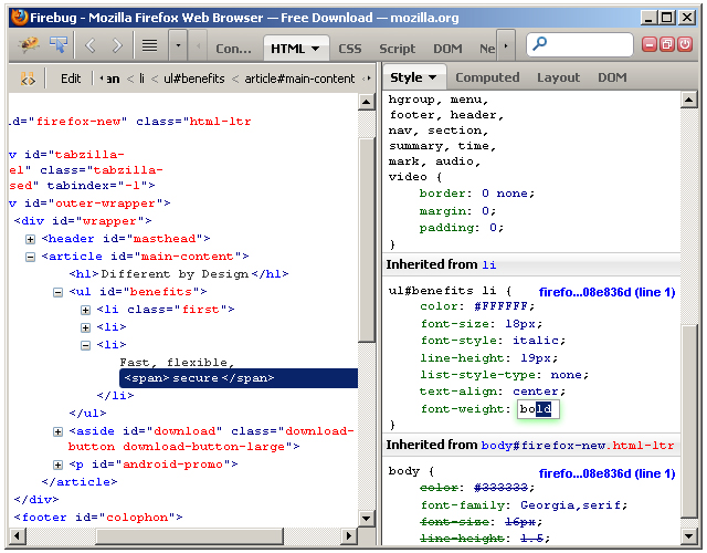
Firefox Developer Tools

Firefox now comes with its own set of developer tools which has a nice focus on the visual side of things. For those who are used to Firebug, that’s still available as an add-on.

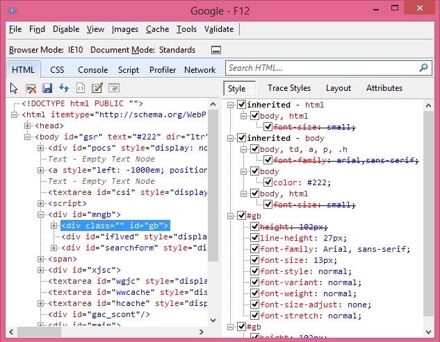
Internet Explorer Developer Tools

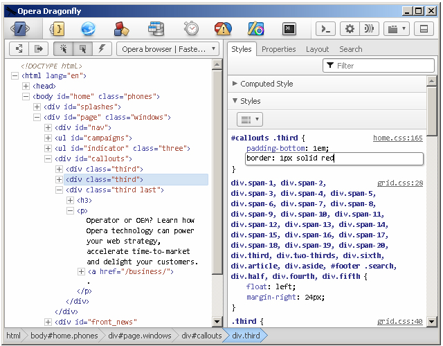
Opera Dragonfly

Getting Started

Note: this tutorial uses the Canary build of Chrome. Therefore, some features covered in this article may or may not be available in the beta or stable releases.

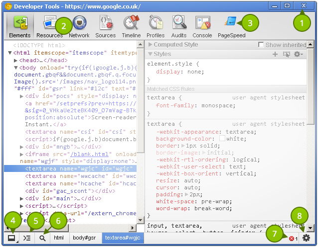
Before taking a look at the contents of the Elements panel, let’s take some time to understand the little controls near the top and bottom. Please refer to the numbered list below the following image that explains the different UI elements in the tool window.

  1. Close Developer Tools.
  2. Buttons to select different tool panels (Elements is currently selected).
  3. A custom tool installed by a third-party extention (PageSpeed).
  4. Change the layout of the developer tools.
  5. Show the console (will be covered in a different tutorial).
  6. Select an element in the tool by clicking on it in the page.
  7. JavaScript errors in the page.
  8. Open the settings screen overlay.

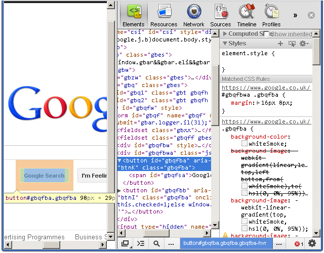
It’s good to choose a layout you are comfortable with. Click once on the bottom-left corner and notice how the developer tools pane detaches itself from the main window–perfect for multi-monitor setups. Clicking and holding on the bottom left icon allows you dock to the right, like this:


Elements Panel

The Elements panel lists the page’s markup as it is rendered in the browser. Any change made to the DOM via JavaScript is reflected in the elements found in this panel.

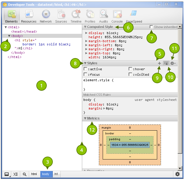
Let’s get familiar with this panel. As before, refer to the list items below the following screenshot that identify the different parts of the Elements panel.

The power given to us by the dev tools is nothing short than amazing.

  1. The elements as rendered within the document.
  2. The arrow indicates that the element has children. The position of the arrow signifies whether the element is collapsed or expanded.
  3. Elemental breadcrumbs starting with the document element (<html/>) and ending with the currently selected element. Hovering over each crumb highlights the respective element in the browser window.
  4. A movable divider to separate the elements list from the style information.
  5. Togglable panes that contain styling (and more) information.
  6. Computed Styles show the styling information the browser calculated for the selected element.
  7. Shows you the styles inherited from the browser’s default styles that are applied to the selected element.
  8. Show you user added styles, such as: styles retrieved from the page’s corresponding styles.css file, styles added via JavaScript, and styles added via the developer tools.
  9. The “New style rule” button. It creates a new style rule for the selected element.
  10. Toggle Element State lets you trigger user initiated states such as :hover (the user hovering over something with their mouse, :active, and more. The image shows the button in its “on” state; it is off by default.
  11. The font section displays only the fonts that the browser has had to download.

  12. Allows you to set the preferred format for color values. You can keep the default (“as authored”), change everything to hex, use RGB, or even set it to HSL.
  13. Visualizes the element’s box by taking margin, border, and padding into account.

Extra Information

  • What: The Elements panel allows for viewing and editing elements and style information.
  • Where: It’s the first panel. You can also access it by right-clicking an element on the page and selecting Inspect element.
  • Why: There are a number of use cases. You may wish to modify the DOM by deleting a node or adding a new one. Markup aside, the elements panel is a great place to see the applied styles of a specific node. You can also add and remove styles, as well as create new rules to possibly add to your stylesheets.

DOM Modifications

Modifying the DOM within the Elements panel is a fairly straightforward process. To delete a node, simply right-click it and select Delete node. As you might expect, deleting a parent node also deletes its children. Handy tip: You can also press the delete key on your keyboard to delete the selected node.

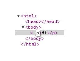
Changing an element’s type is possible by double clicking on the element name itself. For example: the p portion on a paragraph tag. Naturally, changing an element from one type to another causes both the opening and closing tags to change.

renaming an element

Viewing the page’s resources is essential for debugging.

Adding attributes can be achieved by right-clicking on the element and selecting Add attribute. The cursor immediately positions itself where you would expect it to, and you can start typing the attributes you want to add to the element. For example: class="title". Pressing the tab key on your keyboard positions the cursor to the next attribute position.

Editing attributes is similar to adding them. Find the attribute you want to edit, and double click either the attribute name or its value. The former highlights the attribute name, and the latter highlights the value.

Raw HTML editing is enabled by right-clicking on an element and selecting Edit as HTML.

Locating Elements

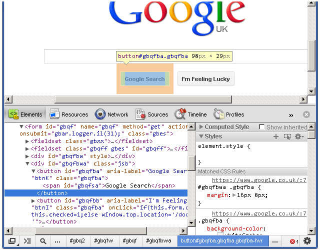
The developer tools provide a few useful techniquies for locating elements in the document. Hovering over elements in the Elements pane causes the corresponding rendered elements to be highlighted in the page. This is a great way to find which element in developer tools matches corresponds with the element in the page.

Hovering over elements in the panel to locate them on the page

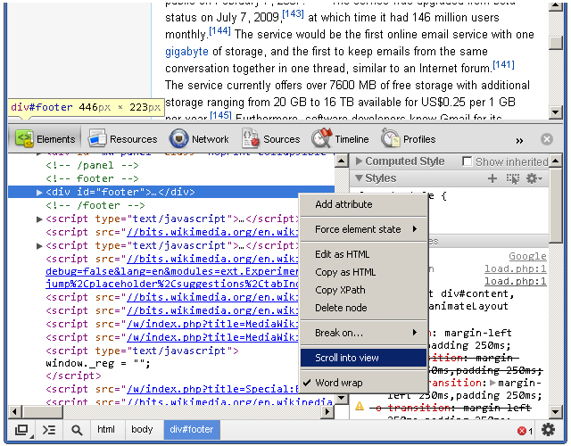
Naturally, we do not see elements outside of the browser’s viewport highlighted when hovering over the corresponding elements in the Elements pane. Fortunately, we do see a tooltip indicating the direction of the out-of-viewport element. The icing on the cake, however, is the Scroll into view feature found within an element’s context menu. It does exactly what its says: it scrolls the element into view.

Scrolling an element into view

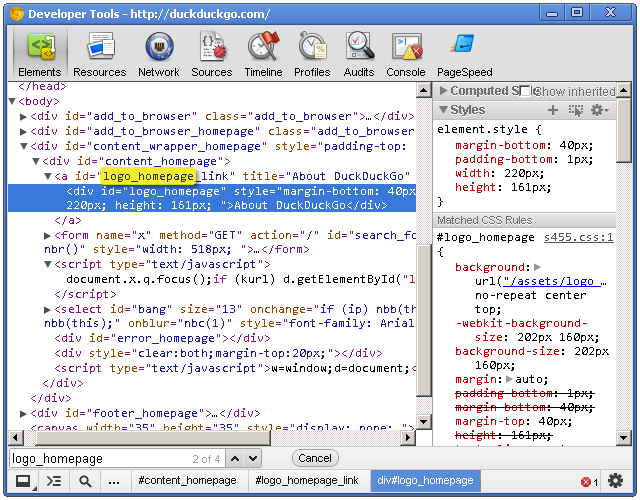
The developer tools also has a search feature. While the dev tools pane has focus, press Control + f to open the search box. This is a simple text search box; so, typing “body” will find the first instance of the text “body” in the document.

Viewing Style Information

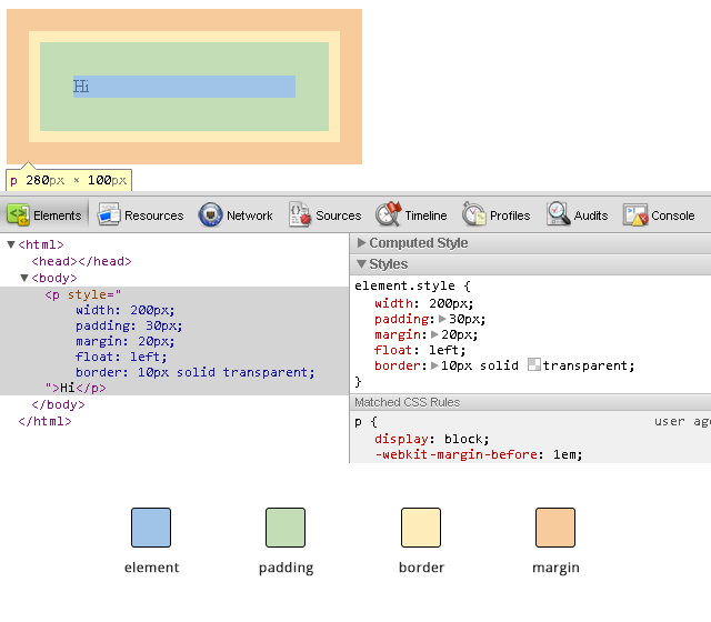
Before we get to the style panes (the right hand side) of the Elements tab, we can access some style information directly from an element if it has all three of margins, paddings and borders specified in the stylesheet. Hovering over one of these elements gives us a glimpse at its box model, like this:

result of hovering over an element

When you’re wondering why some floated elements are not behaving as expected, viewing the margin/padding information can help diagnose the problem. For example, you may find that an element is wider than what you expected due to extra padding.

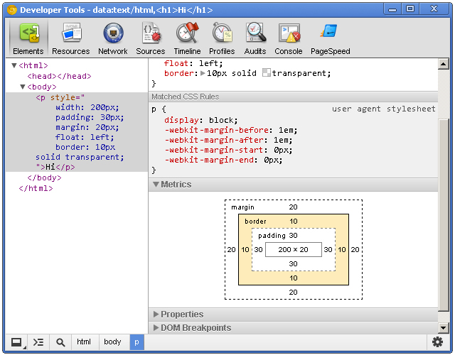
While on the subject of margins/paddings/borders, let’s shift over to the styles area of the Elements panel and check out the “Metrics” pane.

the metrics pane

This allows you to drill-down and identify possible problems as to why an element renders the way it does. It’s also a great learning tool; if you haven’t gotten your head around the CSS Box Model, then the Metrics diagram is a great visual aid.

The Metrics pane lets you view element dimensions, padding, borders and margins. Notice how you can highlight over each individual portion to get a visual representation as to how it renders in the browser. The Metrics diagram also gives pixel based measurements for each portion of the element, e.g. a style rule of padding: 10px 5px (10px at the top and bottom, 5px right and left) will show the exact measurements for each side of the element.

Setting Style Information

Viewing style information is fun, but immediately tinkering with any page’s style ranks much higher on the ‘ol fun meter. Whether it’s to educate ourselves, experiment with a design, or even communicate ideas to our peers, the power given to us by the dev tools is nothing short than amazing.

Ensure the Styles panel is expanded and click just to the right of the opening curly bracket. You’ll notice a cursor automatically positions itself so that you can write a style property. Type a property name, press tab to move the cursor to the value portion, and type the value. I’m going to add the following CSS:

border: 1px solid green

The Elements panel lists the page’s markup as it is rendered in the browser.

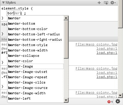
When you start typing in the property name, Chrome provides suggestions, giving you the benefit of auto-completion. Awesome! Pressing tab selects the closest match to what you typed and moves the cursor to the value position. However, pressing the right arrow key causes the cursor to remain in the property portion but fills in the closest match to what you typed.

Auto-completion also works with property values. For example, typing in “pos” *tab* “fi” *tab* creates a style property of position: fixed. When entering pixel/percentage based values, such as 15% or 10px, we can increment and decrement those values using the up and down arrow keys. To increment by 10, use shift + up arrow key.

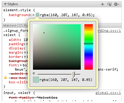
Modifying color values is a breeze thanks to the color picker. After entering a color value, single-click on the small, colored square to the left of the value to bring up the color picker tool. You can also toggle between color value formats by shift+clicking the small colored square.

You can create a new style rule by clicking the small + icon in the styles pane. Markup which looks like:

<h1 id="something">Hello</h1>

Automatically generates the following style rule:

#something { }

Markup which looks like:

<h1 class="some-class">Hello</h1>

Automatically generates the following:

.some-class { }

Markup which looks like:

<h1>Hello</h1>

Generates:

.h1 { }

Markup which looks like:

<h1 class="class1 class2 class3">Hi there</h1>

Automatically generates:

.class1.class2.class3 { }

Of course, style rules can be modified to your liking.

The Elements panel gives you a lot of power with the structure and style of the page, but the dev tools give us many more tools essential to our work.


Resources Panel

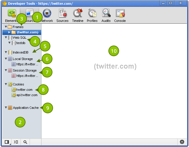
The Resources panel shows what resources a page uses. Let’s take a look at what it provides.

The Metrics pane lets you view element dimensions, padding, borders and margins.

  1. The button to active the Resources panel.
  2. The category pane shows the various types of resources we can inspect. A resource header (such as “Frames” or “Session Storage”) may have an error next to it. This indicates there is more information, and clicking on the header reveals that information. This pane is resizable; so make it as large or small as you like.
  3. Page resources including fonts, images, JavaScript, CSS and the page itself can be found here. If the page uses multiple frames (for example using a frameset), then each frame appears as a separate folder within the parent “Frames” folder. This is useful for understanding the relationship between a frame and its resources.
  4. If Web SQL databases are used in the page, this shows their contents.
  5. Similar to Web SQL, IndexedDB displays the contents of the IndexedDB database.
  6. Displays the key/value pairs stored in localStorage.
  7. Displays the key/value pairs stored in sessionStorage.
  8. Lists the cookies created by the domain.
  9. Displays the assets cached according to the cache manifest. This section contains a lot of useful information. For example, a resource such as a JavaScript library will show the resource path, file size, and file type.
  10. Displays the details regarding the selected resource in the left-hand pane.

Extra Information

The developer tools also has a search feature.

  • What: The resources panel shows resources associated with the page.
  • Where: The second panel, directly after the Elements panel and before the Network panel.
  • Why: Viewing the page’s resources is essential for debugging. You might also be curious as to what information other websites store in localStorage, cookies, or any other data storage mechanism. Additionally, certain resources, such as localStorage can be modified via the developer tools.

Viewing Individual Frame Contents

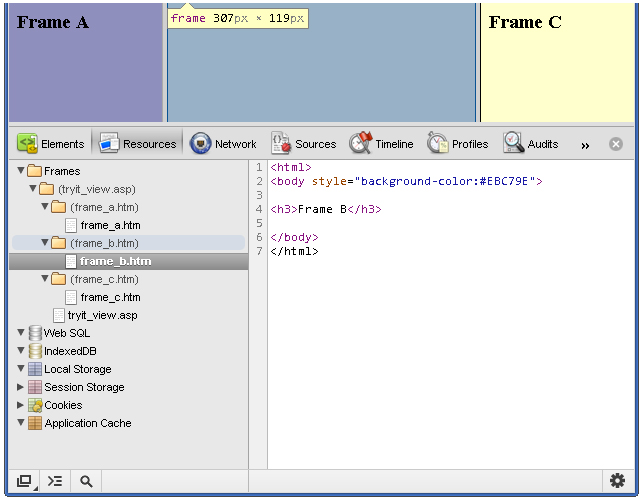
Despite the lack of frames usage in today’s web sites, understanding how to inspect a page with multiple frames is a valuable skill to have. In the following screenshot, you’ll notice a columned page where each column represents a different frame:

viewing multiple frames

You can save a resource to your computer

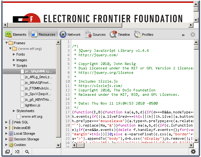
Each frame is placed inside its own folder. Each folder contains each page's assets, and you can click on each page to show their contents. Viewing the contents of an HTML page is helpful, but we can go dig deeper into each page and view its resources. JavaScript, CSS, images, and even fonts can be viewed! Assets that contain code are displayed in the developer tools' code viewer, which comes with syntax highlighting and line numbers.

Fonts

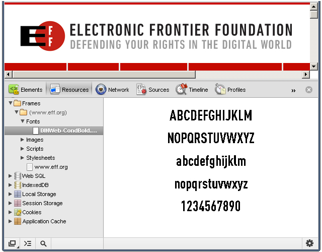
It's important to note that system fonts, such as Arial or Helvetica, are not listed under Fonts; the font section displays only the fonts that the browser has had to download.

Viewing the fonts of a page

The font scales so that it can fit within the resource content area; therefore, resizing the resource content area also resizes the asset!

Images

It's clear that some thought went into the image viewing UI.

Images within a page from the resources panel

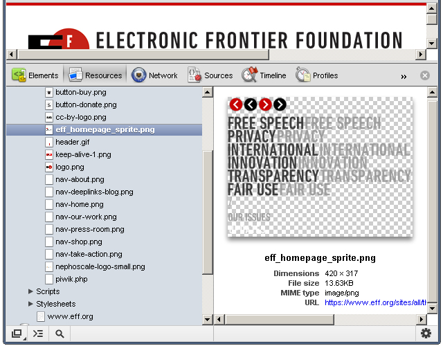
The developer tools displays the image in the content area, and the image scales according to the content area's size. Images with transparency (like the one in the above screenshot) are shown with a checkerboard in the background, making it easier to view the image. Other useful information, such as the dimensions, file size, and MIME type are displayed below the image.

Scripts

The JavaScript! Clicking a script file displays its contents, but not much else.

JavaScript that a page has loaded

But don't despair; viewing assets is simply that: viewing assets. In a future tutorial, we'll look at the dev tools' JavaScript support and capabilities.

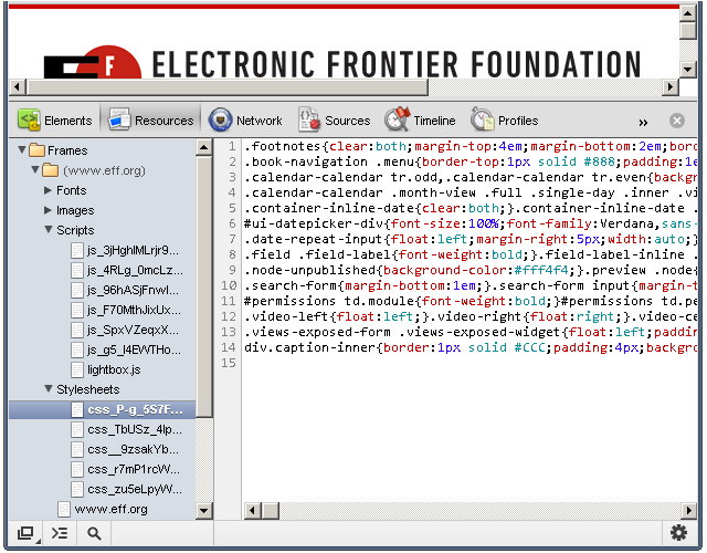
Stylesheets

You can view the different stylesheets that the browser loaded for the web page.

Stylesheets from Chrome dev tools

As with JavaScript files, you cannot do much with the stylesheet assets.

Resources that Failed to Load

Occasionally, the browser will be unable to load a particular resource due to network issues or developer error.

A resource which has not been found

When this happens, a small red notification appears to the right of the asset. The number states how many errors occurred, and the content pane provides more details about the error.

Saving and Viewing Resources

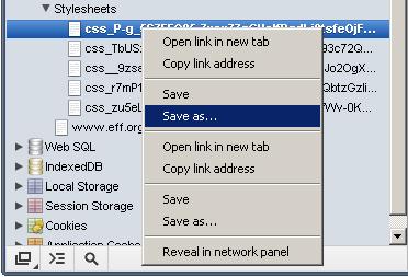
Each resource has a context menu; simply right-clicking on a resource shows a menu similar to this:

the context menu shown for assets

You can save a resource to your computer, open a resource in a new tab, and perform many other tasks. Double-clicking the resource opens the asset in a new tab.

Cookies

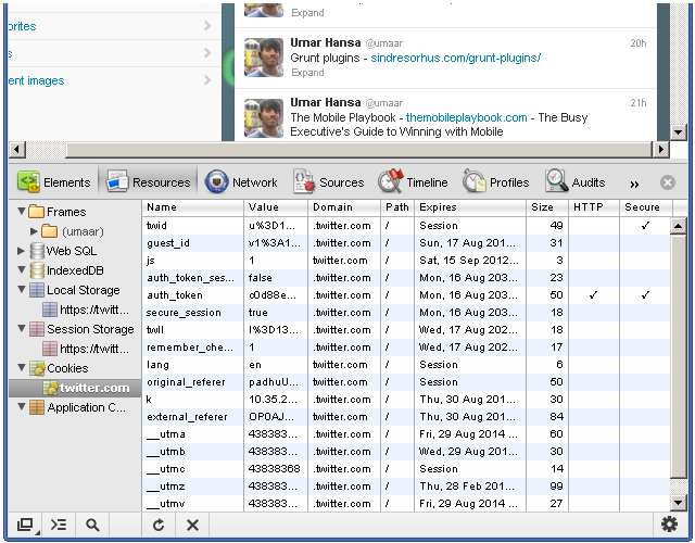
As I previously mentioned, you can view cookie information for a particular website. For example, navigating to Twitter while being signed in may present similar information to what is shown in this screenshot:

viewing the cookies on a page

Here, we see:

When you’re wondering why some floated elements are not behaving as expected, viewing the margin/padding information can help diagnose the problem.

  • Name - the name of the cookie. For example, there's a name with "remember_checked" which has a value of 1. This is likely to state whether the user has checked a "Remember me" checkbox during the sign in process.
  • Value - the value of the cookie. For the "_twitter_sess" named cookie, there's a long encrypted session ID for the value.
  • Domain - the cookie's domain. .twitter.com allows for any sub-domain on twitter.com.
  • Path - similar to domain, the path field states valid paths. "/" allows for all paths.
  • Expires - the date the browser delete the cookie.
  • Size - the size of the cookie in bytes.
  • HTTP - force the cookie to only be accessed via the HTTP protocol. This prevents accessing of cookies via JavaScript and can help combat cookie stealing through cross site scripting.
  • Secure - instructs the browser to communicate cookie data only through encrypted connections such as HTTPS

You can delete a cookie by right-clicking on a cookie and selecting Delete from the context menu.

It's interesting to note how browsers use cookie information to determine whether you are an authenticated user. While logged in to Twitter, deleting the "auth_token" and "_twitter_sess" cookies prompts us to login after refreshing the page. Twitter likely stores our logged in status and other bits of sensitive information in those cookies.

Local Storage

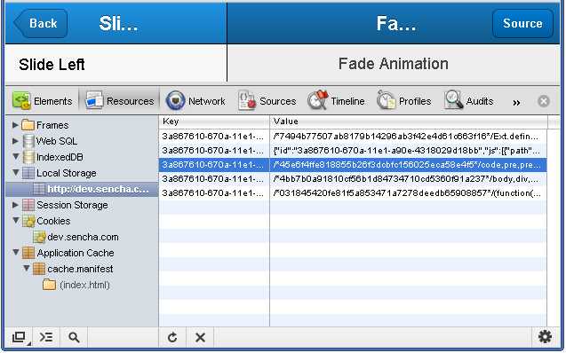
Storing and viewing key/value pairs in localStorage is rather easy. Rather than storing our own keys, we'll use an existing website as an example. The following screenshot shows the local storage view of a Kitchen Sink Example App made with the mobile web application framework Sencha Touch.

Viewing the local storage on a page

When first viewing the page, the browser makes a request for a CSS file. Refreshing the page feels a lot snappier because Sencha stored the CSS in local storage. The kitchen sink app has some interesting key/value pairs. For example, one key looks like this:

3a867610-670a-11e1-a90e-4318029d18bb-http://dev.sencha.com/deploy/touch/examples/production/kitchensink/resources/css/app.css

The value for that key begins with this:

/*45e6f4ffe818855b26f3dcbfc156025eca58e4f5*/code,pre,pre *{font-family:Menlo,Monaco,Courier,monospace}

Steve Souders wrote about storing assets in local storage; it's an interesting and exciting use of local storage which can improve performance--especially on mobile devices.

Application Cache

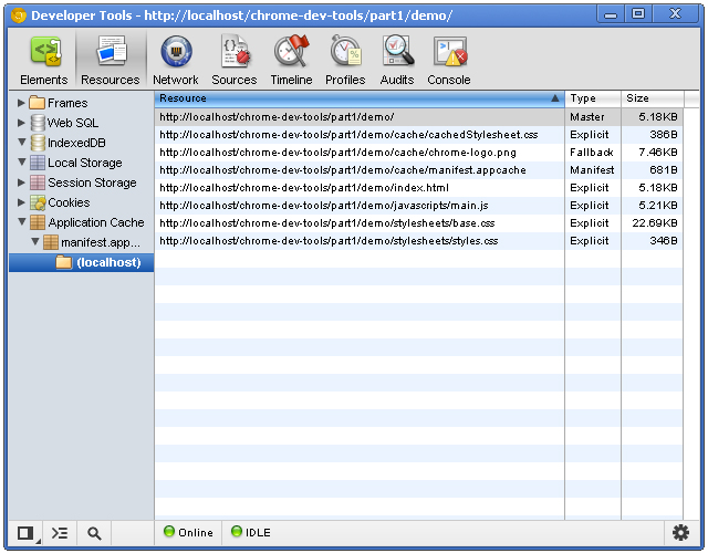
The application cache tells the browser which resources it should cache, and the Application Cache category lets us view what has been cached.

the application cache view in the resources panel

There are three columns with this view:

  • Resource - the full path of the resource. File extensions are typically assets and HTML files. One of the resources is the manifest file itself!
  • Type - can vary. The "Manifest" type is a unique type given to the manifest file itself. Another type is explicit: resources that are explicitly defined in the manifest file. The type of fallback indicates a resource that acts as a fallback for another resource. The Master type is the resource which initiated the cache: the page itself.
  • Size - the size of the resource in kilobytes or bytes.

See this tutorial if you're not familiar with HTML5 application cache.


반응형
반응형

http://html5-demos.appspot.com/


반응형
반응형

소스포지에서 제공되는 HTML5 관련 이슈들~   http://html5center.sourceforge.net/


CSS3 - http://html5center.sourceforge.net/Build-Awesome-Apps-with-CSS3-Animations


Game - http://html5center.sourceforge.net/Bringing-Cut-the-Rope-to-Life-in-an-HTML5-Browser


Geolocation - http://html5center.sourceforge.net/12-Cool-HTML5-Geolocation-Ideas


*** http://david.blob.core.windows.net/html5/css3atat/index.htm ***


반응형

'프로그래밍 > Web' 카테고리의 다른 글

RTSP (real time streaming protocol)  (0) 2012.08.24
[HTML] 마이크로 포멧  (0) 2012.08.20
[PHP] 코드이그나이터 CodeIgniter  (1) 2012.08.13
guava-libraries  (0) 2012.08.09
모바일 프레임워크 비교 사이트  (0) 2012.08.09
반응형

네이티브앱을 만들기만 하던 시대를 지나 이젠 웹으로 앱을 만드는게 보편화 되어버린 시대로 도달했다.

하이브리드앱은 이미 많은 검증을 거쳤고, 상용화되서 시장을 점유하고 있는것이 사실이다.

대표적인 앱제작플롯폼으로 "폰갭(http://phonegap.com/)"을 들 수 있다.

폰갭,앱스프레소, 티타늄들 많이 있지만, 폰갭이 가장 간단하고 사용하기 좋은거 같다. 


자바스크립트를 이용한 처리가 작년만 해도 느렸지만, 하드웨어 성능도 향상되고, 자바스크립트 엔진 성능도 향상되어 지금은 네이티브 API를 사용하는것을 거의 따라잡았다고 볼 수 있다.

오프라인에서는 HTML5 캐시 또는 Web Storage 기능등이 있기때문에 온라인이 아니더라도 일반적인 정보를 보여줄 수 있게되었다. (Web Storage, Web SQL DB, IndexedDB ) 캐시 기능은 문제가 캐시가 잘 변경이 되지 않는다는 단점이 있긴 하지만. 오프라인에서도 화면을 잘 보여준다. 서버 셋팅만 잘 해두었다면 말이다.


HTML5 application Cache

What is Application Cache?

HTML5 introduces application cache, which means that a web application is cached, and accessible without an internet connection.

Application cache gives an application three advantages:

  1. Offline browsing - users can use the application when they're offline
  2. Speed - cached resources load faster
  3. Reduced server load - the browser will only download updated/changed resources from the server

Browser Support

Internet Explorer Firefox Opera Google Chrome Safari

Application cache is supported in all major browsers, except Internet Explorer.


* 일단 서버에서 manifest 타입이 웹에서 활성화 되어야 한다.

   contentType = "text/cache-manifest" 이 적용되어야 한다.

   (contentType만 맞추면 jsp 파일로 구현가능하다. )


1. manifest 파일에 애플리케이션 캐시정책이 기록되어 있다.

    - 어떤 파일을 캐시할지, 오프라인에서 어떤 파일을 보여줄 것인지 등등

2. 처음 화면 접속시 manifest 파일의 내용을 캐시를 해둔다. 

3.두번째 부터는 manifest 파일이 갱신되지 않았으면 캐시를 불러온다.

4.갱신이 되어있어도 일단 캐시를 불러오고, 백그라운드로 업데이트를 한다.

   그래서, 갱신해도 처음에는 이전 캐시를 보여주고 새로고침을 한번 더하거나 하면 갱신된 내용을 보여준다.


웹이 발전하는것은 결국 사용자 편의성을 위한 것이지, 어떤 특정한 기술로 인해 편의성을 져버린다면 그 서비스는 퇴화될것이다 .


반응형
반응형

Web Worker는 현재 페이지에 영향을 주지 않고, 백그라운드로 자바스크립트를 실행한다.

http://www.w3schools.com/html5/html5_webworkers.asp


HTML - Living Standard  : Run JavaScript in the background, in parallel with the main window
http://www.whatwg.org/specs/web-apps/current-work/multipage/workers.html


반응형

+ Recent posts