반응형

Hide the navigation bar - Android

https://developer.android.com/training/system-ui/navigation#behind


Hide the navigation bar  |  Android Developers

This lesson describes how to hide the navigation bar, which was introduced in Android 4.0 (API level 14). Even though this lesson focuses on hiding the navigation bar, you should design your app to hide the status bar at the same time, as described in Hidi

developer.android.com

This lesson describes how to hide the navigation bar, which was introduced in Android 4.0 (API level 14).

Even though this lesson focuses on hiding the navigation bar, you should design your app to hide the status bar at the same time, as described in Hiding the Status Bar. Hiding the navigation and status bars (while still keeping them readily accessible) lets the content use the entire display space, thereby providing a more immersive user experience.

You can hide the navigation bar using the SYSTEM_UI_FLAG_HIDE_NAVIGATION flag. This snippet hides both the navigation bar and the status bar:

View decorView = getWindow().getDecorView();
// Hide both the navigation bar and the status bar.
// SYSTEM_UI_FLAG_FULLSCREEN is only available on Android 4.1 and higher, but as
// a general rule, you should design your app to hide the status bar whenever you
// hide the navigation bar.
int uiOptions = View.SYSTEM_UI_FLAG_HIDE_NAVIGATION
              | View.SYSTEM_UI_FLAG_FULLSCREEN;
decorView.setSystemUiVisibility(uiOptions);
반응형
반응형

15 Responsive jQuery Navigation Plugins


http://inspiretrends.com/responsive-jquery-navigation-plugins/


Constructing a responsive website is not at all any easy task however; the most difficult part is preparation and coding of responsive website’s navigation. Unfortunately, as of now we do not have a universal solution for this difficult part as now because it all depends on the way of the menu you are about to use. Also, a lot depends on your website i.e., if it’s a small or large website. For small websites, most people will prefer a menu with a drop down or a small toggle menu. However, for large websites such as e-commerce ones, you will have to go for a navigation which is known as drawer style.

So, one thing is for sure that solutions differ and today we will cover all styles and their solutions for your convenience and these solutions will be found in jQuery plugins. Below are 15 Responsive jQuery Navigation Plugins.

You May Like : 15 Tabs Navigation Tutorials with jQuery & CSS

jQuery Sidr

Sidr

Sidr is a plugin that is user-friendly and will accomplish the task of creating a responsive side menu just like Facebook. It will help you in creating menus on both side of your page, so use it according to your convenience.

Navgoco: Multilevel Slide Menu

Navgoco

Are you tired of unordered list of links? Well, Navgoco is indeed a perfect solution for you as it will turn those lists into vertical and beautiful multi-level side navigation.

Responsive Menus Flexnav

FlexNav

FlexNav is basically used to create a robust drop-down menu. It is also the chief example for jQuery and of course media queries that are being used in mobiles. It supports touch as well as keyboard.

Smart Menus jQuery

SmartMenus

I consider this plugin to be a great one as it has a lot of features. It will allow you to create both vertical and horizontal responsive list based menus. The good news is that it will work on almost any device.

jQuery Menu-Aim

MeanMenu

this plugin is basically for drop-down menus. This will help your system in detecting it a user is hovering over an item in a dropdown list or is finding a way into contents of a submenu. Menu-aim plugin determines the directions of the users and act accordingly.

Side Toggle Menu

Side Toggle Menu

If you want to add sideways menu bar within your layout, Side Toggle menu is the best option for you. It works two ways; moving over the page or by overlapping the page.

jQuery slimMenu

jQuery slimMenu

It is basically a lightweight jQuery plugin and helps users’ in creating navigation menus on multiple levels.

jPanelMenu

jPanelMenu

This is my personal favorite as I love animated style menu and that too when they are paneled and this is exactly what jPanelMenu is all about. I am sure you are aware of such menus; they are seen all over Mobile Facebook and Twitter. As far as transitions are concerned, they are controlled by CSS and you get to witness flawless transitions.

Responsive Flaunt.js

Flaunt

If you are looking to build a nested navigation out of the box which should be responsive as well, Flaunt.js is the best option for you.

Naver Responsive Navigation

Naver

This is one of the best plugins if you are looking to turn a simple navigation into a mobile version that is user friendly. It works automatically so less effort.

TinyNav.js

TinyNav

It is extremely a lightweight plugin i.e., 368 bytes that will help you in converting <ul> and <ol> menus. These will convert the menus into dropdown that offers selection as well.

Responsive-menu

If your browser is at mobile width, this tiny plugin will convert the site’s navigations into a mobile one.

HorizontalNav

HorizontalNav

This is an interesting plugin because it spans a parallel navigation appropriate for the entire width of its container and also provides an option to the user i.e., if the user wants to go for a responsive version or not.

jQuery.mmenu

jQuery.mmenu

You can create amazingly slick and sleek sliding menus and that too with using a single stroke of JavaScript and it is following:

[js]$(“#nav”).mmenu();[/js]

It is as simple as that. This single line makes things smooth and convenient for you.

MeanMenu

MeanMenu

This media query will help you in converting a simple menu into a mobile responsive one. It is basically a lightweight JS, which can convert a simple menu into a mobile one.


.

반응형
반응형

20 Examples of Minimal Style Navigation Menus in Web Design

Posted by on Aug 13, 2012 | 8 Comments

Minimalism is the art of exposing the essence of something, eliminating non essential forms, features and concepts. In web design, minimalism is really appreciated, especially when it comes to menus and navigation. It is always inspiring to see how some designers apply the well known “less is more” concept to websites menus, and this is what we will show here today, minimal navigation menus. Enjoy.

Colorkite

20 Examples of Minimal Style Navigation Menus in Web Design

Cristian Ordonez

20 Examples of Minimal Style Navigation Menus in Web Design

Kirschner Brasil

20 Examples of Minimal Style Navigation Menus in Web Design

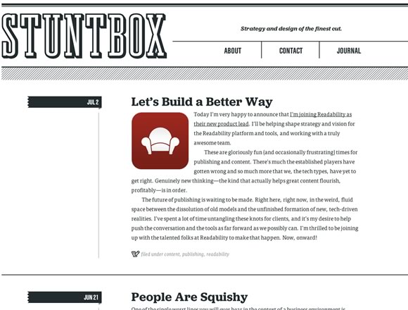
Stuntbox

20 Examples of Minimal Style Navigation Menus in Web Design

Derwent & Tamar Chambers

20 Examples of Minimal Style Navigation Menus in Web Design

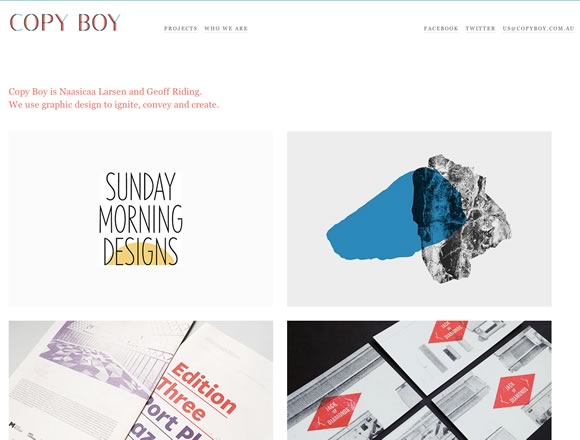
Copy Boy

20 Examples of Minimal Style Navigation Menus in Web Design

Crafting Type

20 Examples of Minimal Style Navigation Menus in Web Design

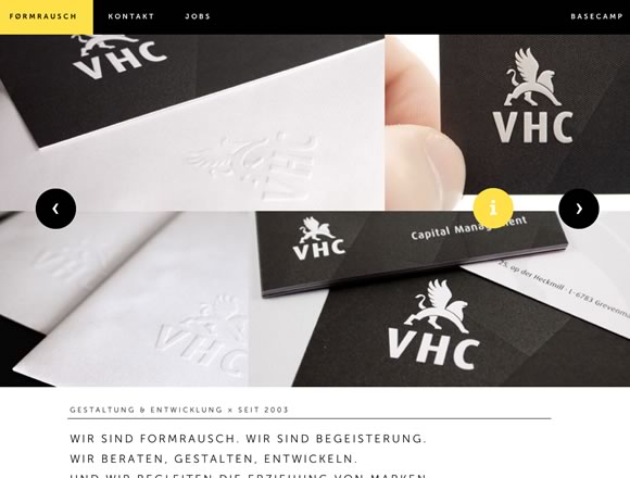
formrausch.com

20 Examples of Minimal Style Navigation Menus in Web Design

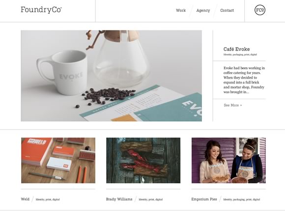
FoundryCo

20 Examples of Minimal Style Navigation Menus in Web Design

Envy Labs

20 Examples of Minimal Style Navigation Menus in Web Design

south & eleven

20 Examples of Minimal Style Navigation Menus in Web Design

Paid to Exist

20 Examples of Minimal Style Navigation Menus in Web Design

mangrove

20 Examples of Minimal Style Navigation Menus in Web Design

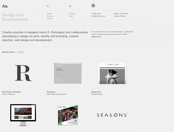
Aa.

20 Examples of Minimal Style Navigation Menus in Web Design

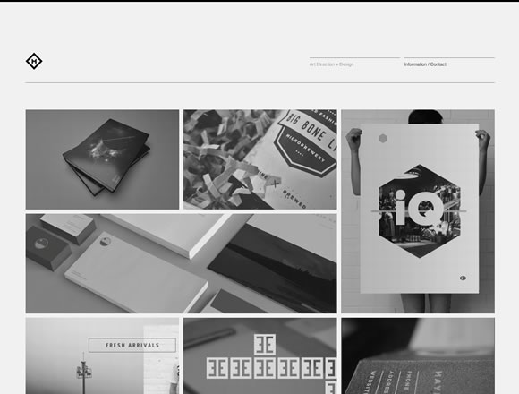
Chad Miller

20 Examples of Minimal Style Navigation Menus in Web Design

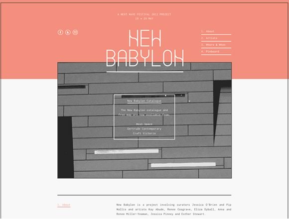
New Babylon

20 Examples of Minimal Style Navigation Menus in Web Design

Fear the Grizzly

20 Examples of Minimal Style Navigation Menus in Web Design

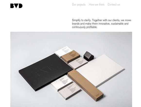
BVD

20 Examples of Minimal Style Navigation Menus in Web Design

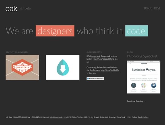
oak

20 Examples of Minimal Style Navigation Menus in Web Design

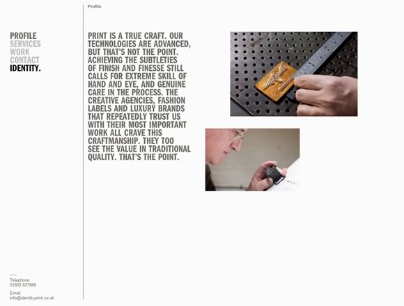
Identity Print

20 Examples of Minimal Style Navigation Menus in Web Design

About the Author

Gisele Muller is someone that recently discovered a new career online. A person that really likes technology, design, photography and creativity. An eternal geek wannabe, tech fan and a communication lover! Current location: San Bruno, CA – USA. Twitter: @gismullr


반응형

+ Recent posts