
반응형
[WEB] 화면별 일반적인 해상도. 웹에서 어떻게 볼 것인가?
반응형 웹 대응
====================================================
▶ 720, 1024, 1334, 1600 네 가지 분기 처리(Breakpoint)를 기본
360 / 640 / 720 / 1024 / 1334 / 1600 / 1920
- PC
@media all and (max-width:1500px) {}
@media all and (max-width:1280px) {}
@media all and (max-width:1180px) {}
- 태블릿, 모바일
@media all and (max-width:981px) {}
@media all and (max-width:768px) {}
@media all and (max-width:640px) {}
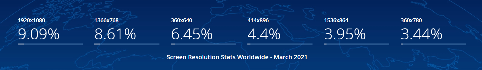
gs.statcounter.com/screen-resolution-stats
Screen Resolution Stats Worldwide | StatCounter Global Stats
This graph shows the stats of screen resolutions worldwide based on over 10 billion monthly page views.
gs.statcounter.com
Source: StatCounter Global Stats - Screen Resolution Market Share
반응형
'프로그래밍 > Style & Design' 카테고리의 다른 글
| [CSS] 중국어 폰트가 웹에서 굵고, 가늘고 할때 어떤 폰트 쓸까? (0) | 2021.06.09 |
|---|---|
| html table css 참고 (0) | 2021.04.29 |
| AdminLTE - Bootstrap 4 Admin Dashboard (0) | 2021.03.23 |
| [bootstrap] AdminLTE에서 print시 모바일 기본인 것을 PC버전으로 출력하고 싶을때. CSS3 Media Queries (0) | 2020.12.21 |
| [style] CSS 레인보우(Rainbow) 색상의 텍스트 만들기 (0) | 2020.12.21 |