반응형

해상도/일람

해상도/일람

https://namu.wiki/w/%ED%95%B4%EC%83%81%EB%8F%84/%EC%9D%BC%EB%9E%8C


해상도/일람 - 나무위키

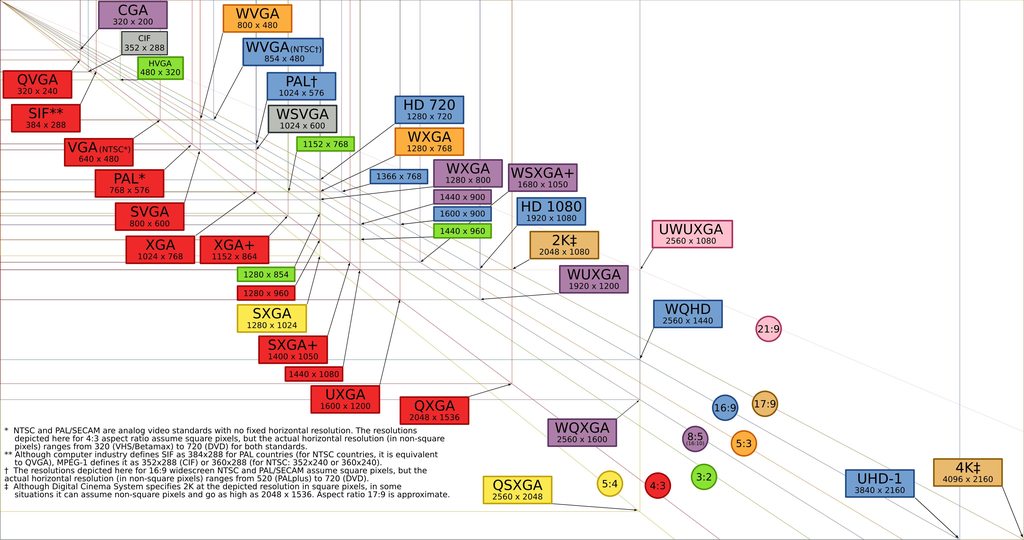
Video Graphics Array 이름해상도비율설명qqVGA160×1204:3HqVGA240×1603:2Half quarter VGA320×2404:3WqVGA400×2405:3Wide quarter VGAHVGA480×3203:2VGA640×4804:3-WVGA800×4805:3FWVGA854×48016:9Full Wide VGASVGA800×6004:3DVGA960×6403:2WSVGA1024×576 1024x 60016:9 17:10 그래픽 어레

namu.wiki

eXtended Graphics Array

이름

해상도

비율

설명

XGA[10]

1024×768

4:3

-

WXGA

1280×768[11] 
1280×800

5:3 
16:10

Wide XGA

FWXGA

1366×768

16:9

Full Wide XGA[12]

XGA+

1152×864[13]

4:3

XGA Plus

WXGA+

1440×900

16:10

Wide XGA Plus

WSXGA

1680×1050

16:10

Widescreen Super XGA

SXGA

1280×1024

5:4

Super XGA

SXGA+

1400×1050

4:3

Super XGA

UXGA

1600×1200

4:3

Ultra XGA

WUXGA

1920×1200

16:10

Wide Ultra XGA


반응형
반응형

UXPin - UI Design and Prototyping Tool

Design tool like no other. Prototypes that feel real, with powers of code components, logic, states and design systems. Join for free!

https://www.uxpin.com/


UXPin - UI Design and Prototyping Tool

Design tool like no other. Prototypes that feel real, with powers of code components, logic, states and design systems. Join for free!

www.uxpin.com


반응형
반응형


CSS3 Media Queries


/* Smartphones (portrait and landscape) ----------- */
@media only screen
and (min-device-width : 320px)
and (max-device-width : 480px) {
/* Styles */
}

/* Smartphones (landscape) ----------- */
@media only screen
and (min-width : 321px) {
/* Styles */
}

/* Smartphones (portrait) ----------- */
@media only screen
and (max-width : 320px) {
/* Styles */
}

/* iPads (portrait and landscape) ----------- */
@media only screen
and (min-device-width : 768px)
and (max-device-width : 1024px) {
/* Styles */
}

/* iPads (landscape) ----------- */
@media only screen
and (min-device-width : 768px)
and (max-device-width : 1024px)
and (orientation : landscape) {
/* Styles */
}

/* iPads (portrait) ----------- */
@media only screen
and (min-device-width : 768px)
and (max-device-width : 1024px)
and (orientation : portrait) {
/* Styles */
}

/* Desktops and laptops ----------- */
@media only screen
and (min-width : 1224px) {
/* Styles */
}

/* Large screens ----------- */
@media only screen
and (min-width : 1824px) {
/* Styles */
}

/* iPhone 4 ----------- */
@media
only screen and (-webkit-min-device-pixel-ratio : 1.5),
only screen and (min-device-pixel-ratio : 1.5) {
/* Styles */
}


...

반응형
반응형
UI 애니메이션 기획에 영감을 주는 “30가지 애니메이션 샘플”을 정리한 블로그 글입니다.

#Developer #개발자 #기발자 #Animation #애니메이션 #Transition #트랜지션 #UI #iOS

UI 애니메이션 기획에 영감을 주는 “30가지 애니메이션 샘플”을 정리한 블로그 글입니다.

반응형
반응형
반응형
반응형
반응형
반응형
반응형
반응형

웹 타이포그래피 7원칙
https://brunch.co.kr/@bundi/17


...
반응형

+ Recent posts