http://feeds.dzone.com/~r/dzone/frontpage/~3/RxeQpCjTqSs/15_useful_jquery_grid_plugins_for_developers.html
15 Best jQuery Grid Plugins for Developers
1. Freewall
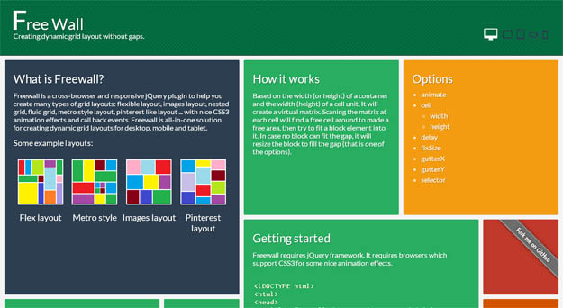
Freewall is a cross-browser and responsive jQuery plugin to help you create many types of grid layouts: flexible layout, images layout, nested grid, fluid grid, metro style layout, pinterest like layout with nice CSS3 animation effects and call back events. Freewall is all-in-one solution for creating dynamic grid layouts for desktop, mobile and tablet.
It is based on the width (or height) of a container and the width (height) of a cell unit, It will create a virtual matrix. Scanning the matrix at each cell will find a free cell around to made a free area, then try to fit a block element into it. In case no block can fit the gap, it will resize the block to fill the gap (that is one of the options).
Source
2. S Gallery

S Gallery is a jQuery image gallery plugin that displays images in a responsive grid. It is inspired from the gallery in Sony’s product pages (which is made with Flash) and mimics that completely. Once an item is clicked and focused, it is possible to browse others with prev-next buttons or via keyboard. Returning back to the grid view is possible with a click and, also, a fullscreen option exists (uses HTML5 Fullscreen API).
Source
3. Mason.js
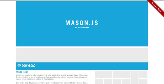
There are various JavaScript-powered solutions for creating dynamic-column grid layouts (like Pinterest). Although most of them are great, sometimes, the grids contain gaps or ragged edges. Mason.js is a jQuery plugin that aims to perfect such grids by filling those gaps smartly. One the grid is created, the plugin calculates where those gaps exist and fills them with either predefined elements or by duplicating the content in the grid. It is possible to define the sizes to be used for elements, the size of columns/rows, breakpoints and if the layout will be fluid or fixed.
Source
4. jQuery.Shapeshift
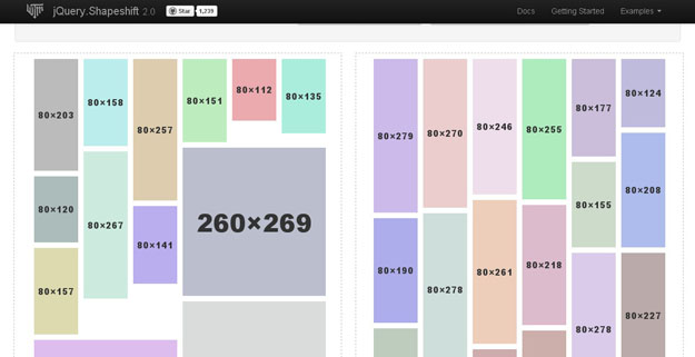
There are various jQuery plugins for creating Pinterest-like dynamic grid layouts. jQuery.Shapeshift is a strong alternative to them with an an extra touch :the items can be drag ‘n’ dropped (uses jQuery UI). The drag ‘n’ drop doesn’t affect the grid negatively as the grid auto-fills the gaps when needed. It also works on touch devices and responsive layouts. The plugin comes with lots of options to set the margins, enable/disable drag-drops, customize animation and much more.
Source
5. jQuery Nested
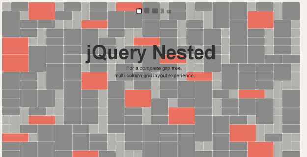
Nested is a jQuery plugin for generating multi-column grid layouts with zero gaps. The plugin creates a matrix of all elements, builds a multi column grid and tries to fill any gaps by reordering the elements. There are various other solutions out there that does the same. However, Nested applies one small action: it resizes any element at the bottom of the grid to guarantee the gap-free layout. Its usage is very easy by simply targeting a container element through a jQuery function. And, various options exist for customization like enabling/disabling animation, min. number of columns and more.
Source
6. Wookmark jQuery Plugin

The dynamic column grid layouts are so popular not only because it is used by Pinterest but also because it is a great way of displaying content with different sizes. Wookmark, a Pinterest alternative, has released a jQuery plugin for creating such layouts, that work well on each browser, instantly. The plugin has very few options to set: the container element, offset (vertical/horizontal distance) and width of the items, that’s all. Once initialized, it gets the size of the window and auto-arranges the grid (yes, it is responsive).
Source
7. Grid-A-Licious
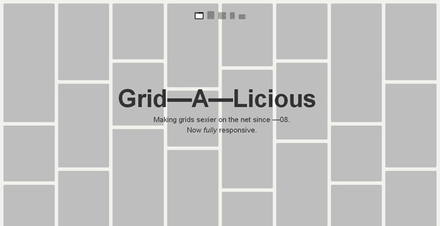
Grid-A-Licious is a jQuery plugin that enables us to easily create Pinterest-like floating-grid layouts. There are other resources to create such an output but Grid-A-Licious differs itself by offering a completely responsive solution. Regardless of the screen size or device, the grid fits perfectly as it is floating (no absolute positioning is used) and fluid. The plugin has options to customize the width, gutter and animation (speed, duration, effect, etc.). And, it supports appending/prepending new items to the grid which is useful for dynamic layouts.
Source
8. jPhotoGrid

jPhotoGrid takes a simple list of images and captions and turns it into a grid of photos that can be explored and zoomed. Nearly all of the styling for this plugin is done in css. The trick is to layout the grid by floating the list items. The first thing the plugin will then do, is convert these all to absolutely positioned. This is what allows the plugin to zoom in on an individual image and then return it to its place.
Source
9. Gridster

Gridster is an impressive jQuery plugin to develop iGoogle-like multi-column grids that can be drag ‘n’ dropped and re-ordered. The plugin only requires jQuery (no jQuery UI) and can convert any given HTML structure into the widgets of the grid. And, we are not limited with the elements loaded initially but can add and remove new ones dynamically.
Source
10. Photoset Grid
Photoset Grid is a simple jQuery plugin to arrange images into a flexible grid, based on Tumblr’s photoset feature. Originally the plugin was created for the Style Hatch Tumblr themes as a way to use the photoset grid in responsive layouts, but they have since expanded it and released a jQuery plugin for us.
Source
11. Flex
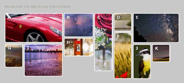
Flex is a fluid asymmetrical animated grid plugin for jQuery. You can mouse over the tiles to see them expand. Flex is an idea inspired by the old flash homepage on Adidas.com.
Source
12. Freetile

Freetile is a plugin for jQuery that enables the organization of webpage content in an efficient, dynamic and responsive layout. It can be applied to a container element and it will attempt to arrange it’s children in a layout that makes optimal use of screen space, by “packing” them in a tight arrangement.
Source
13. Griddy
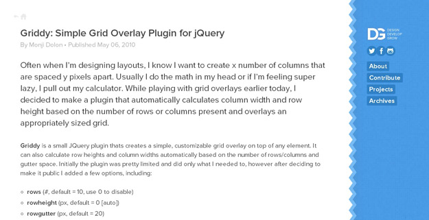
Griddy is a small JQuery plugin thats creates a simple, customizable grid overlay on top of any element. It can also calculate row heights and column widths automatically based on the number of rows/columns and gutter space. There are few options, including: rows, row height, row gutter, columns, column height, column width, color and opacity.
Source
14. jSquares

jSquares is a jQuery plugin that pops up an image and a description in an overlay on hover. It is basically identical to the image grid found on www.ted.com. There are some parameters can be added when you call jSquares, e.g. caption size, opacity of the images, shuffle speed and etc. It works like a charm in IE6+, FF 3+, Safari 3+ and Opera 10.
Source
15. jqGrid
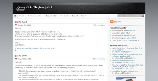
jqGrid is an Ajaxed jQuery grid plugin with amazing features. As the grid is a client-side solution that loads data with Ajax callbacks, it can be used with any server-side language like ASP, PHP, ASP.NET, JSP and so. A clever feature is sub grids which shows you a sub grid when a master column is called.
Source