
https://medium.com/@anirudh.munipalli/10-powerful-css-properties-that-every-web-developer-must-know-e5d7f8f04e10
You probably never heard of them, but you will love them once you know.
CSS.
A language which is responsible for nearly every website in the world.
With so many properties, CSS is pretty huge. Finding good properties among them is like trying to read a binary file by yourself (pls don’t try it).
Which is why I have done that for you (the CSS, not the binary).
Here are 10 properties that you may not use much, or have never heard of, but will love once you know them.
Photo by Markus Spiske on Unsplash
Custom Scrollbars
Let’s change the width and color of the scroll bar. Also, let’s make it a little round as well.
Below are the parts of a scroll bar.

What the different parts of a scroll bar are | Image by Author
We use ::-webkit-scrollbar to change the properties.
/* Set the width of the scroll bar*/
::-webkit-scrollbar{
    width: 10px;
}
/* Change the track to a blue color and give a round border */
::-webkit-scrollbar-track{
    background-color: blue;
    border-radius: 10px;
}
/* Making the thumb (which shows how much you've scrolled) a gray color
  and making it round */
::-webkit-scrollbar-thumb{
    background: gray;
    border-radius: 10px
}
/* A dark gray color when hovered overn */
::-webkit-scrollbar-thumb:hover{
    background: darkgray;
}
The result of the code | Image by Author
Note: This is a non-standard property, and without -webkit-, it will not work.
Cursors
Change how the cursor looks when you mouse over an element.
/* An element with class 'first' */
.first{
    cursor: not-allowed;
}
/* An element with class 'second' */
.second{
    cursor: zoom-in;
}
/* An element with class 'third' */
.third{
    cursor: crosshair;
}
Result of the above code. The cursor on different elements | Image by Author
Scroll behavior
The scroll behavior can make a smooth scroll, to make transition from one section to another smoother.
Add this simple line and see the effect for yourself.
html{
  scroll-behavior:smooth;
}
Instead of simply snapping the page from one section to another, it scroll up/down to the section. See the effect here.
Accent color
Change the color for user interface, such as form controls and checkboxes.

Accent color demo | Image by Author
See how the color of the check box and radio button is blue, instead of the default (and boring) gray.
input{
  accent-color: blue;
}
That’s all. You can use selectors to make some inputs blue, some red and some green.
And this doesn’t change the color of the text, so you can mess around with the colors and experiment. The UI color is under our control.
Aspect Ratio
When building responsive components, constantly keeping check on the height and width might be a headache, as you have to maintain aspect ratios. Videos, and Images may appear stretched sometimes.
That is why we can use the aspect ratio property. Once you set the aspect ratio value, and then set width, the height is set automatically. Or the other way around.
/* An elment with class example */
.example{
    /* Setting the aspect ratio */
    aspect-ratio: 1 / .25;
    /* Upon setting width, height is automatically set */
    width: 200px;
    /* Border is not required, but it is here just to see the effect. */
    border: solid black 1px;
}
Now that we set the width, we will get the height equal to 125 px automatically, to maintain the aspect ratio. This is very useful for responsive behavior.

The result when the CSS is applied to the HTML | Image by Author
Box Reflect
This allows us to create reflections of an component below it.
For this demo, I used an SVG wave image, that I got using this website.
/* An element with class name 'example */
.example{
    /* The reflection will appear below. Other possible values are above | left | right */
    -webkit-box-reflect: below;
}
This creates a reflection below the SVG.
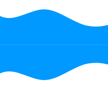
Box reflection below the image | Image by Author
We can also offset the reflection a bit.
/* An element with class name 'example */
.example{
    /* The reflection will appear below. Other possible values are above | left | right */
    -webkit-box-reflect: below 20px;
}
The reflection with offset | Image by Author
Also, I would like it to fade out a bit. We can use a gradient for that.
/* An element with class name 'example */
.example{
    /* The reflection will appear below. Other possible values are above | left | right */
    -webkit-box-reflect: below 0px linear-gradient(to bottom, rgba(0,0,0,0), rgba(0,0,0,.5));
}
This gives a nice reflection.

The resulting reflection | Image by author
This is a non-standard property supported by most major browsers (except Firefox).
Check if browser supports a property
How to check if a particular property is supported in CSS.
/* Check if browser supports display: flex */
@supports (display: flex){
    /* If it does, set the display to flex */
    div{
        display: flex
    }
}
While the above example will always be supported by major browsers, non-standard properties (such as custom scroll bars and box-reflections) might not be supported by some.
Remember to put the condition in () parenthesis.
If you put the not keyword, then it will work if the property is not supported.
@supports not (display: flex){/* If not supported *}
Masks
You can use an Image mask in CSS.
/* An object with class example */
.example{
    /* Setting the mask from a URL */
    -webkit-mask: url(YOUR URL);
    mask: url(YOUR URL);
}
In the mask image, the white represents the mask and black is the area to be clipped.
Filter
You can add amazing filters to your images using CSS. Filters are something we see in every photo sharing app, and now, let’s see how easy they are to implement
img{
    filter: /*YOUR VALUE */;
}
There are many filters available. You can blur, brighten and saturate filters. You can make the image grayscale, change it’s opacity, invert the colors, and more.

The normal image (left), blurred image(middle) and high contrast image(right) | Image by Author | Photo of grass by Author

A brightened image (left), a grayscale image (middle) and a hue rotated image (right) | Image by Author | Photo of grass by Author
See this page for more details.
Backdrop effects
You can add a good looking filter to the area behind an image using backdrop-filter.
All the properties of filter are available here. This is in other words just a filter to apply to the background.
<div class="image">
    <div class="effect">
        backdrop-filter: blur(5px);
    </div>
</div>

<style>
.image{
    background-image: url(YOUR URL);
    background-size: cover;
    width: 400px;
    height: 400px;
    display: flex;
    align-items: center;
    justify-content: center;
}
.effect{
    font-size: x-large;
    color: white;
    font-weight: 800;
    background-color: rgba(255, 255, 255, .3);
    backdrop-filter: blur(5px);
    padding: 20px;
}
</style>
This makes an effect like this:

Result of the code | Image by Author
And with that, you now know 10 new properties of CSS. You can make your website look very professional.
If you like this article, show your support by:
- Clapping
- Following for content about CSS, HTML, JS, Python and AI.
- Responding to this article telling your favorite property.
- Or do all of the above 3 😃
'프로그래밍 > Style & Design' 카테고리의 다른 글
| 58 rules for beautiful UI design (0) | 2024.05.17 |
|---|---|
| 비전 프로 출시 D-2 (0) | 2024.01.31 |
| [ICON] ion-icon 아이콘 사용하기 (0) | 2023.08.24 |
| [CSS] Magic inspired Social Share Button (0) | 2023.08.24 |
| Best 15 CSS Trends To Watch For 2023 (0) | 2023.07.04 |