Chrome Dev Tools: Markup and Style
브라우저, 개발자 도구, 스타일가이드
http://net.tutsplus.com/tutorials/tools-and-tips/chrome-dev-tools-markup-and-style/
Browser Developer Tools
Before digging into Chrome’s
developer tools, I want to give you just a brief look at the development
tools provided by the major browsers. Note that this isn’t a
comprehensive look at these tools and their features, but I do provide
basic information for each tool.
Chrome Developer Tools
You can use the developer tools within Chrome, Chrome Canary and even Chromium.
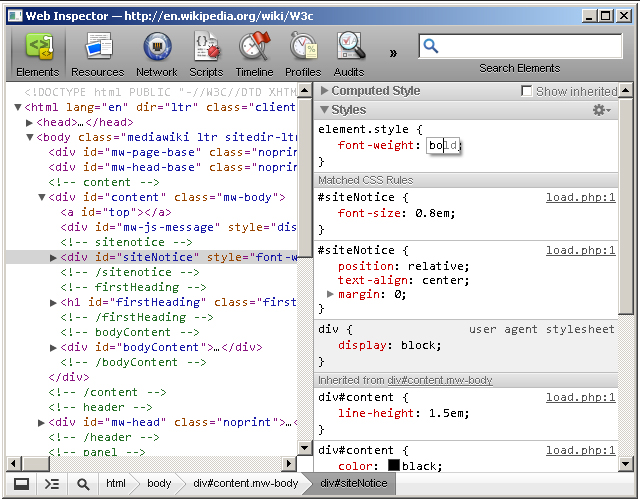
Safari WebKit Inspector
Safari uses code from the Web Inspector repository; however, you may find that it’s not updated as often as Chrome.
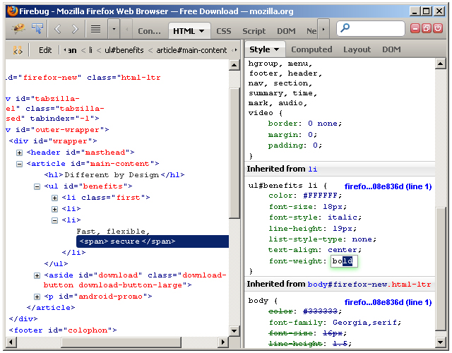
Firefox Developer Tools
Firefox
now comes with its own set of developer tools which has a nice focus on
the visual side of things. For those who are used to Firebug, that’s
still available as an add-on.
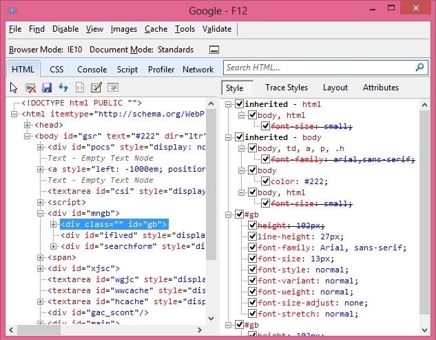
Internet Explorer Developer Tools
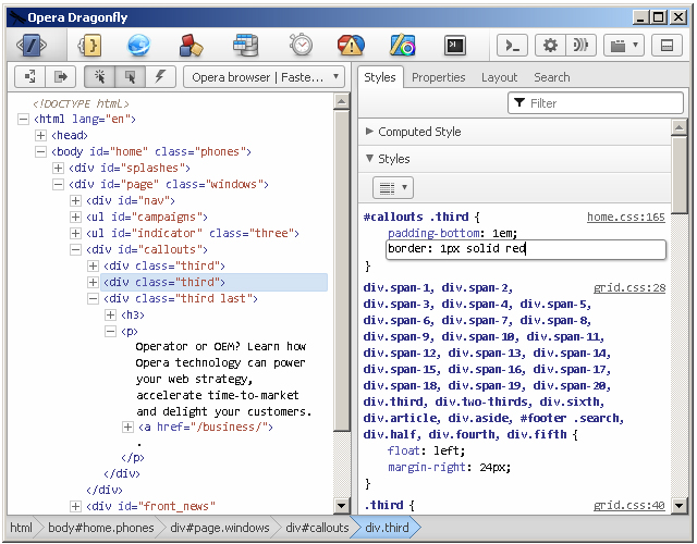
Opera Dragonfly
Getting Started
Note: this tutorial uses the Canary build
of Chrome. Therefore, some features covered in this article may or may
not be available in the beta or stable releases.
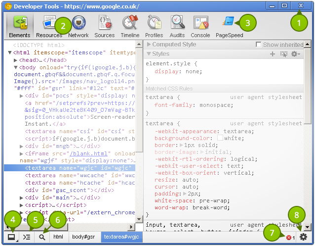
Before taking a look at the contents of the Elements
panel, let’s take some time to understand the little controls near the
top and bottom. Please refer to the numbered list below the following
image that explains the different UI elements in the tool window.
- Close Developer Tools.
- Buttons to select different tool panels (Elements is currently selected).
- A custom tool installed by a third-party extention (PageSpeed).
- Change the layout of the developer tools.
- Show the console (will be covered in a different tutorial).
- Select an element in the tool by clicking on it in the page.
- JavaScript errors in the page.
- Open the settings screen overlay.
It’s
good to choose a layout you are comfortable with. Click once on the
bottom-left corner and notice how the developer tools pane detaches
itself from the main window–perfect for multi-monitor setups. Clicking
and holding on the bottom left icon allows you dock to the right, like
this:
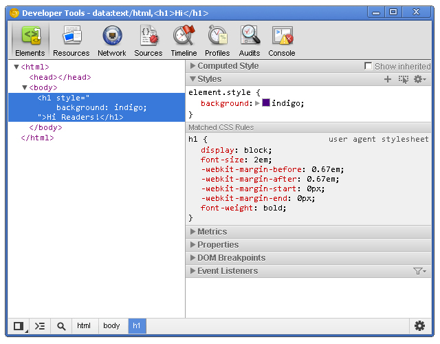
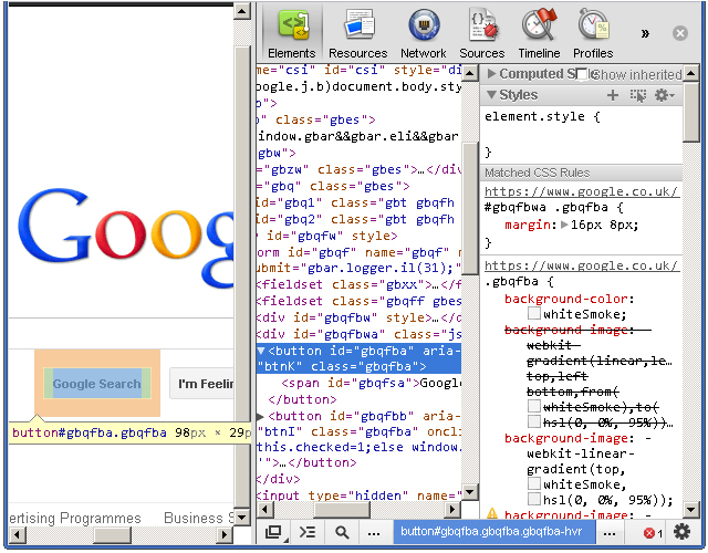
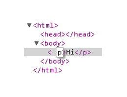
Elements Panel
The Elements
panel lists the page’s markup as it is rendered in the browser. Any
change made to the DOM via JavaScript is reflected in the elements found
in this panel.
Let’s get familiar with this panel. As before,
refer to the list items below the following screenshot that identify the
different parts of the Elements panel.
The power given to us by the dev tools is nothing short than amazing.
- The elements as rendered within the document.
- The
arrow indicates that the element has children. The position of the
arrow signifies whether the element is collapsed or expanded.
- Elemental breadcrumbs starting with the document element (
<html/>)
and ending with the currently selected element. Hovering over each
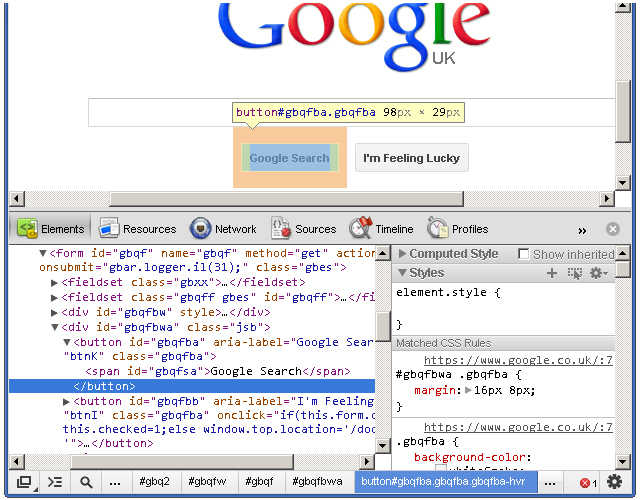
crumb highlights the respective element in the browser window. - A movable divider to separate the elements list from the style information.
- Togglable panes that contain styling (and more) information.
- Computed Styles show the styling information the browser calculated for the selected element.
- Shows you the styles inherited from the browser’s default styles that are applied to the selected element.
- Show
you user added styles, such as: styles retrieved from the page’s
corresponding styles.css file, styles added via JavaScript, and styles
added via the developer tools.
- The “New style rule” button. It creates a new style rule for the selected element.
- Toggle Element State lets you trigger user initiated states such as :hover (the user hovering over something with their mouse, :active, and more. The image shows the button in its “on” state; it is off by default.
The font section displays only the fonts that the browser has had to download.
- Allows
you to set the preferred format for color values. You can keep the
default (“as authored”), change everything to hex, use RGB, or even set
it to HSL.
- Visualizes the element’s box by taking margin, border, and padding into account.
Extra Information
- What: The Elements panel allows for viewing and editing elements and style information.
- Where: It’s the first panel. You can also access it by right-clicking an element on the page and selecting Inspect element.
- Why: There
are a number of use cases. You may wish to modify the DOM by deleting a
node or adding a new one. Markup aside, the elements panel is a great
place to see the applied styles of a specific node. You can also add and
remove styles, as well as create new rules to possibly add to your
stylesheets.
DOM Modifications
Modifying the DOM within the Elements panel is a fairly straightforward process. To delete a node, simply right-click it and select Delete node. As you might expect, deleting a parent node also deletes its children. Handy tip: You can also press the delete key on your keyboard to delete the selected node.
Changing an element’s type is possible by double clicking on the element name itself. For example: the p
portion on a paragraph tag. Naturally, changing an element from one
type to another causes both the opening and closing tags to change.
Viewing the page’s resources is essential for debugging.
Adding attributes can be achieved by right-clicking on the element and selecting Add attribute.
The cursor immediately positions itself where you would expect it to,
and you can start typing the attributes you want to add to the element.
For example: class="title". Pressing the tab key on your keyboard positions the cursor to the next attribute position.
Editing attributes
is similar to adding them. Find the attribute you want to edit, and
double click either the attribute name or its value. The former
highlights the attribute name, and the latter highlights the value.
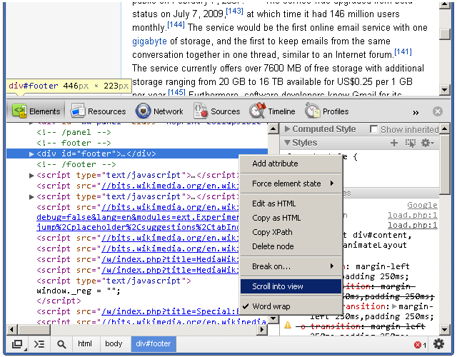
Raw HTML editing is enabled by right-clicking on an element and selecting Edit as HTML.
Locating Elements
The developer tools provide a few useful techniquies for locating elements in the document. Hovering over elements in the Elements
pane causes the corresponding rendered elements to be highlighted in
the page. This is a great way to find which element in developer tools
matches corresponds with the element in the page.
Naturally,
we do not see elements outside of the browser’s viewport highlighted
when hovering over the corresponding elements in the Elements
pane. Fortunately, we do see a tooltip indicating the direction of the
out-of-viewport element. The icing on the cake, however, is the Scroll into view feature found within an element’s context menu. It does exactly what its says: it scrolls the element into view.
The
developer tools also has a search feature. While the dev tools pane has
focus, press Control + f to open the search box. This is a simple text
search box; so, typing “body” will find the first instance of the text
“body” in the document.
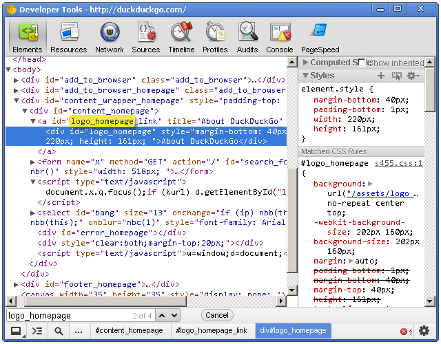
Viewing Style Information
Before we get to the style panes (the right hand side) of the Elements
tab, we can access some style information directly from an element if
it has all three of margins, paddings and borders specified in the
stylesheet. Hovering over one of these elements gives us a glimpse at
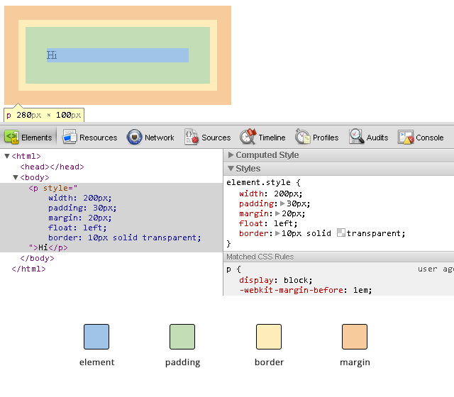
its box model, like this:
When
you’re wondering why some floated elements are not behaving as
expected, viewing the margin/padding information can help diagnose the
problem. For example, you may find that an element is wider than what
you expected due to extra padding.
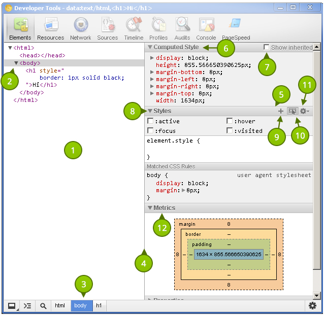
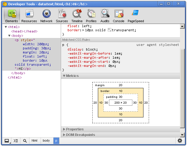
While on the subject of margins/paddings/borders, let’s shift over to the styles area of the Elements panel and check out the “Metrics” pane.
This
allows you to drill-down and identify possible problems as to why an
element renders the way it does. It’s also a great learning tool; if you
haven’t gotten your head around the CSS Box Model, then the Metrics diagram is a great visual aid.
The Metrics
pane lets you view element dimensions, padding, borders and margins.
Notice how you can highlight over each individual portion to get a
visual representation as to how it renders in the browser. The Metrics diagram also gives pixel based measurements for each portion of the element, e.g. a style rule of padding: 10px 5px (10px at the top and bottom, 5px right and left) will show the exact measurements for each side of the element.
Setting Style Information
Viewing
style information is fun, but immediately tinkering with any page’s
style ranks much higher on the ‘ol fun meter. Whether it’s to educate
ourselves, experiment with a design, or even communicate ideas to our
peers, the power given to us by the dev tools is nothing short than
amazing.
Ensure the Styles
panel is expanded and click just to the right of the opening curly
bracket. You’ll notice a cursor automatically positions itself so that
you can write a style property. Type a property name, press tab to move
the cursor to the value portion, and type the value. I’m going to add
the following CSS:
border: 1px solid green
The Elements panel lists the page’s markup as it is rendered in the browser.
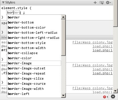
When you start typing in the property name, Chrome provides suggestions, giving you the benefit of auto-completion. Awesome! Pressing tab selects the closest match to what you typed and moves the cursor to the value position. However, pressing the right arrow key causes the cursor to remain in the property portion but fills in the closest match to what you typed.
Auto-completion also works with property values. For example, typing in “pos” *tab* “fi” *tab* creates a style property of position: fixed.
When entering pixel/percentage based values, such as 15% or 10px, we
can increment and decrement those values using the up and down arrow
keys. To increment by 10, use shift + up arrow key.
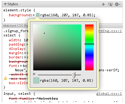
Modifying
color values is a breeze thanks to the color picker. After entering a
color value, single-click on the small, colored square to the left of
the value to bring up the color picker tool. You can also toggle between
color value formats by shift+clicking the small colored square.
You can create a new style rule by clicking the small + icon in the styles pane. Markup which looks like:
<h1 id="something">Hello</h1>
Automatically generates the following style rule:
#something { }
Markup which looks like:
<h1 class="some-class">Hello</h1>
Automatically generates the following:
.some-class { }
Markup which looks like:
<h1>Hello</h1>
Generates:
.h1 { }
Markup which looks like:
<h1 class="class1 class2 class3">Hi there</h1>
Automatically generates:
.class1.class2.class3 { }
Of course, style rules can be modified to your liking.
The Elements
panel gives you a lot of power with the structure and style of the
page, but the dev tools give us many more tools essential to our work.
Resources Panel
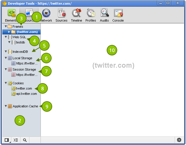
The Resources panel shows what resources a page uses. Let’s take a look at what it provides.
The Metrics pane lets you view element dimensions, padding, borders and margins.
- The button to active the Resources panel.
- The
category pane shows the various types of resources we can inspect. A
resource header (such as “Frames” or “Session Storage”) may have an
error next to it. This indicates there is more information, and clicking
on the header reveals that information. This pane is resizable; so make
it as large or small as you like.
- Page resources including
fonts, images, JavaScript, CSS and the page itself can be found here. If
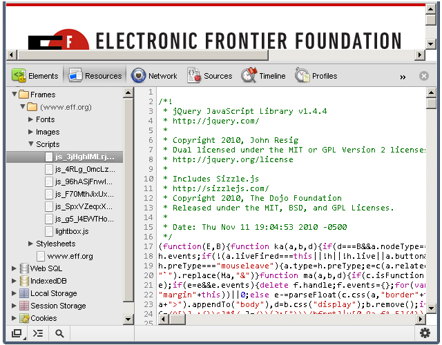
the page uses multiple frames (for example using a frameset), then each
frame appears as a separate folder within the parent “Frames” folder.
This is useful for understanding the relationship between a frame and
its resources.
- If Web SQL databases are used in the page, this shows their contents.
- Similar to Web SQL, IndexedDB displays the contents of the IndexedDB database.
- Displays the key/value pairs stored in
localStorage. - Displays the key/value pairs stored in
sessionStorage. - Lists the cookies created by the domain.
- Displays
the assets cached according to the cache manifest. This section
contains a lot of useful information. For example, a resource such as a
JavaScript library will show the resource path, file size, and file
type.
- Displays the details regarding the selected resource in the left-hand pane.
Extra Information
The developer tools also has a search feature.
- What: The resources panel shows resources associated with the page.
- Where: The second panel, directly after the Elements panel and before the Network panel.
- Why: Viewing
the page’s resources is essential for debugging. You might also be
curious as to what information other websites store in
localStorage, cookies, or any other data storage mechanism. Additionally, certain resources, such as localStorage can be modified via the developer tools.
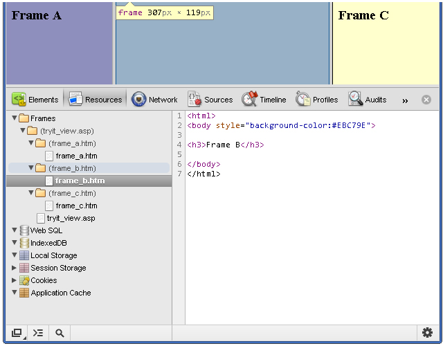
Viewing Individual Frame Contents
Despite
the lack of frames usage in today’s web sites, understanding how to
inspect a page with multiple frames is a valuable skill to have. In the
following screenshot, you’ll notice a columned page where each column
represents a different frame:
You can save a resource to your computer
Each
frame is placed inside its own folder. Each folder contains each page's
assets, and you can click on each page to show their contents. Viewing
the contents of an HTML page is helpful, but we can go dig deeper into
each page and view its resources. JavaScript, CSS, images, and even
fonts can be viewed! Assets that contain code are displayed in the
developer tools' code viewer, which comes with syntax highlighting and
line numbers.
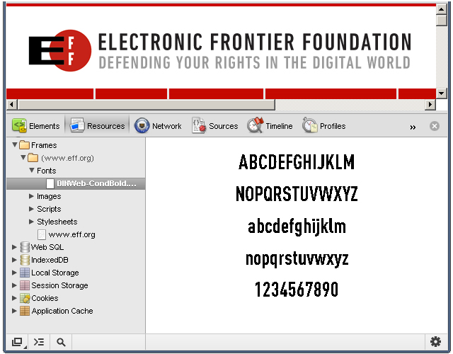
Fonts
It's important to note that system
fonts, such as Arial or Helvetica, are not listed under Fonts; the font
section displays only the fonts that the browser has had to download.
The
font scales so that it can fit within the resource content area;
therefore, resizing the resource content area also resizes the asset!
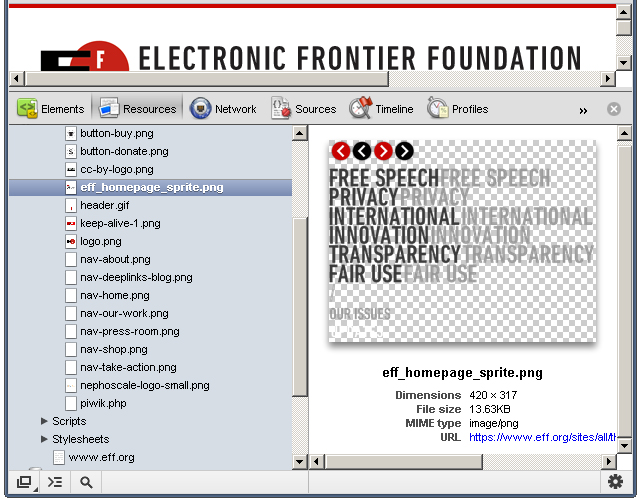
Images
It's clear that some thought went into the image viewing UI.
The
developer tools displays the image in the content area, and the image
scales according to the content area's size. Images with transparency
(like the one in the above screenshot) are shown with a checkerboard in
the background, making it easier to view the image. Other useful
information, such as the dimensions, file size, and MIME type are
displayed below the image.
Scripts
The JavaScript! Clicking a script file displays its contents, but not much else.
But
don't despair; viewing assets is simply that: viewing assets. In a
future tutorial, we'll look at the dev tools' JavaScript support and
capabilities.
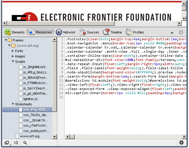
Stylesheets
You can view the different stylesheets that the browser loaded for the web page.
As with JavaScript files, you cannot do much with the stylesheet assets.
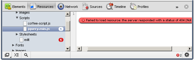
Resources that Failed to Load
Occasionally, the browser will be unable to load a particular resource due to network issues or developer error.
When
this happens, a small red notification appears to the right of the
asset. The number states how many errors occurred, and the content pane
provides more details about the error.
Saving and Viewing Resources
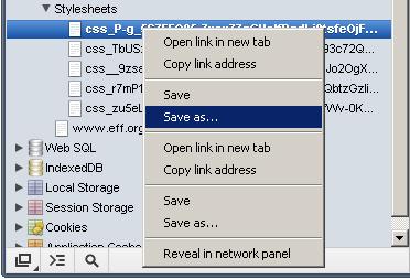
Each resource has a context menu; simply right-clicking on a resource shows a menu similar to this:
You
can save a resource to your computer, open a resource in a new tab, and
perform many other tasks. Double-clicking the resource opens the asset
in a new tab.
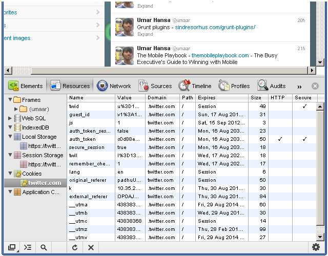
Cookies
As I previously mentioned, you can
view cookie information for a particular website. For example,
navigating to Twitter while being signed in may present similar
information to what is shown in this screenshot:
Here, we see:
When
you’re wondering why some floated elements are not behaving as
expected, viewing the margin/padding information can help diagnose the
problem.
- Name - the name of the
cookie. For example, there's a name with "remember_checked" which has a
value of 1. This is likely to state whether the user has checked a
"Remember me" checkbox during the sign in process.
- Value - the value of the cookie. For the "_twitter_sess" named cookie, there's a long encrypted session ID for the value.
- Domain - the cookie's domain.
.twitter.com allows for any sub-domain on twitter.com. - Path - similar to domain, the path field states valid paths. "/" allows for all paths.
- Expires - the date the browser delete the cookie.
- Size - the size of the cookie in bytes.
- HTTP
- force the cookie to only be accessed via the HTTP protocol. This
prevents accessing of cookies via JavaScript and can help combat cookie
stealing through cross site scripting.
- Secure - instructs the browser to communicate cookie data only through encrypted connections such as HTTPS
You can delete a cookie by right-clicking on a cookie and selecting Delete from the context menu.
It's
interesting to note how browsers use cookie information to determine
whether you are an authenticated user. While logged in to Twitter,
deleting the "auth_token" and "_twitter_sess" cookies prompts us to
login after refreshing the page. Twitter likely stores our logged in
status and other bits of sensitive information in those cookies.
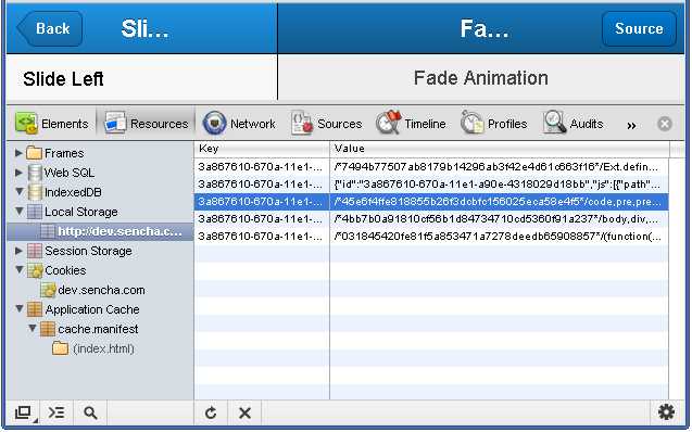
Local Storage
Storing and viewing key/value pairs in localStorage
is rather easy. Rather than storing our own keys, we'll use an existing
website as an example. The following screenshot shows the local storage
view of a Kitchen Sink Example App made with the mobile web application framework Sencha Touch.
When
first viewing the page, the browser makes a request for a CSS file.
Refreshing the page feels a lot snappier because Sencha stored the CSS
in local storage. The kitchen sink app has some interesting key/value
pairs. For example, one key looks like this:
3a867610-670a-11e1-a90e-4318029d18bb-http://dev.sencha.com/deploy/touch/examples/production/kitchensink/resources/css/app.css
The value for that key begins with this:
/*45e6f4ffe818855b26f3dcbfc156025eca58e4f5*/code,pre,pre *{font-family:Menlo,Monaco,Courier,monospace}
Steve Souders wrote about storing assets in local storage; it's an interesting and exciting use of local storage which can improve performance--especially on mobile devices.
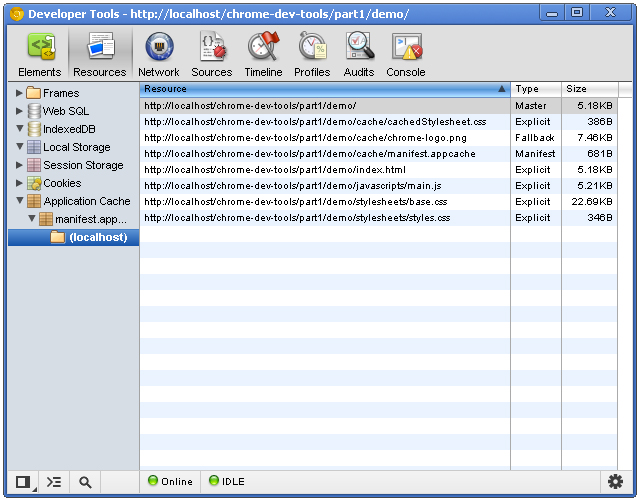
Application Cache
The application cache tells the browser which resources it should cache, and the Application Cache category lets us view what has been cached.
There are three columns with this view:
- Resource
- the full path of the resource. File extensions are typically assets
and HTML files. One of the resources is the manifest file itself!
- Type - can vary. The "Manifest" type is a unique type given to the manifest file itself. Another type is explicit: resources that are explicitly defined in the manifest file. The type of fallback indicates a resource that acts as a fallback for another resource. The Master type is the resource which initiated the cache: the page itself.
- Size - the size of the resource in kilobytes or bytes.
See this tutorial if you're not familiar with HTML5 application cache.