
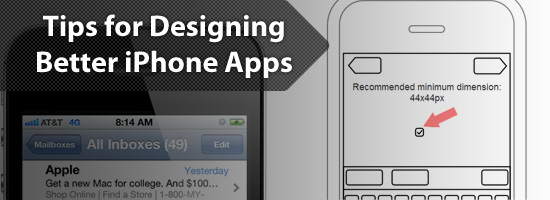
Simple Tips for Designing Better iPhone Apps
As users shop the Apple App Store looking for new apps to buy, they judge their potential purchases based on design.
We’re told early on in life not to judge a book by its cover, but without a way to trial an app, screenshots are one of the few ways a user can judge the quality of it.
Since it’s not possible for someone to judge ease-of-use (usability) or code-quality just by browsing the App Store, judging entirely based on design makes sense, and so apps with better design tend to be chosen more often when compared with competing apps.
So how can we design better apps? Well, I’m glad you asked. I’ll discuss five simple tips that will help.
1. Wireframe Your App
When we talk about an app’s design, we’re talking about two main components. These two components are user experience (UX) design and user interface (UI) design.
Experience design is all about the goals of the app, such as which features to include, and how the user will accomplish those goals.
The user interface design is what that experience looks like visually. That includes the colors, textures, and fonts used to craft the visual style of the app.
In designing iPhone apps, both of those design components are critical and go hand in hand.
However, it’s important that you first spend time on designing the experience of the user. Instead of starting with the visual design of your iPhone app, start with wireframes.
A wireframe is a simple outline of your app idea that allows you to work exclusively on the experience, ignoring the visual aspects. (Read more benefits of wireframing your designs.)
I like to use pen and paper to draw simple boxes and shapes for my wireframes. Others use everything from Illustrator to Balsamiq Mockups (a popular tool for wireframing apps). For this task, the tool doesn’t matter.
 Image source: MOObileFrames
You want to focus on planning out how your app features will fit together, what screen the user will encounter first, and how they’ll navigate your application.
Draw buttons, write in text, and especially focus on making the learning process intuitive.
Only start paying attention to style once you’re confident that your wireframes represent a clean, usable app design.
2. Use Finger-Sized Tap Targets
This is the biggest thing you can do to improve the usability of your app: Increase the tappable area for every button. You’re designing for fingers and thumbs, not mouse cursors (which have a higher pointing accuracy).
Apple recommends a minimum of 44x44px for any element the user is expected to interact with.
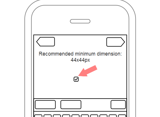
Now this doesn’t mean that the button needs to visually look that big. The tappable area can extend beyond the visual size of the button. This will help users avoid the frustration of trying multiple times to tap an element. Just be careful if you have several buttons close to each other. Make sure that your extra tappable area doesn’t overlap with other buttons.
3. Have Only One Primary Goal Per Screen
When you’re designing a screen in your app, focus on the primary goal you want the user to accomplish.
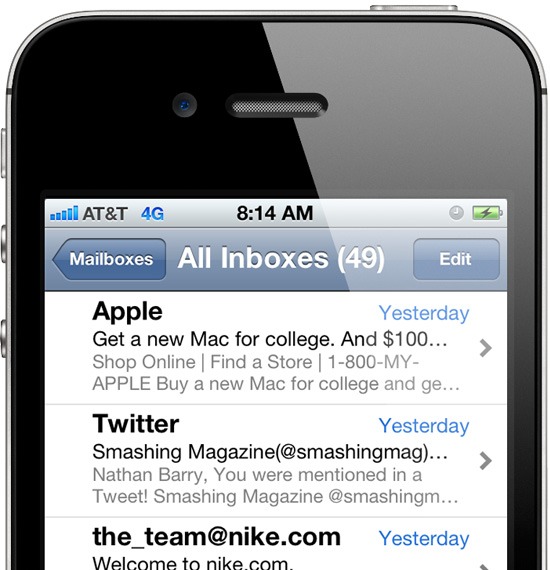
For example, in the email list screen in iPhone’s Mail app, the user’s primary goal is to read emails. Though there’s a secondary action for composing an email, the button is off in the corner and not emphasized.
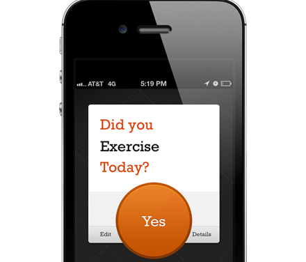
In Commit (one of my iPhone applications) the primary action of the commitment screen is to mark it complete. So I made a huge orange button for that action. Though other buttons are on the same screen, none compete for attention with the primary action.
One of your tasks as a designer is to decide what’s the most important, and then emphasize that. Decrease the visual weight of secondary elements so that the primary action is clear.
To help you create better visual hierarchies and priorities in your designs, check out the following articles:
- Working with Visual Weight in Your Designs
- Creating Focal Points in Your Web Design
- Using Power Structure and Gestalt for Visual Hierarchy
- The Art of Distinction in Web Design
4. Avoid Default Button Styles
The default style for UIButtons on the iPhone is one of my biggest design pet peeves. Almost all of the default elements included with iOS look good. Then there is the default button.
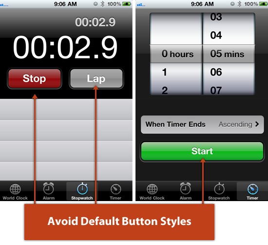
Unless you have a very boring design style for your app, chances are, the default button styles won’t match. Customizing the look of buttons to match your UI will make a huge difference and keep you from looking like an amateur app designer.
You can either set the button style to Custom and include a background image, or you can draw a new button style with code.
There are plenty of tutorials and resources that will help you create great looking buttons. Take a look at both of these resources:
5. Add Extra Views When There’s a Lot of Information
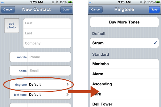
Moving into a new view (either through a push or modal transition) is very easy for the user. So if you find yourself trying to add too much information to a single view, then just add another view.
In iPhone, you can see Apple does this quite often on their "create" screens.
In the New Contact view, selecting a ringtone pushes/slides you to a new view called Ringtones that displays the list of available ringtones you can assign to that new contact.
Tapping a phone number label brings up a modal dialog with other label options (called Label).

By adding extra screens, you can avoid confusing your users with too many cluttered elements by only showing the information they request (a concept known as progressive disclosure).
Related Content
- 10 Solutions for Creating Cross-Platform Mobile Apps
- Helping Your Clients Build an Effective Mobile Strategy
- Native App vs. Mobile Web App: A Quick Comparison
- Related categories: Mobile and User Interface
'프로그래밍 > Style & Design' 카테고리의 다른 글
| [Design] 20 Examples of Minimal Style Navigation Menus in Web Design (0) | 2012.09.05 |
|---|---|
| [Design] 21 Beautifully Designed E-commerce Sites (0) | 2012.09.05 |
| CSS Sprite Sheets: Best Practices, Tools and Helpful Applications (0) | 2012.08.31 |
| CSS, JS 모음 사이트 (0) | 2012.08.14 |
| http://shinydemos.com/ - 오페라에서 만든 웹표준 데모 (0) | 2012.08.10 |