반응형
20 Examples of Minimal Style Navigation Menus in Web Design
Minimalism is the art of exposing the essence of something, eliminating non essential forms, features and concepts. In web design, minimalism is really appreciated, especially when it comes to menus and navigation. It is always inspiring to see how some designers apply the well known “less is more” concept to websites menus, and this is what we will show here today, minimal navigation menus. Enjoy.
Colorkite
Cristian Ordonez
Kirschner Brasil
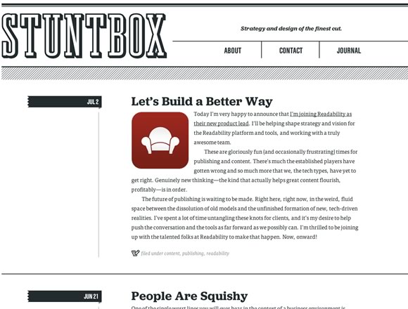
Stuntbox
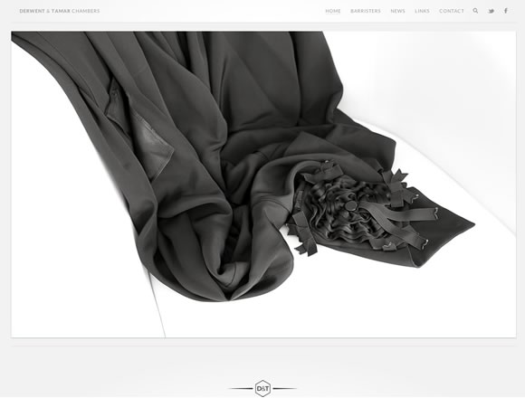
Derwent & Tamar Chambers
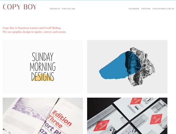
Copy Boy
Crafting Type
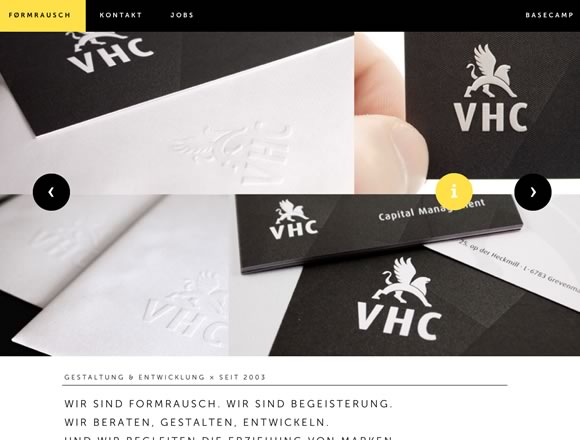
formrausch.com
FoundryCo
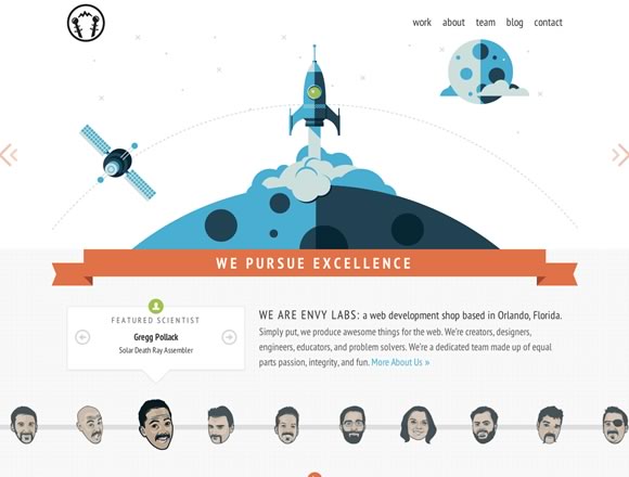
Envy Labs
south & eleven
Paid to Exist
mangrove
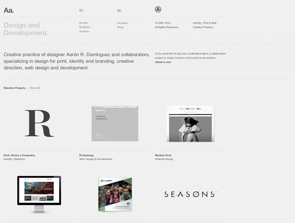
Aa.
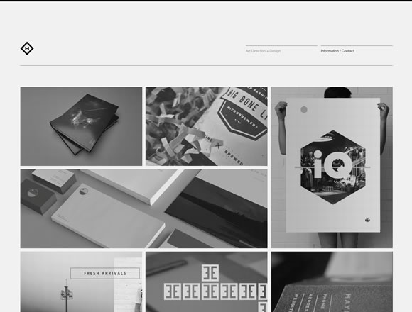
Chad Miller
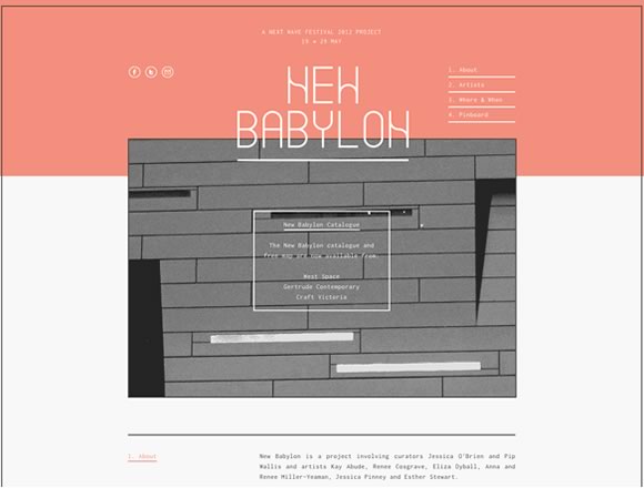
New Babylon
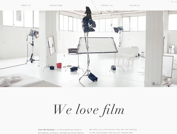
Fear the Grizzly
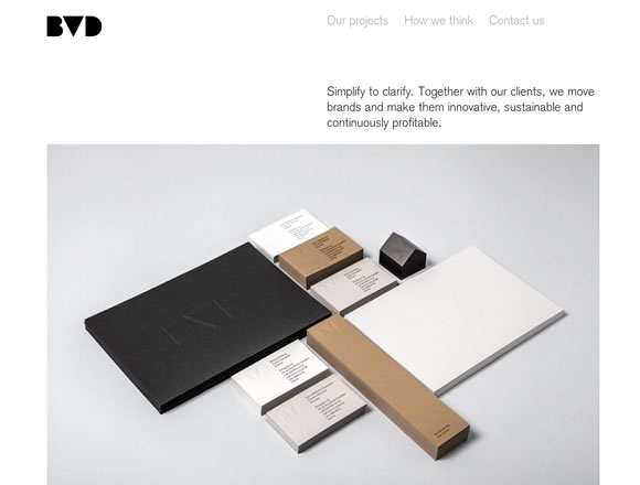
BVD
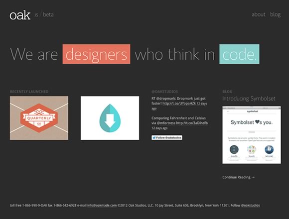
oak
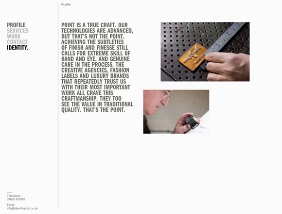
Identity Print
반응형
'프로그래밍 > Style & Design' 카테고리의 다른 글
| Responsive Patterns A collection of patterns and modules for responsive designs. (0) | 2012.09.12 |
|---|---|
| Principles for Successful Button Design (0) | 2012.09.12 |
| [Design] 21 Beautifully Designed E-commerce Sites (0) | 2012.09.05 |
| [Design] 5 Simple Tips for Designing Better iPhone Apps (0) | 2012.09.05 |
| CSS Sprite Sheets: Best Practices, Tools and Helpful Applications (0) | 2012.08.31 |

