반응형
반응형

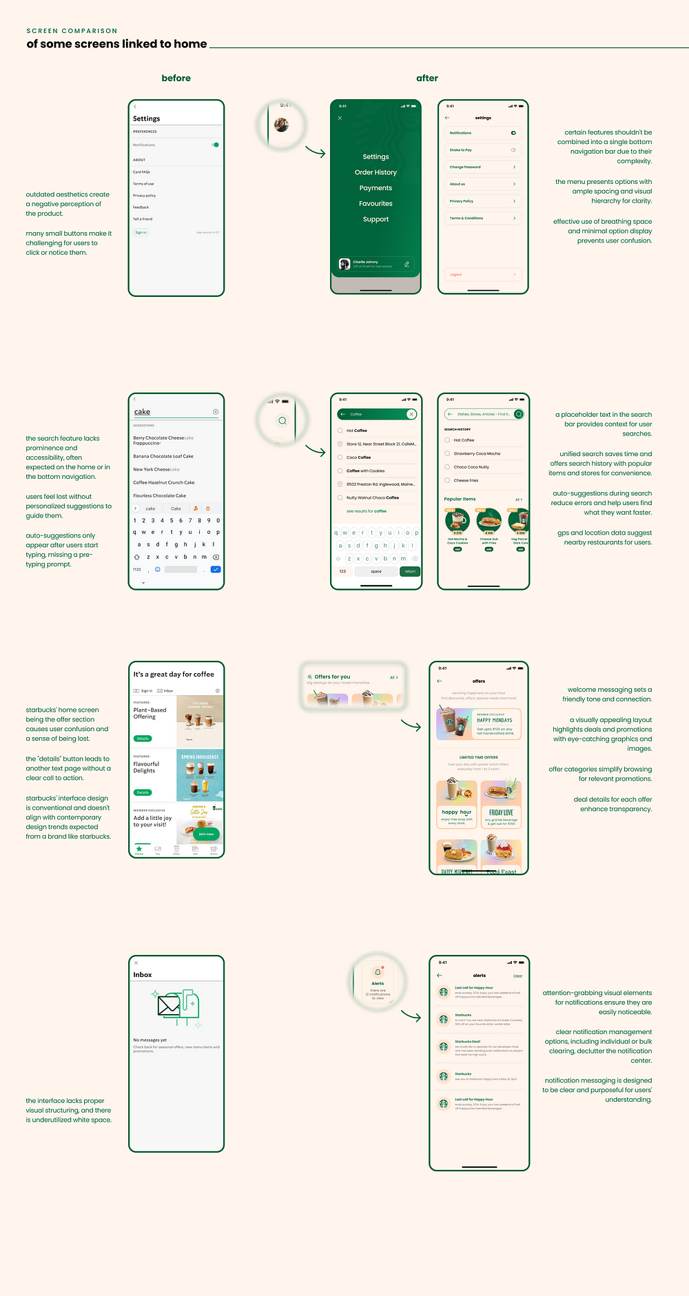
About Starbucks India:

Starbucks is renowned for sourcing and roasting the finest whole-bean coffees, creating a global haven for coffee enthusiasts. Beyond exceptional coffee, Starbucks promises a delightful experience with pleasant service in a welcoming atmosphere.

  • Mission: Inspire and nurture the human spirit, one person, one cup, and one neighborhood at a time.
  • Vision: Establish Starbucks as the world’s leading purveyor of the finest coffee while staying true to their unshakable beliefs.

Key Statistics:

  • Starbucks operates in 75 countries, boasting 27,000 outlets and generating over $22 billion in annual revenue.
  • The Starbucks app has seen significant growth, with 125.15K total web visitors in the last six months 500,000+ downloads on Google Play, and 100,000+ downloads on the App Store.


https://bootcamp.uxdesign.cc/ui-ux-case-study-the-starbucks-app-revamp-youve-all-been-waiting-for-f51ebc8c507b


UI/UX Case Study: The Starbucks App Revamp You’ve All Been Waiting For…

In this article, I’ll outline my approach to refining and enhancing the user experience of the Starbucks India Mobile App.

bootcamp.uxdesign.cc


반응형
반응형

https://uxdesign.cc/58-rules-for-stunning-and-effective-user-interface-design-ea4b93f931f6


58 rules for beautiful UI design

The right UI can elevate an application from functional to unforgettable, making the difference between a user who engages once and one…

uxdesign.cc

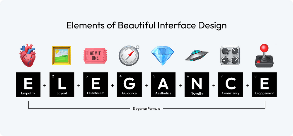
Crafted to be your ultimate roadmap in the journey of UI design. Whether you are a seasoned designer looking to refresh your approach or a novice eager to learn the ropes, these rules are tailored to help you create interfaces that are not just visually appealing but also intuitively functional. To navigate this complex terrain, I have compiled 58 rules across eight categories, collectively forming the “Elegance Formula” for user interface design.

🫀 Empathy: There is no universal concept of beauty; only when you truly understand your target audience can you create a design that is appealing to them.

🖼️ Layout: The layout is the canvas of your interface; it should guide the user’s eye effortlessly, creating a seamless flow that intuitively connects each element.

🎟 Essentialism: Embrace simplicity; every element in your design should serve a purpose, as clutter can obscure the message and hinder the user experience.

🧭 Guidance: Design should not just please the eye but also lead the user, providing clear pathways and cues for what they should do next.

💎 Aesthetics: Aesthetics go beyond mere appearance; they encapsulate the feel of the design, creating an environment that resonates emotionally with the user.

🛸 Novelty: Innovative designs capture attention, but the true art lies in balancing novelty with familiarity, ensuring users feel intrigued yet comfortable.

🎛 Consistency: Consistency in design breeds familiarity; it ensures the user feels at home across various parts of your interface, building trust and ease of use.

🕹 Engagement: An engaging design is like a good conversation; it keeps the user interested, responds to their actions, and encourages them to come back for more.

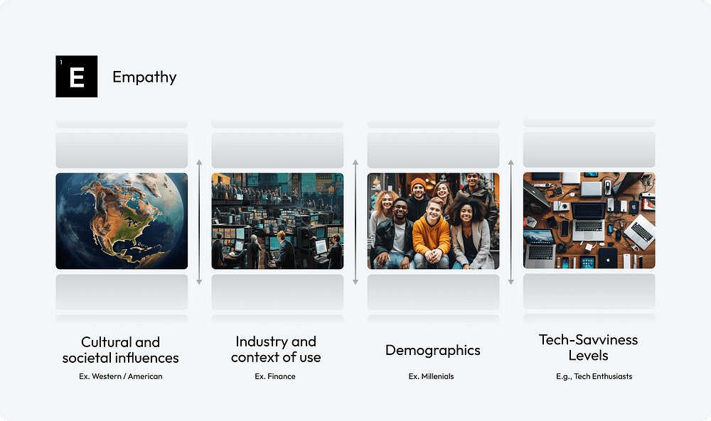
Cultural and societal influences play a crucial role in shaping preferences and perceptions

1. Consider Cultural and Societal Influences: Factor in the diverse cultural and societal backgrounds of your audience to ensure your design resonates broadly and respectfully.

2. Understand Industry and Context of Use: Tailor your design to align with the specific industry norms and the practical context in which your interface will be used.

3. Embrace User Demographics: Embrace the diversity in user demographics, incorporating insights about age, gender, profession, and other factors to craft a more tailored and effective interface.

4. Adapt to Your Audience’s Tech-Savviness: Customize your interface to suit the specific tech-savviness level of your target audience

The Nielsen Norman Group’s research across different demographics — highlighting the unique online behaviors and expectations of young adults, the evolving digital literacy and specific usability needs of seniors, and the distinct and varying design requirements for children — emphasizes the critical importance of empathetic and user-centric design in user interface development to cater effectively to each group’s unique characteristics and preferences.

A well-planned layout is not just about placing elements on a screen; it’s about creating a visual symphony that directs, delights, and engages users

5. Embrace Negative Space: Use negative space wisely to create a clean, uncluttered interface that highlights the most important elements and improves readability.

6. Use the Golden Ratio or Rule of Thirds: Incorporate the Golden Ratio or the Rule of Thirds in your design to achieve natural balance and aesthetically pleasing proportions.

7. Establish a Clear Hierarchy with Size, Color, and Spacing: Utilize variations in size, color, and spacing to create a visual hierarchy that guides the user’s eye to the most significant information first.

8. Utilize Grid Systems: Implement grid systems to bring structure and consistency to your layout, ensuring a cohesive and harmonious arrangement of elements.

The welcome screen of the Allset app skillfully utilizes the Z-pattern layout to create rhythm and direct the user’s attention to the ‘Sign Up’ or ‘Log In’ button. By employing grid systems and ample negative space, the design presents multiple options in a manner that is clear and not overwhelming, effectively balancing information display with visual ease.

9. Create a Clear Focal Point: Designate a clear focal point in your layout to capture immediate attention and orient the user’s interaction with your content.

10. Create Rhythm to Direct Attention: Employ rhythmic design elements, such as repeated patterns or structured layouts, to create a visual flow that intuitively directs the user’s attention through the interface.

In addition, consider utilizing F and Z-pattern layouts to match users’ natural scanning habits. Employ the F-pattern in text-dense interfaces, strategically placing crucial information at the top and left.

Simplicity is ultimate sophistication

It’s about stripping away the non-essential elements and focusing on what truly matters to the user.

11. Achieve Simplicity Through Thoughtful Reduction: Prioritize content and features, removing anything non-essential. Focus on the core functionalities to create a streamlined and more user-friendly interface.

12. Organization Helps the System of Many Look Fewer: Use clear categorization and grouping of elements. Implement drop-down menus or tabs to organize content, making the interface less cluttered and more navigable.

13. Don’t Make Users Think: Ensure that navigation and task flows are logical and predictable. Use common UI elements and place them where users expect them to be, reducing cognitive load.

14. Good Design is as Little Design as Possible: Adopt a minimalist approach, using only elements that are necessary for functionality. Avoid excessive use of colors, fonts, and graphics to maintain a clean and focused interface.

The Tesla App is evidently designed with a focus on minimalism and enduring design aesthetics. This is primarily achieved through the reduction of components and labels. The interface avoids the use of intrusive styles and instead, it employs a digital representation of the car itself as the main visual element.

15. Break Up Huge Tasks into Smaller Steps: Design complex processes, like forms or multi-step tasks, into smaller segments. Use progress bars or breadcrumbs to visually indicate the user’s progress and what remains.

16. Savings in Time Feel Like Simplicity: Optimize load times and streamline processes to make interactions quicker. Use smart defaults, autocomplete features, and predictive text to speed up user input and decision-making.

You can find more recommendations in How to simplify your design.

It’s not just about leading the user from point A to point B; it’s about creating a journey that feels natural, effortless, and engaging

The art of designing a user interface involves guiding the user through a digital landscape with intuition and ease.

17. Craft Engaging User Onboarding: Start by designing an engaging onboarding process that educates users about your product from the first interaction. Effective onboarding lays the foundation for the user’s entire experience with your interface.

18. Ensure an Intuitive Flow: Develop your interface with a logical, step-by-step flow that feels natural and requires minimal effort for users to navigate, enhancing their overall experience.

19. Offer Contextual Hints and Tips: Implement contextual assistance such as tooltips, pop-ups, or inline instructions that appear when users need them, aiding in their understanding and use of the interface.

The engaging onboarding process of the ‘How We Feel’ app allows users to immediately grasp the value of the product. Helpful tips and guided recommendations are tailored based on the user’s current feelings, fostering a sense of control and intuitiveness in the user experience.

20. Implement Progressive Disclosure: Strategically reveal information to users, showing only what’s necessary at each step. This approach helps maintain a clean interface and focuses the user’s attention on immediate tasks.

21. Design to Encourage User Actions: Use clear design elements like buttons, icons, and calls to action to guide users towards desired interactions, ensuring these elements are prominent and easily accessible.

22. Provide Feedback for User Actions: Create a system that offers immediate visual or auditory feedback for user actions, acknowledging their interactions and guiding them to the next step in the interface.

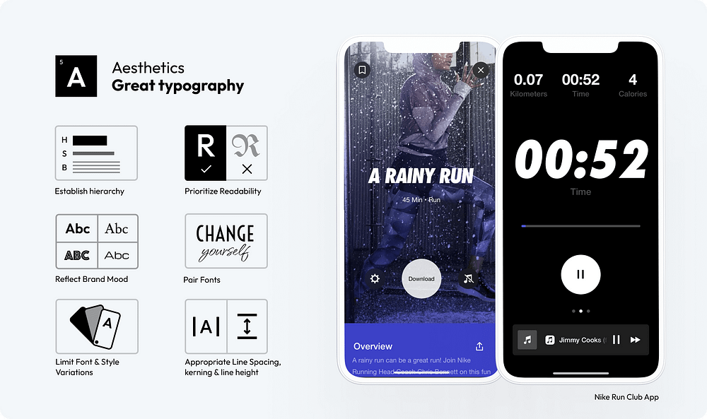
Masterfully applied typography helps you stand out, enhance readability and aesthetic appeal

23. Establish Typography Hierarchy: Create a clear hierarchy using different font sizes, weights, and styles to guide the user’s attention to the most important content first.

24. Prioritize Readability: Choose fonts that are easy to read on various devices and screen sizes. Legibility should be a top priority, especially for body text.

25. Reflect Brand Mood: Select fonts that align with your brand’s personality. Whether it’s professional, playful, or elegant, typography should reinforce the brand’s tone.

The Nike Run Club App skillfully employs bold, italic typography as its main focus, evoking a sense of movement and uniqueness without overwhelming, thanks to its sparing use alongside a neutral body font

26. Pair Fonts Wisely: When combining multiple fonts, ensure they complement each other.

27. Limit Font and Style Variations: Too many font types or styles can create a cluttered and confusing interface. Stick to a limited set to maintain a clean and cohesive look.

28. Adjust Line Spacing, Kerning, and Line Height: Proper spacing between letters (kerning), words, and lines improves readability and text flow. Experiment with different settings to find the most visually appealing and readable format.

The right color choices can make a significant difference in how users perceive and interact with a product

29. Contrast is Key: Ensure sufficient contrast between text and background to enhance readability and accessibility.

30. Create and Use a Consistent Color Palette: Develop a consistent color palette that reflects your brand identity and use it consistently across your interface to maintain visual coherence.

31. Use the 60–30–10 rule for balancing colors: — 60% dominant color, 30% secondary color, and 10% accent color, to create a visually harmonious interface.

The MasterClass app serves as an exemplary model for the application of the 60–30–10 rule in design, showcasing how this principle can be effectively utilized to enhance user interface aesthetics and functionality.

32. Understand Color Psychology and Cultural Significance: Consider how different colors evoke different emotions and meanings in various cultures. Tailoring your color choices to your audience can enhance the user experience and avoid cultural missteps.

33. Communicate Status with Semantic Colors: Use colors to communicate status intuitively, like red for errors or green for success, to help users understand system feedback quickly.

34. Use Color to Guide Actions: Utilize color strategically to highlight key actions, like buttons or links, guiding the user’s attention to important interactions.

Effective visual content in UI design enhances user engagement and emotional connection

35. Prioritize Content Over Excessive UI Styling: Focus on delivering content through visuals without overwhelming the user with excessive UI decorations. Let the visuals speak for themselves.

36. Purposeful Imagery and Illustrations: Use imagery and illustrations that add meaning to your content. Avoid generic stock photos; opt for custom or carefully selected images that reflect the brand’s identity and message.

37. Keep Text Concise and Straightforward: Complement visuals with clear and concise text. Avoid long paragraphs and opt for bullet points or short descriptions that enhance the visual message.

The Hims app distinguishes itself with a content-first approach, minimizing the reliance on complex UI styling. It employs high-quality visuals, including well-curated photos and short videos, that are consistent with the app’s mood and style, contributing to a cohesive and user-friendly interface.

38. Micro-Interactions & Delightful Animations: Incorporate subtle animations and micro-interactions that enhance user engagement without detracting from the main content.

39. Use Video for Dynamic Storytelling: Implement video content to tell stories or explain complex concepts dynamically. Videos can be particularly effective in conveying messages that are difficult to express through static images.

40. Incorporate High-Quality Product Shots or Renders: For e-commerce and product-based interfaces, use high-quality photographs or 3D renders of products. Detailed and attractive product visuals can significantly boost user interest and sales.

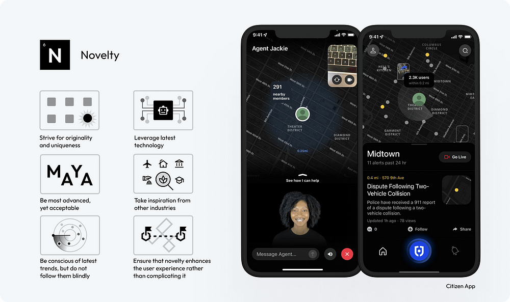
Innovative or unique interfaces will create memorable experiences, leading to higher user satisfaction.

41. Strive for Originality and Uniqueness: Create UI designs that stand out with original concepts and unique elements, differentiating your product in a crowded market.

42. Leverage the Latest Technology: Stay abreast of emerging technologies and consider how they can be incorporated into your design to offer cutting-edge experiences.

43. Be the Most Advanced, Yet Acceptable: Push the boundaries of innovation, but ensure your designs remain user-friendly and accessible to your target audience.

Citizen’s personal safety network empowers users to protect themselves and their communities. Its integration of a personal agent concept is both innovative and user-friendly, offering a novel yet logical enhancement to the experience.

44. Take Inspiration from Other Industries: Look beyond the field of UI design for inspiration, drawing creative ideas from art, architecture, nature, and more.

45. Be Conscious of Latest Trends, But Do Not Follow Them Blindly: Stay informed about current design trends, but use them judiciously to ensure your design maintains its unique identity.

46. Ensure that Novelty Enhances the User Experience Rather Than Complicating It: Novelty should always serve a purpose, enhancing the overall user experience without adding unnecessary complexity.

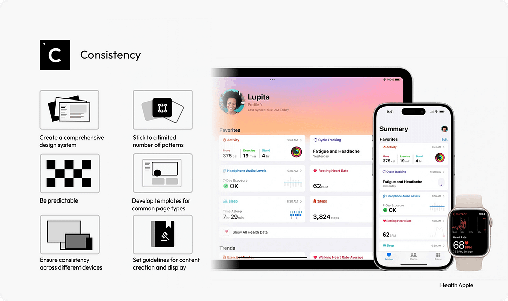
Consistency creates a sense of familiarity and helps build trust and confidence

47. Develop a Comprehensive Design System: A design system acts as a single source of truth for all design elements, ensuring uniformity across all aspects of the UI.

48. Limit Design Patterns: Using a consistent set of design patterns simplifies the user’s interaction model, making the interface more predictable and user-friendly.

49. Ensure Predictability in Element Behavior: Interface elements should behave consistently throughout the application, so users know what to expect from their interactions.

The Apple Health app serves as an exemplary model of consistent user experience across various devices. Its extensive library of components and templates ensures that new features and updates can be seamlessly integrated, maintaining ease of use and uniformity.

50. Use Standardized Templates: For common page types, standardized templates provide a consistent structure, aiding in user navigation and content comprehension.

51. Maintain Cross-Device Consistency: A consistent UI across different devices and platforms enhances the user experience, making the interface more approachable and accessible.

52. Standardize Content Guidelines: Consistent tone, style, and formatting in content presentation help maintain a coherent narrative across the interface.

Create a more immersive user experience that entertains

53. Introduce Gamification Elements: Incorporate game mechanics like points, badges, and leaderboards to motivate users and encourage interaction.

54. Personalization and Customization: Offer users the ability to customize their experience. Personalization can increase the relevance of the interface to the individual user, enhancing engagement.

55. Utilize Storytelling Techniques: Embed narrative elements in the UI to create a more compelling and memorable user experience. Storytelling can guide users through the interface in an engaging way.

The Bloom App effectively incorporates gamification and educational components to assist investors in staying engaged and making well-informed investment decisions. An example of this is the offering of random gift stocks, a type of variable reward, which serves to create a sense of delight and surprise among users.

56. Visually Display Progress: Use visual indicators like progress bars to show users their achievements and progression. This can increase motivation and sense of accomplishment.

57. Incorporate Variable Reward Mechanisms: Implement elements of surprise and delight, such as unexpected rewards or bonuses, to keep users engaged and curious.

58. Integrate Social Features: Include social integration features like sharing achievements or competing with friends to foster a sense of community and encourage continued engagement.


Thank you for reading! If you found these insights helpful, don’t miss out on my poster of “58 Rules for Stunning and Effective User Interface Design.” It’s a practical checklist that you can use to elevate your design skills. You can find it here.
https://www.figma.com/community/file/1326467076529354215/poster-58-rules-for-stunning-and-effective-user-interface-design

반응형
반응형

비전 프로 출시 D-2

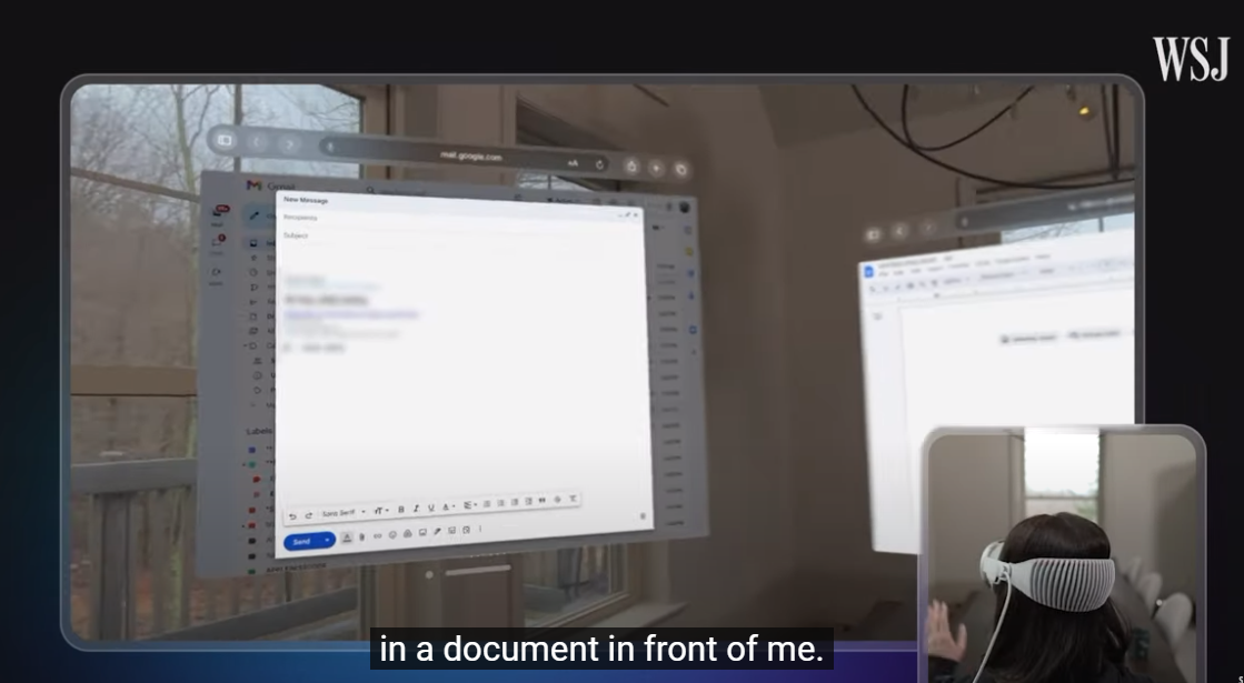
Vision Pro Review: 24 Hours With Apple’s Mixed-Reality Headset | WSJ


https://www.youtube.com/watch?v=8xI10SFgzQ8

실리콘밸리 시간으로는 3일, 한국시간으로는 2일 후 애플의 신형 디바이스인 비전 프로가 판매를 드디어 시작하는데요. 미국의 미디어 유튜버들의 제품 리뷰와 영상이 본격적으로 공개되기 시작했어요. 유튜브나 뉴스검색을 통해서 찾아보실 수 있는데요. 리뷰어들의 소감 중에서 재미있는 것을 정리해봤어요. 


  • 무겁다 : 실제 무게도 있지만 메타 퀘스트와 달리 무게가 앞에 쏠려있는 점이 문제.
  • 가상 키보드는 별로 : 비전 프로로 일을 하고 싶다면 실물 키보드를 추천.
  • 안경은 못쓴다 : 안경을 쓰고 착용하기 어렵기 때문에 도수가 있는 렌즈를 별도로 구매해서 부착해야해요.  
  • 놀라운 디스플레이 : 디스플레이 성능이 너무 좋은데 이것이 높은 가격의 가장 큰 원인 중 하나. 
  • 패스스루도 완벽 : 비전 프로를 착용해도 카메라를 통해서 외부를 보는 혼합현실(Mixed Reality)기능이 매우 훌륭하다고 해요. 
  • 시리를 많이 사용하게 된다 : 음성 AI 비서인 시리가 비전프로에서도 당연히 작동을 하는데, 비전프로를 쓰고 있는 환경에서는 자연스럽게 시리를 호출해서 명령을 내리는 경우가 많아요. 마치 아이언맨이 자비스를 부르는 것 처럼요.  
  • 3D 영상 촬영이 킬러 서비스 : 아이폰15 프로로 공간동영상(Spatial)을 촬영할 수 있는데, 이걸 비전 프로에서 볼 수 있어요. 많은 리뷰어들이 여기에 만족을 나타냈어요. 2D 영상을 보는 것보다 과거의 경험을 다시 생생하게 느낄 수 있다고 해요. 특히 아이의 영상을 찍은 부모들의 만족도가 높았어요. 과거 캠코더가 아이들의 영상을 찍기 위해 많은 부모들이 샀던 것처럼 비전 프로 수요도 있을 것 같아요.  
  • 침대에 누워서 쓰기 좋다 : 침대에서 스마트폰을 쓰는 분들이 많은데, 비전 프로를 쓰면 무게도 덜 느끼고 좋을 것 같아요.

패스스루란?

패스스루는 VR 화면에서 벗어나 주변의 실제 환경을 볼 수 있게 해주는 기능입니다. 패스스루는 헤드셋의 센서를 사용하여 사용자가 헤드셋 너머의 실제 환경을 본다고 가정했을 때 보게 될 환경을 대략적으로 보여줍니다. 안전 보호 경계를 만들거나 조정할 때 자동으로 패스스루가 작동합니다. 실제 및 가상 환경을 혼합하기 위해 앱에도 패스스루가 표시됩니다.

반응형
반응형

https://medium.com/@anirudh.munipalli/10-powerful-css-properties-that-every-web-developer-must-know-e5d7f8f04e10

You probably never heard of them, but you will love them once you know.

CSS.

A language which is responsible for nearly every website in the world.

With so many properties, CSS is pretty huge. Finding good properties among them is like trying to read a binary file by yourself (pls don’t try it).

Which is why I have done that for you (the CSS, not the binary).

Here are 10 properties that you may not use much, or have never heard of, but will love once you know them.

Photo by Markus Spiske on Unsplash

Custom Scrollbars

Let’s change the width and color of the scroll bar. Also, let’s make it a little round as well.

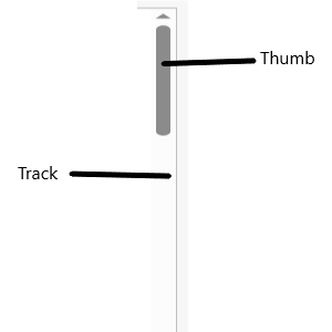
Below are the parts of a scroll bar.

What the different parts of a scroll bar are | Image by Author

We use ::-webkit-scrollbar to change the properties.

/* Set the width of the scroll bar*/
::-webkit-scrollbar{
    width: 10px;
}
/* Change the track to a blue color and give a round border */
::-webkit-scrollbar-track{
    background-color: blue;
    border-radius: 10px;
}
/* Making the thumb (which shows how much you've scrolled) a gray color
  and making it round */
::-webkit-scrollbar-thumb{
    background: gray;
    border-radius: 10px
}
/* A dark gray color when hovered overn */
::-webkit-scrollbar-thumb:hover{
    background: darkgray;
}

The result of the code | Image by Author

Note: This is a non-standard property, and without -webkit-, it will not work.

Cursors

Change how the cursor looks when you mouse over an element.

/* An element with class 'first' */
.first{
    cursor: not-allowed;
}
/* An element with class 'second' */
.second{
    cursor: zoom-in;
}
/* An element with class 'third' */
.third{
    cursor: crosshair;
}

Result of the above code. The cursor on different elements | Image by Author

Scroll behavior

The scroll behavior can make a smooth scroll, to make transition from one section to another smoother.

Add this simple line and see the effect for yourself.

html{
  scroll-behavior:smooth;
}

Instead of simply snapping the page from one section to another, it scroll up/down to the section. See the effect here.

Accent color

Change the color for user interface, such as form controls and checkboxes.

Accent color demo | Image by Author

See how the color of the check box and radio button is blue, instead of the default (and boring) gray.

input{
  accent-color: blue;
}

That’s all. You can use selectors to make some inputs blue, some red and some green.

And this doesn’t change the color of the text, so you can mess around with the colors and experiment. The UI color is under our control.

Aspect Ratio

When building responsive components, constantly keeping check on the height and width might be a headache, as you have to maintain aspect ratios. Videos, and Images may appear stretched sometimes.

That is why we can use the aspect ratio property. Once you set the aspect ratio value, and then set width, the height is set automatically. Or the other way around.

/* An elment with class example */
.example{
    /* Setting the aspect ratio */
    aspect-ratio: 1 / .25;
    /* Upon setting width, height is automatically set */
    width: 200px;
    /* Border is not required, but it is here just to see the effect. */
    border: solid black 1px;
}

Now that we set the width, we will get the height equal to 125 px automatically, to maintain the aspect ratio. This is very useful for responsive behavior.

The result when the CSS is applied to the HTML | Image by Author

Box Reflect

This allows us to create reflections of an component below it.

For this demo, I used an SVG wave image, that I got using this website.

/* An element with class name 'example */
.example{
    /* The reflection will appear below. Other possible values are above | left | right */
    -webkit-box-reflect: below;
}

This creates a reflection below the SVG.

Box reflection below the image | Image by Author

We can also offset the reflection a bit.

/* An element with class name 'example */
.example{
    /* The reflection will appear below. Other possible values are above | left | right */
    -webkit-box-reflect: below 20px;
}

The reflection with offset | Image by Author

Also, I would like it to fade out a bit. We can use a gradient for that.

/* An element with class name 'example */
.example{
    /* The reflection will appear below. Other possible values are above | left | right */
    -webkit-box-reflect: below 0px linear-gradient(to bottom, rgba(0,0,0,0), rgba(0,0,0,.5));
}

This gives a nice reflection.

The resulting reflection | Image by author

This is a non-standard property supported by most major browsers (except Firefox).

Check if browser supports a property

How to check if a particular property is supported in CSS.

/* Check if browser supports display: flex */
@supports (display: flex){
    /* If it does, set the display to flex */
    div{
        display: flex
    }
}

While the above example will always be supported by major browsers, non-standard properties (such as custom scroll bars and box-reflections) might not be supported by some.

Remember to put the condition in () parenthesis.

If you put the not keyword, then it will work if the property is not supported.

@supports not (display: flex){/* If not supported *}

Masks

You can use an Image mask in CSS.

/* An object with class example */
.example{
    /* Setting the mask from a URL */
    -webkit-mask: url(YOUR URL);
    mask: url(YOUR URL);
}

In the mask image, the white represents the mask and black is the area to be clipped.

Filter

You can add amazing filters to your images using CSS. Filters are something we see in every photo sharing app, and now, let’s see how easy they are to implement

img{
    filter: /*YOUR VALUE */;
}

There are many filters available. You can blur, brighten and saturate filters. You can make the image grayscale, change it’s opacity, invert the colors, and more.

The normal image (left), blurred image(middle) and high contrast image(right) | Image by Author | Photo of grass by Author

A brightened image (left), a grayscale image (middle) and a hue rotated image (right) | Image by Author | Photo of grass by Author

See this page for more details.

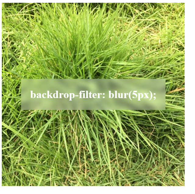
Backdrop effects

You can add a good looking filter to the area behind an image using backdrop-filter.

All the properties of filter are available here. This is in other words just a filter to apply to the background.

<div class="image">
    <div class="effect">
        backdrop-filter: blur(5px);
    </div>
</div>

<style>
.image{
    background-image: url(YOUR URL);
    background-size: cover;
    width: 400px;
    height: 400px;
    display: flex;
    align-items: center;
    justify-content: center;
}
.effect{
    font-size: x-large;
    color: white;
    font-weight: 800;
    background-color: rgba(255, 255, 255, .3);
    backdrop-filter: blur(5px);
    padding: 20px;
}
</style>

This makes an effect like this:

Result of the code | Image by Author

And with that, you now know 10 new properties of CSS. You can make your website look very professional.

If you like this article, show your support by:

  1. Clapping
  2. Following for content about CSS, HTML, JS, Python and AI.
  3. Responding to this article telling your favorite property.
  4. Or do all of the above 3 😃
반응형
반응형

[ICON] ion-icon 아이콘 사용하기 

https://ionic.io/ionicons


Ionicons: The premium icon pack for Ionic Framework

Ionicons is an open-sourced and MIT licensed icon pack.

ionic.io

Installation

If you're using Ionic Framework, Ionicons is packaged by default, so no installation is necessary. Want to use Ionicons without Ionic Framework? Place the following <script> near the end of your page, right before the closing </body> tag, to enable them.

<script type="module" src="https://unpkg.com/ionicons@7.1.0/dist/ionicons/ionicons.esm.js"></script>
<script nomodule src="https://unpkg.com/ionicons@7.1.0/dist/ionicons/ionicons.js"></script>

Basic usage

To use a built-in icon from the Ionicons package, populate the name attribute on the ion-icon component:

<ion-icon name="heart"></ion-icon>
반응형
반응형

Magic inspired Social Share Button
-- https://codepen.io/codingstella/pen/gOQqaWo

https://codepen.io/codingstella/pen/gOQqaWo


Magic inspired Social Share Button

...

codepen.io

https://codepen.io/codingstella/


Coding Stella on CodePen

Amazing CSS Animation That You Have Never Seen 🤒

codepen.io

<script src="https://unpkg.com/ionicons@5.5.2/dist/ionicons/ionicons.esm.js"></script>
<script src="https://unpkg.com/ionicons@5.5.2/dist/ionicons/ionicons.js"></script>
<script src="https://cdpn.io/cpe/boomboom/pen.js?key=pen.js-ae5cde2e-fb64-f510-42d5-4efea99ca66b" crossorigin=""></script>

<div class="menu">
  <div class="toggle">
    <ion-icon name="share-social"></ion-icon>
    </div>
  
      <li style="--i:0;--clr:#1877f2">
      <a href="#"><ion-icon name="logo-facebook"></ion-icon></a>
    </li>
    <li style="--i:1;--clr:#25d366">
      <a href="#"><ion-icon name="logo-whatsapp"></ion-icon></a>
    </li>
    <li style="--i:2;--clr:#1da1f2">
      <a href="#"><ion-icon name="logo-twitter"></ion-icon></a>
    </li>
     <li style="--i:3;--clr:#FF5733">
      <a href="#"><ion-icon name="logo-reddit"></ion-icon></a>
    </li>
    <li style="--i:4;--clr:#0a66c2">
      <a href="#"><ion-icon name="logo-linkedin"></ion-icon></a>
    </li>
    <li style="--i:5;--clr:#c32aa3">
      <a href="#"><ion-icon name="logo-instagram"></ion-icon></a>
    </li>
    <li style="--i:6;--clr:#1b1e21">
      <a href="#"><ion-icon name="logo-github"></ion-icon></a>
    </li>
    <li style="--i:7;--clr:#ff0000">
      <a href="#"><ion-icon name="logo-youtube"></ion-icon></a>
    </li>
</div>
*{
  margin:0;
  padding:0;
  box-sizing:border-box;
}
body{
  display:flex;
  align-items:center;
  justify-content:center;
  min-height:100vh;
  background: #262433;
}
.menu{
  position:relative;
 width:280px;
  height:280px;
  display:flex;
  align-items:center;
  justify-content:center;
}
.menu .toggle{
  position:relative;
  height:60px;
  width:60px;
  background:#fff;
  border-radius:50%;
  box-shadow:0 3px 4px rgba(0,0,0,0.15);
  display:flex;
  align-items:center;
  justify-content:center;
  color:#333;
  font-size:2rem;
  cursor:pointer;
  transition:1.25s;
  z-index:5;
}
.menu.active .toggle{
  transform:rotate(360deg);
  box-shadow: 0 6px 8px rgba(0,0,0,0.15),
    0 0 0 2px #333,
    0 0 0 8px #fff;
}
.menu li{
  position:absolute;
  left:0;
  list-style:none;
  transition:0.5s;
  transform:rotate(calc(360deg/8 * var(--i)));
  transform-origin:140px;
  scale:0;
  transition-delay: calc(0.05s * var(--i));
}
.menu.active li{
  scale:1;
}
.menu li a{
  position:relative;
  display:flex;
 transform:rotate(calc(360deg/-8 * var(--i)));
  width:60px;
  height:60px;
  background-color:#FFF;
  display:flex;
  align-items:center;
  justify-content:center;
  border-radius:50%;
  font-size:1.75rem;
  color:var(--clr);
   box-shadow:0 3px 4px rgba(0,0,0,0.15);
  transition:0.5s;
}
.menu li:hover a{
  font-size:2.5rem;
  box-shadow:0 0 0 2px var(--clr),
    0 0 0 6px #fff;
}
const menu=document.querySelector(".menu");
const toggle=document.querySelector(".toggle");
toggle.addEventListener("click",()=>{
  menu.classList.toggle("active");
})
반응형

+ Recent posts