반응형

adaptive - 적응

responsive - 반응

interactive - 대화형


RESPONSIVE WEB DESIGN (RWD)


ADAPTIVE WEB DESIGN (AWD)


http://www.junowebdesign.com/responsive-vs-adaptive-web-design/


반응형 보다는 적응형이 좋다는 얘기.

반응형은 모든걸 다 load해야 하는 반면, 적응형은 Device에 따라서 보여줄것만 load 하기 때문에 로딩속도나 사용자 경험 측면에서 더 낳다.


In case you haven’t noticed, mobile web design has arrived. With mobile traffic now accounting for around 12.5% (and rising) of all website visitors it’s high time you started putting effective mobile design at the top of your to-do list, because if you fail to do so you’ll be missing out on a huge sector of the market. And we mean huge. According to recent statistics 9 out of 10 mobile searches result in some action and over half the time that action is a purchase—mobile users are falling over themselves to buy something from you, so if you want to get those sales you need to make sure you’re giving visitors what they want.

And what they want is a site that works on their chosen device. Sounds simple enough but it’s surprising how many companies get it wrong—they don’t have an effective strategy in place and instead expect customers to use the desktop layout on their mobile, and that will easily send them elsewhere—so it’s time you considered the options and embraced the brand new world of mobile design. In that world there are two main options to choose from, responsive web design and adaptive, and here’s a quick run-through of each:


RESPONSIVE WEB DESIGN (RWD)

In this method you’re running the website from one content management system but it simply adapts and readjusts according to the dimensions of the device it’s being viewed on. The content stays the same but the layout changes—it might be in 3 columns on a desktop and 1 on a smartphone, for example—with it automatically adjusting and wrapping around columns to suit the screen. This method is quick and easy to implement but there are a few drawbacks, namely that the user doesn’t get a fully-optimised experience—searchers behave differently when using mobile devices and regular websites will take far too long to load on a smaller screen, damaging the overall experience. That’s where adaptive web design comes in.


ADAPTIVE WEB DESIGN (AWD)

This offers all the benefits of responsive design without the drawbacks, and this relatively new concept is rapidly gaining popularity. In this form of design not only does the content adapt to the size of the screen but it takes into account the capabilities of the device as well, offering a much better user experience as the whole design will be based on context. Certain elements will change depending on whether the user’s got a touch screen or a traditional mouse and keyboard arrangement and different layouts will be offered for tablets and mobiles, and images and videos can be edited or even completely removed to speed up the loading times of a page.


Adaptive web design enhances the user experience in a way that RWD can’t match to offer total usability and a more customer-focused result, but of course, the method that’s right for you will depend on your business, your budget and the type of content you provide. Either one of them could be perfect for your needs, so as long as you choose one you can be confident you’re hitting the mobile web design mark to give customers what they’re looking for.


Totally unique designer chairs from Juno Interiors
Take the hassle out of moving home with crate rental from Juno Crates


반응형
반응형

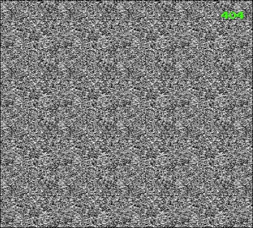
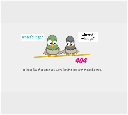
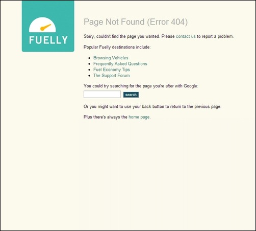
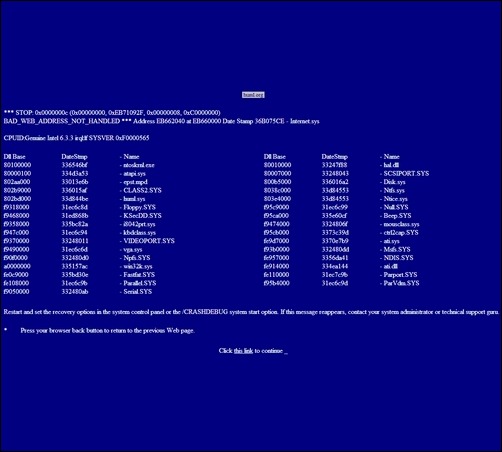
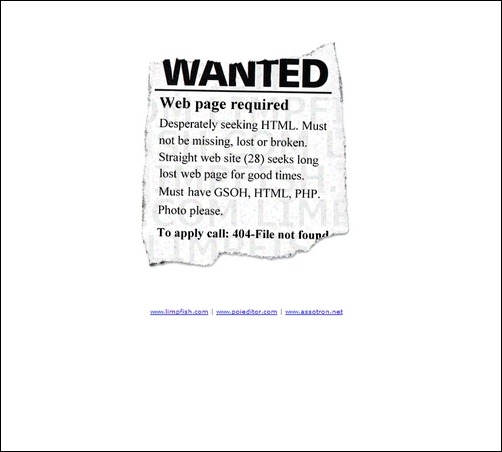
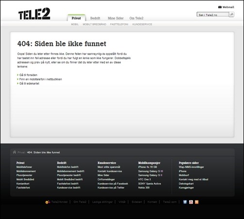
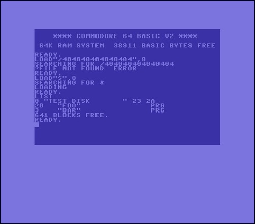
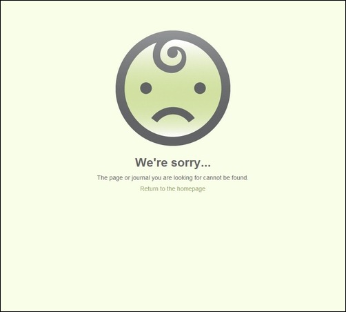
40+ Seriously Creative 404 File Not Found Pages


http://creativecan.com/2013/04/creative-404-file-not-found-pages/


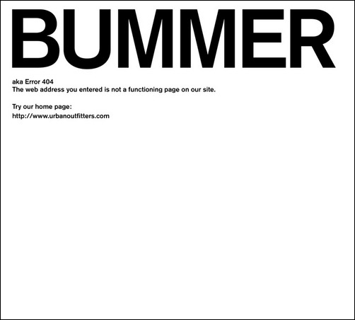
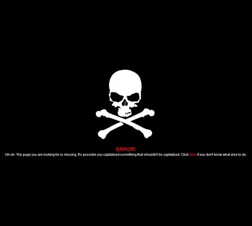
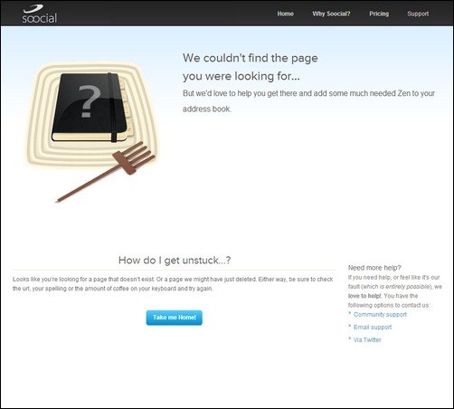
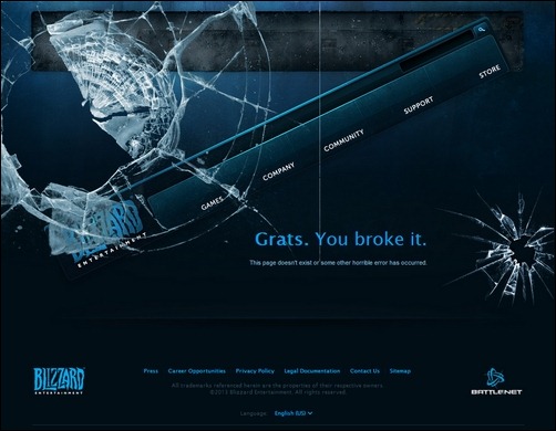
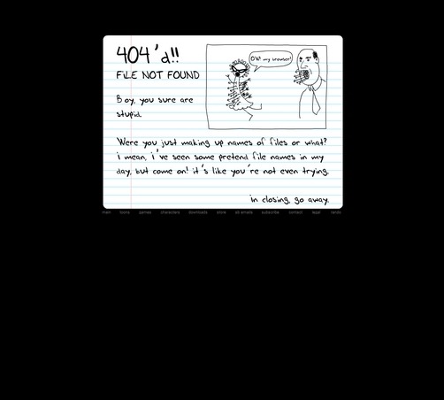
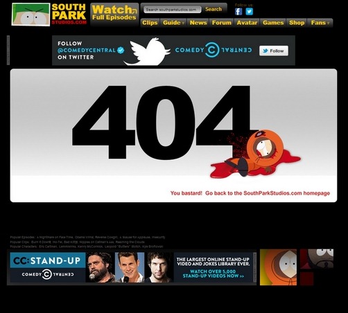
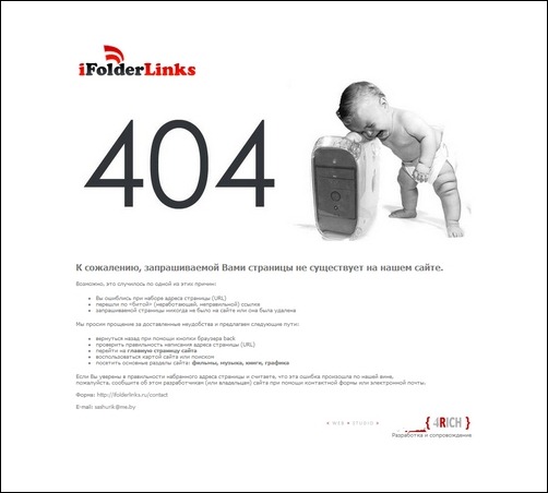
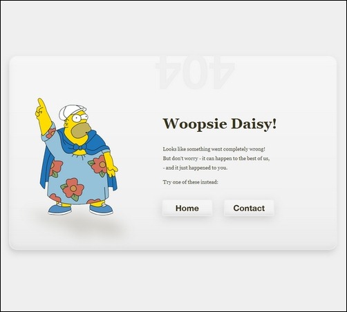
404 에러 페이지를 각 사이트의 특성에 맞게 디자인한 것들 중 좋은 것들.


404-south-park

When a requested page is not found and it typically means there is a link with a broken URL somewhere. In this case, it is best practice for a website to show a 404 page to the visitor. The 404 – page not found error is common and every Internet user get it now and then. Reason is that most websites change regularly, while external links remain the same. It is hard if not impossible to maintain external links and require a lot of work so the best thing you can do is to make 301 permanent redirects when you change an URL for a page. In WordPress you can automate this using plugins like Redirection. This plugin detect changes and create redirects to avoid links to be broken.

Even if you maintain your links like this you cannot avoid situation where a visitor types in a wrong URLs or clicks on a broken links to your website. It is possible to look into website stats, find typical 404 pages, and then redirect these to meaningful pages. Still you can expect some visitors to hit your 404, probably every day, and I am sure you want to give them the best experience and try to keep them on the site. Therefore, it is a good idea to have a fun illustration and some options for the visitors to move on into your site.

In this article, I am sharing some really creative examples of how 404 pages can be designed. Check them out and use them as inspiration for your own site.

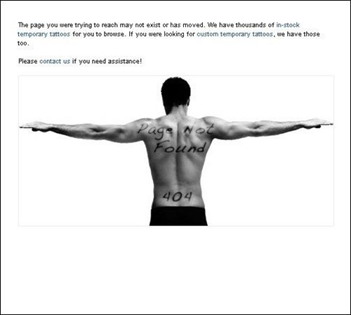
TattooSales – MORE INFO

tattoosales-404-page-not-found

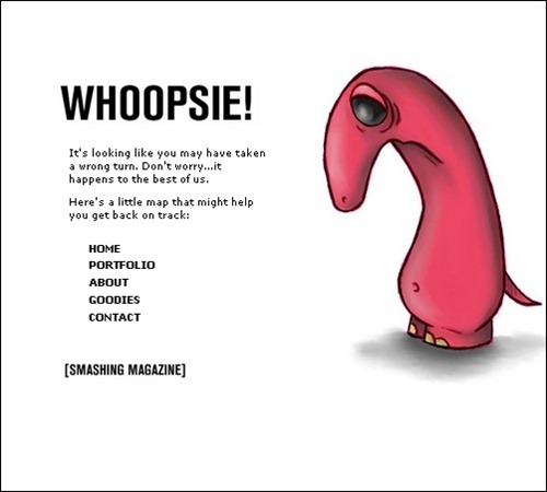
Suspended Animations – MORE INFO

suspsneded

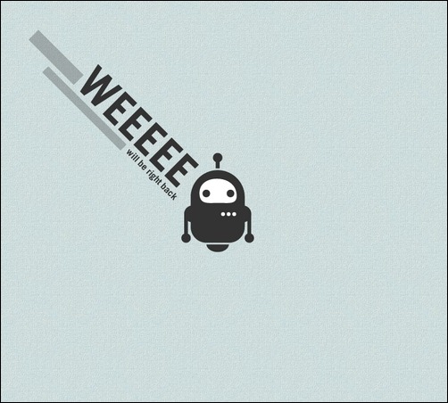
Be Right Back – MORE INFO

will-be-right-back

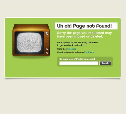
Funned – MORE INFO

funned

Seecoy – MORE INFO

seecoy

Twurn – MORE INFO

twurn

Fuelly – MORE INFO

fuelly

Huml – MORE INFO

huml

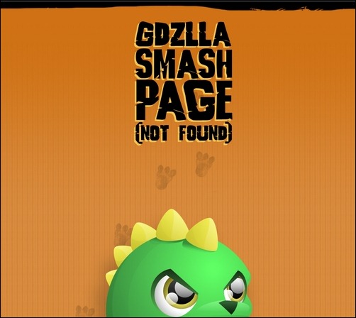
GDZLLA – MORE INFO

gdzlla

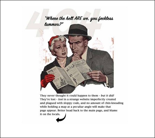
Lileks – MORE INFO

lileks

b3ta – MORE INFO

b3ta

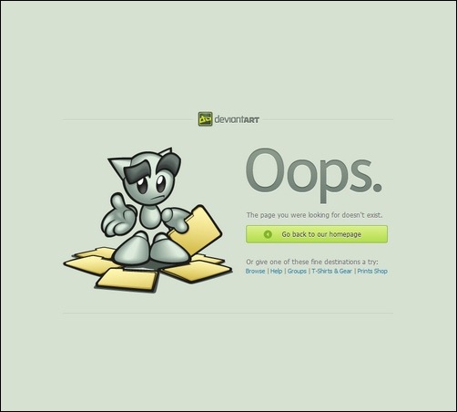
Deviantart – MORE INFO

deviantart

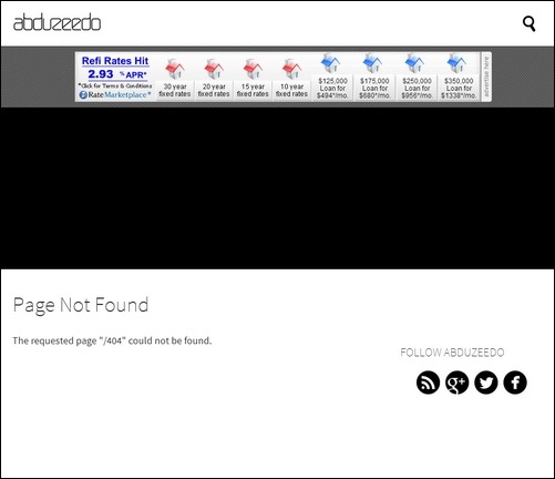
Abduzeedo – MORE INFO

abduzeedo

Scar.atspace – MORE INFO

scar-atspace

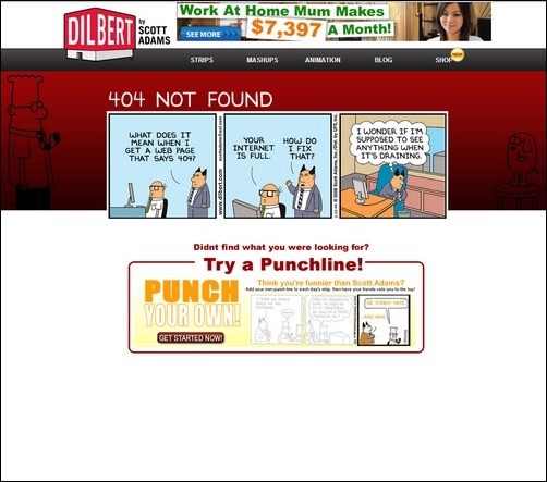
Dilbert – MORE INFO

dilbert

CSS – Tricks – MORE INFO

css-tricks

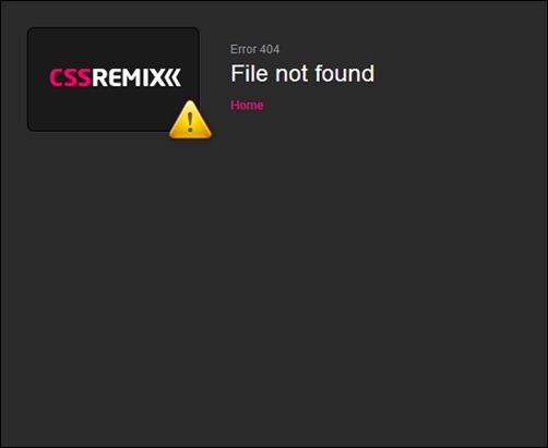
CSS Remix – MORE INFO

css-remix

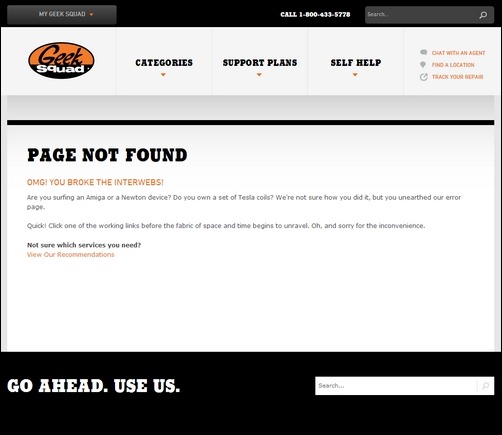
Geek Squad – MORE INFO

geeksquad

Amorphia Apparel – MORE INFO

amorphia-apparel

Open Ended Adventure – MORE INFO

open-ended-adventure

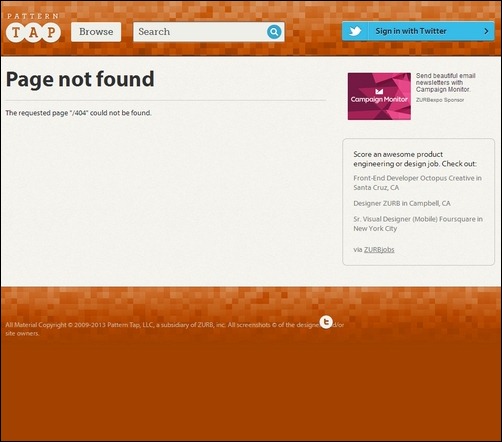
Pattern Tap – MORE INFO

pattern-tap

Urban Outfitters – MORE INFO

urban-outfitters

D20srd – MORE INFO

d20srd

The Web Motel – MORE INFO

the-web-motel

Soocial – MORE INFO

soocial

Blizzard – MORE INFO

blizzard

Home Star Runner – MORE INFO

home-star-runner

South Park Studios – MORE INFO

south-park-studios

I Folder Links – MORE INFO

i-folder-links

Henrik Hedegard – MORE INFO

henrik-hedegard

Limp Fish – MORE INFO

limp-fish

Tele2 – MORE INFO

tele2

Klaus – MORE INFO

klaus

Kidmondo – MORE INFO

kidmondo

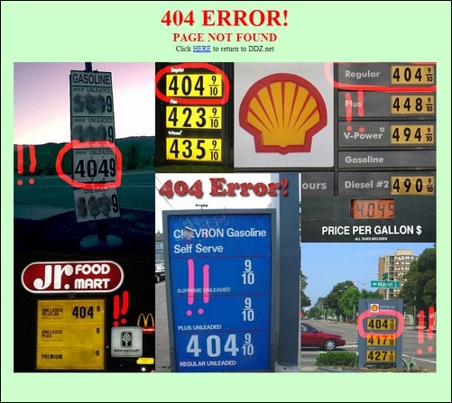
DDZ – MORE INFO

ddz-net

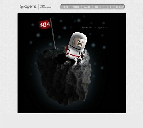
Agens – MORE INFO

agens

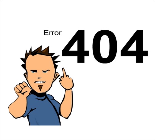
Ferdaze – MORE INFO

ferdaze

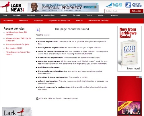
Lark News – MORE INFO

lark-news

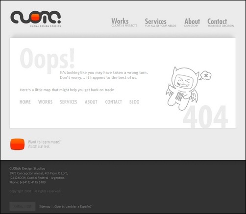
Cuoma – MORE INFO

couma

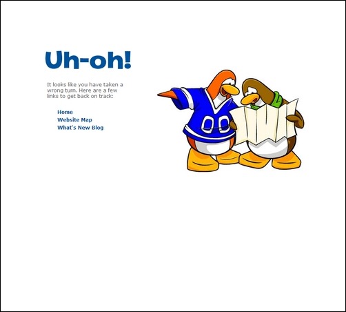
Club Penguin – MORE INFO

club-penguin

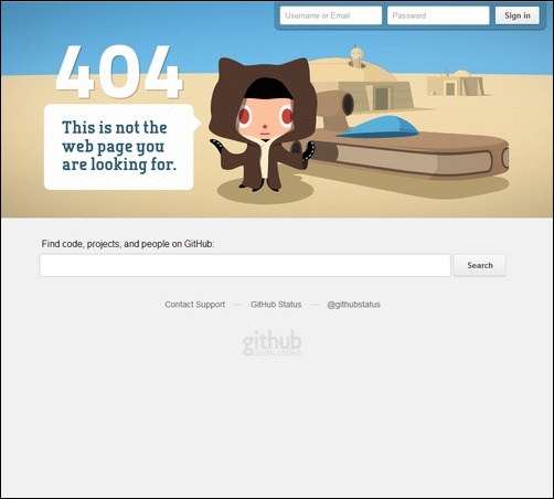
Github – MORE INFO

github


반응형
반응형


60+ Responsive Web Design Tutorial Roundup – Spoil Your Mobile visitors!

by Lars on February 19, 2013

responsive-web-design-tutorial

Time to learn responsive web design and development techniques? In this huge collection, I am sure you will find the responsive web design tutorial you need to get started!

With more than 1 billion mobile Internet users, the demand for building professional and user-friendly mobile websites is exploding right now. Up to date statistics show that close to 12% of internet users are browsing from mobile devices and the number is constantly growing. This leaves us with no doubt about investing time and money into spoiling mobile visitors on our website.

Many web designers use responsive frameworks as the foundation in their web project to leverage the many hours of work, experience and maturity experts put into many of them. It is also a popular trend to take offset in a responsive website HTML5 template or a WordPress theme with a build in responsive layout.

Ethan Marcotte started the responsive web design trend back in May 2010. He wrote an article about the need for a more flexible approach to web design, “Responsive Web Design,” for A List Apart. Today most new websites are responsive somehow, but the responsive behavior vary a lot. Some websites and templates have several designs that are perfectly adapted to specific view port sizes, while many still only have one layout for pc screens and one for small mobile devices. The effort required to do it right should not be underestimated. Checking a few well-written responsive web design tutorials is a good start to learn and find inspiration.

Please take time to leave a comment and share this resource with co-workers that you think need to learn about responsive web design.


Responsive Column Layouts – MORE INFO

responsive-column-design

In this tutorial you will learn a very simple CSS trick to create a responsive column layout using nth-of-type pseudo class.

Responsive Web Design using CSS3 - MORE INFO

resposive-web-design-tutorial-1

This responsive web design tutorial explain you how to use CSS 3 @media property (known as media queries) and working with Internet Explorer using Modernizr.

CSS Only Responsive Layout With Smooth Transitions – MORE INFO

css-responsive

A tutorial on how to create a 100% width and height smooth scrolling layout with CSS only.

Responsive Design With CSS3 Media Queries – MORE INFO

css3-with-media-design-queries

This responsive web design tutorial will show you how to create a cross-browser responsive design with HTML5 & CSS3 media queries.

Responsive Pricing Tables Using :target for Small Screens – MORE INFO

responsive-target

In this tutorial you will learn how to make a fluid pricing table, then alter the way it’s displayed at different viewport sizes using media queries.

Creating a CSS3 Responsive Menu – MORE INFO

creating-css3-responsive-menu

This tutorial aims to provide step by step instructions to enable you to create a responsive navigation menu that adapts to varying screen sizes, with the help of CSS media queries.

Create a Responsive Web Design Template – MORE INFO

create-reponsive-web-design-template

In this tutorial, you will learn how to make a (very simple looking) web template that is responsive from desktop size down to mobile version.

Responsive Design in 3 Steps – MORE INFO

responsive-design-in-3-steps

In this tutorial you will learn how to do the basic logic of responsive design and media queries in 3 steps (assuming you have the basic CSS knowledge)

Responsive Data Tables – MORE INFO

responsive-data-tables

This tutorial will show you how to create and format a responsive data table.

Turn Any Site Into a Responsive Site – MORE INFO

turn-responsive

This tutorial will teach you some techniques on how to take your current site and turn it into a mobile friendly one, with little effort.

Typography Responsive Web Design – MORE INFO

typography-responsive-web-design

This tutorial will be discussing typography vis a vis responsive web design. Our focus will be on typography strictly in relation to responsive web design only.

Responsive Menu Concepts – MORE INFO

responsive-menu-concepts

This tutorial will teach you four concepts on how to handle navigation menus for small screens.

CSS Effect: Space Image Out to Match Text Height – MORE INFO

spacing-out

This responsive website tutorial will teach you how to properly space out images to match text height.

Scalable Navigation Patterns in Responsive Web Design – MORE INFO

scalable-navigation-patterns-responsive

This tutorial focuses on how to deal with deep navigation in the landscape of a templated environment.

Building a Responsive Layout with Skeleton: jQuery Plugins – MORE INFO

building-layout

In this tutorial you will learn various jQuery plugins to utitlize in order to pull Twitter and Flickr feeds to a page, plus a responsive slider plugin for our features area at the top.

Responsive Resume – MORE INFO

reponsive-resume

This tutorial will teach you how to create a mobile responsive resume to attract new projects.

Techniques for Gracefully Degrading Media Queries – MORE INFO

broken-media

This tutorial will teach you how to implement CSS Media Queries for mobile web.

CSS Elastic Videos – MORE INFO

css-elastic-videos

In this responsive web design tutorial, you will learn how to make embedded videos elastic (responsive) to browsers.

Build a Responsive Filterable Portfolio with CSS3 Twists – MORE INFO

responsive-portfolio

This tutorial will teach you how to inherent visual appeals of filterable portfolios using straight-forward markup, CSS3 and a little bit of jQuery.

How to Build a Responsive Thumbnail Gallery – MORE INFO

responsive-thumbnail-gallery

In this tutorial you will learn how to build a responsive thumbnail gallery.

Responsive Content Navigator With CSS3 – MORE INFO

responsive-content-navigator

This tutorial will show you how to create a content navigator with CSS only.

Responsive Coming Soon HTML5 Page Tutorial – MORE INFO

responsive-html-5

In this tutorial we’ll create a coming soon template, 100% responsive, that will help you keep your users informed while you are building a new website.

Convert Menu to Dropdown – MORE INFO

convert-menu-to-dropdown

This tutorial will teach you how to convert your regular row of links into a drop down menu.

Build Responsive Site Week Designing Responsively Part 1 – MORE INFO

build-responsive-in-a-week

This tutorial will teach you the basics of creating a responsive website for mobile devices.

Create a Responsive Web Design with Media Queries – MORE INFO

responsive-web-design

In this tutorial how to convert a previous WordPress theme design into a responsive layout, while taking into consideration the design’s original grid structure.

Beginner’s Guide to Responsive Web Design – MORE INFO

beginners-responsive

This tutorial is intended both for beginners and advanced web designers in creating mobile responsive websites.

Designing for a Responsive Web – MORE INFO

designing-responsive-web

In this tutorial, you will learn the do’s and don’ts of designing websites for mobile responsiveness.

CSS Responsive Navigation Menu – MORE INFO

css-responsive-navigation

This tutorial will teach you how make a responsive toggle on hover menu which is more user friendly.

Build a Responsive, Mobile-Friendly Web Page With Skeleton – MORE INFO

built-with-skeleton

In this tutorial you will learn how to use a boilerplate called Skeleton to take the headaches out of designing and building a responsive web page.

How to Use CSS3 Orientation Media Queries – MORE INFO

css3-orientation

This tutorial will focus on the orientation of media queries and also demonstrate on how to use it.

Adaptive Layout Media Queries – MORE INFO

adaptive-layout

This tutorial will teach you how to create a beautiful website employing adaptive layouts and optimized for the latest mobile devices.

Responsive Images Experimenting with Context Aware Image Sizing – MORE INFO

responsive-images

This tutorial will teach you how to deliver optimized, contextual image sizes for responsive layouts that utilize dramatically different image sizes at different resolutions.

Responsive Web Design: A Visual Guide – MORE INFO

responsive-design-visual

This tutorial shows how to build a mobile responsive site thru a video presentation. It covers all the basic things needed to get you started.

Elements of Responsive Web Design – MORE INFO

elements-design

In this tutorial, an in depth discussion of the elements of web design is presented.

Responsive Web Nav – MORE INFO

response-nav

This tutorial walk you through on how to build a simple navigation from the ground using the CSS3 media queries and jQuery to display it in a small screen size like the smartphones properly.

User Opt-out Responsive Web Design – MORE INFO

user-opt-out-responsive-design

Responsive Design – MORE INFO

responsive-design

This tutorial is going to walk you through how to create an adaptive web experience that’s designed mobile-first

How to Use CSS3 Media Queries to Create a Mobile Version of Your Website – MORE INFO

mobile-version

In this tutorial, you will learn how to convert an existing website into a mobile responsive website.

Handling Typography Responsive Design – MORE INFO

typography-responsive

This tutorial covers how to effectively format font types to be responsive as well.

The Sparkbox Responsive Design Process – MORE INFO

sparkbox

A graphic tutorial about responsive web design process.

Big Menus, Small Screens: Responsive, Multi Level Navigation – MORE INFO

big-menu-small-screen

In this responsive website tutorial to responsive navigation, you will learn how to use an approach that can accommodate large, multi-level navigation menus using media queries and jQuery, whilst trying to keep markup simple and external resources minimal.

Responsive Horizontal Layout – MORE INFO

responsive-layout

This tutorial will show you how to create a horizontal layout with several content panels.

Responsive Web Design – MORE INFO

responsive-web

This responsive web design tutorial aims to show how to create a responsive design of a web page adaptable to different screen resolutions, and providing a concrete example.

Optimizing your emails for mobile devices With the @media query – MORE INFO

mobile-devices

A quick tutorial on how to properly handle emails using the @media query.

Fluidgrids – MORE INFO

fluidgrids

This tutorial pretty much discusses how to make grids fluid and resize according to the browser’s window.

Responsive Design – MORE INFO

bootstrap

This tutorial is about how to apply responsive design feature into your web layout.

Creating Responsive Stylish with CSS3 and HTML5 – MORE INFO

responsive-form

This tutorial provides a basic introduction on how to make responsive sites using HTML5 and CSS3.

5 Useful CSS Tricks for responsive Design – MORE INFO

useful-css

A tutorial of 5 most commonly used CSS tricks along with sample cases for coding responsive designs. They are simple CSS properties such as min-width, max-width, overflow, and relative value — but these properties play an important part in responsive design.

Responsive Web Design – MORE INFO

responsive-web-design

Working with Fluid Images in Dreamweaver CS6 – MORE INFO

dreamweaver-cs6

In this tutorial, you will see how to manage fluid images integrated within the website using Dreamweaver CS6.

반응형
반응형

50 Best Responsive Web Design Toolbox


http://smashinghub.com/50-best-responsive-web-design-toolbox.htm


We all know that smart-phones, Androids, iPhones and Tablets are gaining popularity like anything. Thanks to their popularity, responsive website designing is not only getting popular but also very important. Since websites are being accessed via mobiles on a larger scale, more and more web owners are turning towards responsive web designing. Web developers and designers who can design responsive websites are earning intensely. To support the entire process of responsive website designing and development, a lot of web design tools have been introduced. We should definitely thank those developers who are talented enough to design these tools and make things easier for other developers.

50 Useful Responsive Web Design Tools For Designers

In this article, we have compiled 50 of the most useful responsive web design tools which can help developers in building a responsive design toolbox. This collection of responsive web design tools will help you a lot with your entrance in the field of responsive designing. The tools have been categorized for you to understand the tools and their functionality.

Grid & Frameworks

Let’s start with Grid & Framework tools.

Columnal

Columnal is a great tool for making your grids flexible. So, when your grids are flexible your window will be resized with ease. This is a project of Pulp+Pixels having a pinch of cssgrid.net and code inspiration from 960.gs.

1.Columnal

Skeleton

This tool is popular among designers and developers because it is simple and efficient to use. This tool basically prevails CSS framework so you will get a neat and easy documentation and the best part is, no Javascript here.

2.Skeleton

LessFramework 4

With LessFramework 4, responsive web development gets a lot easier. This is basically based on CSS media queries.

3. LessFramework 4

Semantic Grid System

This tool is basically meant to design grid layouts for responsive web sites. In order to give you the maximum proficiency, the Semantic Grid System uses pre-processed CSS extensions like LESS, SCSS or Stylus. Also, it gives developers an option to select widths and deal with pixels.

4. Semantic Grid System

Golden Grid System

This is best for beginners and with Golden Grid System you can make your web pages look good with pixels from 240 to 2560.

Golden Grid System

320 and Up

This is again a beginner’s guide or a template for responsive website. It is basically a CSS media queries boilerplate and is quite different in comparison to other boilerplates.

320 and Up

Inuit.Css

The best part of Inuit.CSS is that it is very convenient for users. It is quite to the point but supports plugins for more help.

InuitCss

Gridless

This is a boilerplate which helps users in developing responsive websites with extraordinary typography. Gridless is great for newbies.

Grid Set

1140 CSS Grid

This grid system is designed by Melbourne designer Andy Taylor and the basic purpose of this tool is to make your design adaptable to various resolutions.

1140 CSS Grid

1KB CSS Grid

Tyler Tate takes the credit for this tool. With this you can set the number of columns.

1KBCSSGrid

Bootstrap

Bootstrap has a huge number of free UI elements, layouts, Javascript tools for users’ to download and they can be utilized in various responsive designing projects.

Bootstrap

Fluid Grid Calculator

This is indeed a simple tool with a simple functionality. You can easily seize the CSS of your fluid grid website design.

Fluid Grid Calculator

Fluid Grids

This will help you in creating responsive layouts with 6-16 columns.

Fluid Grids

Flurid

This is a great tool and indeed a useful one. It is a cross-browser CSS grid framework with up to 16 columns.

Flurid

Grid Set

This will help you in making grids of all kinds. Mark Boulton has introduced the beta version but it is a good one.

Grid Set

Gridpak

This is an online grid generator which helps user with the number of columns, padding, and gutter. Apart from this, user can also add custom breakpoints. The best part is that with Gridpak, you can download PNG grid templates.

Gridpak

SimpleGrid

As the name suggests, it is pretty simple and is developed by Michael Kuhn.

SimpleGrid

Susy

Sassy is another form of the Semantic Grid System.

Susy

Tiny Fluid Grid

This is an excellent web app which can accommodate you in determining the grid system of your website in an interactive way.

Tiny Fluid Grid

Variable Grid System

This is based on 960 grid system and allows user to design customized grids.

Variable Grid System

Sketch Sheets & Wireframes

Responsive Web Design SketchSheets

This tool makes mapping out and placements of the elements a lot easier.

Responsive Web Design SketchSheets

Responsive Wireframes

Built with HTML and CSS, this tool will help you in visualizing your responsive website.

Responsive Wireframes

StyleTiles

It also helps you in analyzing how your website will look like.

StyleTiles

JavaScript & JQuery Plugins

Adapt.js

This is a great alternative to CSS media queries. This is basically a small javascript library.

Adaptjs

Isotope

This is a jQuery plugin useful for designing responsive websites. It helps in the rearrangement of elements on resizing.

Isotope

Masonry

With this you can create adaptive responsive layouts. It also helps in rearrangement of the elements.

Masonry

Respond.js

The main purpose of this script is to make your responsive website compatible for browsers like IE wo do not support CSS3 media queries.

Respondjs

TinyNav.js

This helps developers in creating small drop downs for long lists.

TinyNavjs

Wookmark JQuery Plugin

This is a great tool and functions to detect the size of the browser and fits the elements accordingly.

Wookmark JQuery Plugin

Pages: 1 2

About the author

Humaira Sajawal is a competent, dynamic and highly motivated creative writer. She loves to write on variety of subjects as writing is her passion! She is also a great fan of reading.

Twitter Visit author website
Related Articles
반응형
반응형

30+ High Performing HTML5 Templates for Web Design

image

HTML5 templates have become very popular and for a good reason. HTML5 is still a work in process standard, but it has brought a lot of new features to the table. Recent versions of the major browsers support many of them already, and they continue to add new features.

The new tags available in HTML5 includes the <canvas> element for 2D drawing, the <video> and <audio> elements for media playback, the new content-specific elements, like <article>, <footer>, <header>, <nav>, <section> and new form controls, like calendar, date, time, email, url, search. In addition, the arrival of CSS3 adds even more power in the hands of web designers.

The benefits of HTML5 are many and new tags will help web designers build stunning future proof websites without need for proprietary plugins like e.g. Flash.

In this article I share with you high quality HTML5 templates to provide inspiration and insights about HTML5 based web design. Hopefully, this collection will help in creating your own HTML5 powered website.


SmartStart – Responsive HTML5 Template – MORE INFO

smartstart-hml5-template

This is a professional theme with a clean and simple attitude. It is designed for portfolio or business websites. SmartStart has been crafted with the latest CSS3 and HTML5 techniques. It will easily adjust to any browsing device, including mobile phones and tablets, because of its responsive feature. You can also get this template in the WordPress version.

Perspective – Responsive HTML5 Template – MORE INFO

perspective-hml5-template

Perspective is a template that is ideal for all kinds of business websites. It is packed with plenty of HTML shortcodes and jQuery plugins like accordion, sliders and tabs. The design is responsive, and it can be edited easily.

Agora HTML5 Template – MORE INFO

agora-hml5-template

This is a nice HTML5 template that is ideal for showcasing fashion, studios and creative. It can be customized easily with 13 pages and powerful full screen gallery that can showcase big sized works on the homepage directly. The customization process can be enhanced by the Serif and Sans Serif styles that are included with the template. In addition, the themes is mobile friendly.

VividPhoto HTML5 and CSS3 Template (free) – MORE INFO

vivid-photo-hml5-template

VividPhoto is a stunning photography HTML5 and CSS3 template that is designed to showcase a portfolio of images.

Vega HTML5 Responsive Template – MÒRE INFO

vega-hml5-template

Vega is a HTML5 template that is dynamic, stylish and creative. It is easy to customize and user friendly. Vega is a great way of showcasing your media.

Popular – Responsive HTML5 Theme – MORE INFO

popular-hml5-template

This template was designed with HTML5 and CSS3, and has a corporate and agency appearance. It’s fully responsive feature is created with Bootstrap.

Royale’ Creative HTML5 Template – MORE INFO

royale-hml5-template

This is a creative template that can enhance your video or photography showcase. The complete page template set will provide the possibility to showcase your work and brand in a professional and refined manner.

Minimalism HTML5 and CSS3 Template (free) – MORE INFO

minimalism-hml5-template

Minimalism is an HTML5 and CSS3 template that is minimal and beautiful in its simplicity. Combines multiple-column groupings and newspaper style column.

Harmony – Multipurpose HTML5 Template – MORE INFO

harmony-hml5-template

Harmony is packed with easy to use and built in features that will make user experience an exciting, pleasant and intuitive one. The package includes 4 Home page sliders , 16 color schemes, a working contact form with validation and more. IT is not responsive though.

Chromatron HTML5 Admin Backend – MORE INFO

chromatron-hml5-template

This is a professional and simple HTML5 template that can be used for both desktop and mobile devices. Chromatron has a lot of features and build in jQuery. There are 4 default colors available, each packed with popular and basic user interface widgets.

Folder (free) – MORE INFO

folder-hml5-template

Folder is a free HTML5 portfolio theme with responsive design.

Neutron – HTML5 Templat – MORE INFO

neutron-hml5-template

This HTML5 template is modern and clean. It is great for any portfolio or business website. It has jQuery features available and 12 page templates.

Retro – HTML5 Template – MORE INFO

retro-hml5-template

This is a modern and clean template that is best suited for business or portfolio websites. Easy and fast to set up, Retro also has a WordPress version.

NeoArts (free) – MORE INFO

neoarts-hml5-template

NeoArts is a modern and elegant web template designed for Design/Studio websites. All-in-One page with an animated theme.

Qreator – Corporate HTML5 template – MORE INFO

qreator-hml5-template

Almost anything can be changed in this template. You can make your own creative design and set up color for all site elements using CSS. It includes 5 preset Home page layouts, Google webfont directory support (320+ Fonts) and more.

Limitless – Multipurpose HTML5 Template – MORE INFO

limitless-hml5-template

Limitless HTML5 template is packed full of user friendly features and plenty of PSD and HTML files. Limitless was designed with SEO in mind.

Responsive Brownie (Free) Html5 Template – MORE INFO

brownie-hml5-template

An awesome free, responsive HTML5 template aimed at businesses and portfolios.

Simplex – Responsive HTML5 Template – MORE INFO

simplex-hml5-template

Clean, responsive and simple would be the perfect words to describe Simplex HTML5 template. Simplex has been designed with mobile devices in consideration and is well suited for studios and digital agencies. The template will adjust its size automatically on different devices, ensuring a nice experience for every visitor.

Projection – Responsive HTML5 Template – MORE INFO

projection-hml5-template

This template is entirely responsive and designed with an elegant and minimal look. The package includes CSS3 and HTML5 codes.

Manifest – Premium HTML5 Template – MORE INFO

manifest-hml5-template

Manifest is a HTML5 template that is very flexible and clean. It has a minimalist and modern design that is ideal for galleries, creative blogs, portfolios and other types of websites. The package includes 6 predefined skins to customize your website easily.

Muro (free) HTML5 Template – MORE INFO

muro-hml5-template

Muro is a brilliantly designed web template that comes with 3 different skins, 7 page layouts as well as jQuery functionality.

Energetic – Responsive HTML5 Template – MORE INFO

energetic-hml5-template

This is a professional and clean template that is ideal for portfolio, business and hosting websites. It has a responsive design that was created with HTML5 and CSS3, making it compatible with all kinds of devices including iPhone, iPad and Androids.

White Noise – HTML5 Template – MORE INFO

white-noise-hml5-template

This template is easy to customize and full of features. Show off your work with this easy-to-customize and fully featured Site Template.

Basix – Premium HTML5 Template – MORE INFO

basix-hml5-template

This theme is easy to customize and use. Basix is a minimal HTML 5 template that is full of features like unlimited colors, jQuery, 960 grid system and working contact form. The portfolio section is filtered using Isotope. In addition, this theme is also well documented, with a lot of shortcodes and features for creating your own pages.

Moderna Responsive HTML5 Template – MORE INFO

moderna-hml5-template

A clean and responsive HTML5 template. Moderna is ideal for both creative personal portfolio and professional business websites. The theme has two skins, which are stretched and boxed. The boxed version has 15 patterns so that you can have unlimited options in managing and organizing your contents.

LEFT HTML5 Theme (free) – MORE INFO

left[5]-hml5-template

LEFT web template is designed in HTML5 and offers more than 6 page layouts with a unique skin system.

Weiss – Responsive HTML5 Template – MORE INFO

weiss-hml5-template

If you are looking for a responsive and clean theme that is suitable for a wide variety of uses, Weiss HTML5 template would be a great choice.

Canopus – Responsive HTML5 Template – MORE INFO

canopus-hml5-template

This is a responsive HTML5 template that is ideal for business and portfolio websites. It was created using the best web design practices such as Microformats. Canopus is ideal for iPhone, iPad and other mobile devices.

Oreva Business HTML5 Template – MORE INFO

oreva-hml5-template

Oreva is very minimal and clean HTML5 business template that can be used for all kinds of personal and business websites. The template has 2 color variations that can fulfill all the requirements of modern web development.

Impromptu – Responsive HTML5 Template – MORE INFO

impromptu-hml5-template

Classy and responsive, Impromptu HTML5 template is perfect for portfolio blog or business websites.

Magazine HTML5 Responsive Template – MORE INFO

magazine-hml5-template

This minimalist and clean HTML5 template was created for WordPress. It is ideal for blogs, magazine, personal and news websites.

Responsy – Responsive HTML5 Portfolio – MORE INFO

responsy-hml5-template

This responsive HTML5 template is most suited for creative agency and portfolio websites. The solid responsive layout is flexible and can scale down from 1170 pixels to 320 pixels.

Mustach – Responsive Html5 Theme – MORE INFO

mustach-hml5-template

Simple yet packed with a lot of options, Mustach can be used for personal portfolio and small business sites. The template comes with a clean and neat code, making it easy to understand when making variations in the template.

반응형
반응형

URI는 그것이 텍스트의 한 페이지나, 비디오 또는 사운드 클립이든, 정지 화상이든 동영상이든, 또는 프로그램이든 상관없이, 이러한 콘텐츠 들 중 어느 하나를 인식하기 위한 수단이다. 가장 보편적인 형태의 URI가 바로, 웹페이지 주소 즉, URL인데, 이는 URI의 특별한 형태이자 부분집합이라 할 수 있다. URI는 대체로 다음과 같이 설명할 수 있다.

    자원에 접근하기 위해 사용되는 절차
    어떤 자원을 가지고 있는 특정한 컴퓨터
    컴퓨터 상의 특정 자원의 이름 (파일 이름)

예를 들어 아래의 URI는 웹프로토콜 애플리케이션인 HTTP를 사용하여 액세스될 수 있는 파일을 인식하며, 그 파일은 유일한 인터넷 주소로 사상될 수 있는 www.w3.org라는 이름을 가진 컴퓨터에 존재한다.

    http://www.w3.org/Icons/WWW/w3c_main.gif

컴퓨터의 디렉토리 구조에서, 그 파일은 "/Icons/WWW/w3c_main.gif"에 위치해 있다. FTP 주소와 전자우편 주소들을 인식하는 문자열들도 역시 URI이다 (그리고 HTTP 주소처럼, 이것들도 URL이라고 불리는 URI의 부분집합이다). URI의 또다른 종류 중 하나는 URN이다. URN은 "제도적인 영속성"을 갖는 URI의 한 형태로서, 그것의 정확한 위치는 때로 변할 수 있지만, 일부 에이전시가 그것을 찾을 수 있다는 것을 의미한다. 


The What, Why and How of Data URIs in Web Design

http://webdesign.tutsplus.com/tutorials/htmlcss-tutorials/the-what-why-and-how-of-data-uris-in-web-design/


반응형
반응형

Principles for Successful Button Design

http://webdesign.tutsplus.com/articles/design-theory/principles-for-successful-button-design/


http://dribbble.com/ormeski/tags/button


1. Matching Brand

It’s important that your buttons match their contextual style. This could mean fitting in with a color palette, graphical style or taking a lead from some form of brand guidelines or logo. Perhaps there are some prominent shapes, textures or design styles that you can pick up on. Maybe a logo has a circular aspect to it and you could pick up on this in your buttons or other potential calls to action.

If an interface predominately uses flat color then perhaps big shiny Apple-like buttons aren’t the way to go. If you can, take the opportunity to experiment with extending the brand through to the interface by using appropriate shapes, effects, coloring or other forms of embellishment.


2. Matching Contextual Style

Following on from above, stop for a moment before opening the ‘UI Elements PSD’. It’s easy to reach for grads, shadows, bevels etc. but take a moment to think whether it’s the right choice not just to match a brand but also the interface in which the buttons sit and whether they need to feel overly ‘buttony’.

Buttons may need to feel particularly button-like within an app and on mobile, for example, but with websites maybe there’s room to do something a little different with your buttons or calls to action.


3. Ensure Buttons Have Enough Contrast

With so many interface designs being inspired by Apple OS styling, particularly in a lot of the UI Element PSD’s out there, buttons can get a little lost amongst other elements being used in the UI, diluting their potentially important power. Try using color, size, whitespace or typography to ensure your buttons have the visual weight they need to stand out from the rest of the interface.


4. Consider Rounded or Shapely Buttons

Following on from the above, if there are lots of other rounded corner UI elements in your design, consider using circular  ended buttons or perhaps some other change in shape. This could give you an extra bit of contrast that ensures your important calls to action have the prominence they may need.


5. De-emphasise Secondary UI Elements

If you’re striving for an OS inspired style or you’re working with a predesigned elements PSD then it’s likely your UI elements will predominantly be rounded corner rectangular in shape. Consider reducing the level of embellishment on elements that can afford to feel less ‘buttony’.


For example, bespoke select menus, segmented controls, custom menu triggers might all be the same rounder corner shapes but using less shadow, border, bevel, gradient or other effects can help to reduce their richness and in turn promote button styles.


6. Color Match Strokes/Borders

Most buttons we see out there have some form of border or stroke on them. Loosely speaking, if your button is darker than the background on which it sits use a dark stroke of the general button color. If the reverse is true then go for a stroke that’s a darker shade of the background color. If you stick with the former and use it on a darker background I find it can make the button edges a little ‘dirty’. Using the latter can also help make your button really pop. I consider this to be a general design principle when dealing with strokes/borders in web design.


7. Be Careful With Blurred Shadows

Over the years I’ve always sworn by my ‘Shadow Law’. The ‘Shadow Law’ states that drop shadows work best when an element is lighter than its background. If an element is darker than its background then drop shadows should be used very subtly. Similar to color matching strokes and borders, I very much consider this to be a general design principle that applies to all UI elements.


8. Subtle Iconography Can Give Affordances

As well as being another small detail that can further differentiate your buttons from similar UI elements, the use of simple iconic elements such as arrows can give some sense of action and a small affordance as to what happens when a user clicks.

For example, an arrow pointing right after the text on a button maybe gives the user some sense of moving on or leaving the page. An arrow pointing down might suggest that some content will be progressively disclosed below, or perhaps some kind of menu will open.


9. Consider Primary, Secondary and Tertiary Styles

If you’re designing an interface where there are consistently lots of actions and functionality on display it may be important to establish some visual language with your buttons by establishing primary, secondary, tertiary and potentially more styles.

Consider reserving the strongest and boldest color for your primary buttons and using progressively less strength or saturation as you reduce importance. As well as color and shade, consider reducing size, whitespace, text size and level of embellishment to further reduce the visual weight of buttons that aren’t primary.


10. Always Make Feedback States

This is a no brainer really, but is often something considered toward the end of the design process. Always work through the core states required for your buttons to ensure they provide the user with sufficient feedback in their context. Users will likely have a mental model of how a button works in the real world as they use it through its various states. Some simple CSS tweaks with shadows, border and gradients and the like can give the user some simple feedback and a touch of eye candy!


Conclusion

As designers you’ll all have your own process you go through. I’ll bet a lot of the time that can involve moving your head back from the screen, tilting it slightly, squinting and saying ‘Yeah that’s about right!’. That’s part of the fun of designing of course and talented designers tend to get it right doing just that, but I think it’s always good to run a bit of internal commentary, interrogating and reasoning over the design decisions you’re making.

There’s no harm in re-using or leaning on pre-designed styles and UI elements, they can obviously save a lot of time. It may even be the case that someone has pixel-perfectly crafted exactly what you were looking for and is offering it for free. However, I don’t think there’s any harm in having a deeper understanding of the design process and craft behind what you’re creating and informing your design decisions going forward.


반응형
반응형

20 Examples of Minimal Style Navigation Menus in Web Design

Posted by on Aug 13, 2012 | 8 Comments

Minimalism is the art of exposing the essence of something, eliminating non essential forms, features and concepts. In web design, minimalism is really appreciated, especially when it comes to menus and navigation. It is always inspiring to see how some designers apply the well known “less is more” concept to websites menus, and this is what we will show here today, minimal navigation menus. Enjoy.

Colorkite

20 Examples of Minimal Style Navigation Menus in Web Design

Cristian Ordonez

20 Examples of Minimal Style Navigation Menus in Web Design

Kirschner Brasil

20 Examples of Minimal Style Navigation Menus in Web Design

Stuntbox

20 Examples of Minimal Style Navigation Menus in Web Design

Derwent & Tamar Chambers

20 Examples of Minimal Style Navigation Menus in Web Design

Copy Boy

20 Examples of Minimal Style Navigation Menus in Web Design

Crafting Type

20 Examples of Minimal Style Navigation Menus in Web Design

formrausch.com

20 Examples of Minimal Style Navigation Menus in Web Design

FoundryCo

20 Examples of Minimal Style Navigation Menus in Web Design

Envy Labs

20 Examples of Minimal Style Navigation Menus in Web Design

south & eleven

20 Examples of Minimal Style Navigation Menus in Web Design

Paid to Exist

20 Examples of Minimal Style Navigation Menus in Web Design

mangrove

20 Examples of Minimal Style Navigation Menus in Web Design

Aa.

20 Examples of Minimal Style Navigation Menus in Web Design

Chad Miller

20 Examples of Minimal Style Navigation Menus in Web Design

New Babylon

20 Examples of Minimal Style Navigation Menus in Web Design

Fear the Grizzly

20 Examples of Minimal Style Navigation Menus in Web Design

BVD

20 Examples of Minimal Style Navigation Menus in Web Design

oak

20 Examples of Minimal Style Navigation Menus in Web Design

Identity Print

20 Examples of Minimal Style Navigation Menus in Web Design

About the Author

Gisele Muller is someone that recently discovered a new career online. A person that really likes technology, design, photography and creativity. An eternal geek wannabe, tech fan and a communication lover! Current location: San Bruno, CA – USA. Twitter: @gismullr


반응형

+ Recent posts