The Holy Grail jQuery Plugin of CSS Design
http://www.codeproject.com/Articles/629019/The-Holy-Grail-jQuery-Plugin-of-CSS-Design

The joy of creating jQuery Plugin resides in the fact that you can wrap a big deal of jQuery code that otherwise could end up spread all over your codebase, and by establishing a jQuery Plugin, you can confine a coherent set of functionalities in a self-contained component, and then work on this component in order to make it useful for a very wide community of web developers.
In Holy Grail plogin code, we start by creating a immediately-invoked function expression (IIFE) in JavaScript code. The IIFE is a design pattern that provides the self-containment of private functions variables and functions within the plugin scope, thus avoiding the pollution of JavaScript's Global Environment. JavaScript developers will easily recognize the IIFE pattern by the following code:
 Collapse | Copy Code
 (function(){
}());
In the above code, the outermost pair of parentheses wrap the function in an expression and immediately forces its evaluation. The pair of parentheses in the last line of code invokes the function immediately.
Notice that, within the jQuery plugin development, it's important to pass the jQuery reference as a parameter in our IIFE expression, so that the dollar sign ($) can be used safely within the scope of the plugin, without the risk of external libraries overriding the dollar sign:
 Collapse | Copy Code
 (function($){
}(jQuery));
Next, we create the function that will hold and execute the whole of our Holy Grail plugin functionality. Notice the options parameter, which will contain all the initialization settings needed to configure the bar chart according to the Holy Grail plugin requirements:
 Collapse | Copy Code
 (function($){
$.fn.holygrail = function (options) {
}
}(jQuery));
Inside the plugin function, the context is given by the this JavaScript keyword. Most often than not, developers will be tempted to reference the context by enclosing it using the dollar sign (i.e. jQuery) function: "$(this)", instead of just this. This is a common mistake, since the this keyword already refers to the jQuery object and not the DOM element inside which the bar chart is being created:
 Collapse | Copy Code
 (function($){
$.fn.barChart = function (options) {
var self = this;
}
}(jQuery));
In the above JavaScript code, we are storing the value of the this object in the self reference. This is needed specifically inside functions, where the this keyword behaves as the context for the function itself, instead of the context for the outermost plugin function. Thus, the self will be used as the context for the bar chart plugin instead.
The plugin code starts by defining a series of settings that will become the default values for the most common configurations. This will provide our plugin users with convenient standard values that can be either configured (allowing a flexible charting component) or ignored (so that the plugin user can provide the smallest set of startup configuration).
As the plugin component gets more sophisticated, it's generally a good idea to provide a more complete and comprehensive set of default settings, in order to give users a powerful, flexible and unobtrusive plugin.
 Collapse | Copy Code
 $.fn.holygrail = function (options) {
var self = this;
var settings = $.extend({
headerContent: options.headerContent,
centerContent: options.centerContent,
leftContent: options.leftContent,
rightContent: options.rightContent,
footerContent: options.footerContent
}, options);
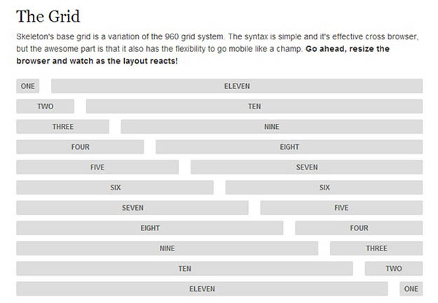
The above code snippet shows the plugin settings: there is a different plugin configuration for each of the page's sections: headerContent, centerContent, leftContent, rightContent and footerContent:
 Collapse | Copy Code
 =========================
| header |
=========================
| | | |
| left | center | right |
| | | |
=========================
| footer |
=========================
The plugin code itself is all about gathering the content elements and rearranging them in a way that the resulting rendering complies with the above layout:
 Collapse | Copy Code
 (function ($) {
var HolyGrail = {};
var raster;
$.fn.holygrail = function (options) {
var self = this;
var settings = $.extend({
headerContent: options.headerContent,
centerContent: options.centerContent,
leftContent: options.leftContent,
rightContent: options.rightContent,
footerContent: options.footerContent
}, options);
var body = $('body');
var hgHeader = $('<div>').attr({ id: 'hg-header' });
var hgContainer = $('<div>').attr({ id: 'hg-container' });
var hgCenter = $('<div>').attr({ id: 'hg-center', 'class': 'hg-column' });
var hgLeft = $('<div>').attr({ id: 'hg-left', 'class': 'hg-column' });
var hgRight = $('<div>').attr({ id: 'hg-right', 'class': 'hg-column' });
var hgFooter = $('<div>').attr({ id: 'hg-footer' });
$(hgContainer).append(hgCenter);
$(hgContainer).append(hgLeft);
$(hgContainer).append(hgRight);
$(body).append(hgHeader);
$(body).append(hgContainer);
$(body).append(hgFooter);
$(this.headerContent).attr({ 'class': 'hg-pad' });
$(this.centerContent).attr({ 'class': 'hg-pad' });
$(this.leftContent).attr({ 'class': 'hg-pad' });
$(this.rightContent).attr({ 'class': 'hg-pad' });
$(this.footerContent).attr({ 'class': 'hg-pad' });
$(hgHeader).append($(settings.headerContent));
$(hgCenter).append($(settings.centerContent));
$(hgLeft).append($(settings.leftContent));
$(hgRight).append($(settings.rightContent));
$(hgFooter).append($(settings.footerContent));
}
}(jQuery));
</div></div></div></div></div></div></reference>


