Mobilizing websites with responsive design and HTML5
http://css.dzone.com/articles/mobilizing-websites-responsive
This is a blog post series tutorial for adapting your existing websites for mobile devices without building a separate mobile site. It shows, with examples, how with little changes in your HTML, CSS and Javascript code you can deliver much nicer user experience for small screen and mobile devices. You can make existing HTML designs more mobile friendly with selective CSS loading and HTML5 tags. Selective CSS loading with CSS3 media queries allow you to change layout depending on the browser screen size: this kind of layout is called responsive design.
The tutorial is divided to several, functionality specific, blog posts, each with screenshot examples, explanations and links for more in-depth information.
The tutorial was written in a conjunction with a consulting project for a Finnish public sector organization. As the one of the funding sources is Finnish tax money, including some of my very own pennies, it was a common interest to get the information born in the consultation project published.
Below is an example what one can accomplish.
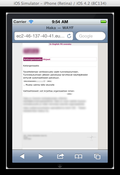
The site landing page before any mobilization was done; the site is using the default desktop styles on mobile devices:
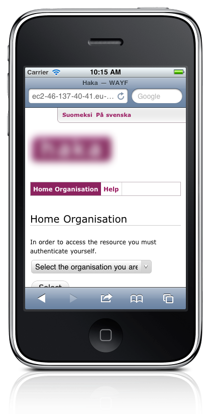
The site after HTML and CSS adjustments:
1. Prerequisites
Prerequisites for understanding this tutorial are
- Basic HTML, CSS and Javascript knowledge
- Some understanding how the process of HTML5 evolution and browser feature support work
2. Table of contents
The tutorial contents is outlined below. I’ll keep linking to new blog posts as I finish writing them. Stay tuned, by following the RSS feed or Twitter.
- Introduction(part 1)
- Working on HTML(5) for mobile sites (part 2)
- There is no HTML5; there is only HTML
- Strategies for building a mobile site
- Tools for mobile site building
- Spoofing the development browser as mobile
- User agent detection
- Native apps
- Considerations when mobilizing a legacy website (part 3)
- Applying a hint of responsiveness on an existing layout
- Minizing code changes and risks associated with them
- Setting mobile browsing viewport (part 4)
- Mobile site CSS with CSS3 media queries (part 5)
- Resizing images in responsive mobile design (part 6)
- Server-side image resizing solutions
- Styling HTML forms for mobile screens (part 7)
- Shortcutting unnecessary user choices
- HTML5 <input> element enhancements
- Zoom-on-orientation-change fix for WebKit mobile browsers ( part 8 )
- Mobile web browser testing overview (part 9)
- Accessing different mobile browsers on devices and simulators
- Desktop web browser testing
- URL shorteting
- IFRAME based simulators
- Testing mobile sites on iPhone and its simulator (part 10)
- Testing mobile sites on Android and its emulator (part 11)
- Testing mobile sites on Firefox Mobile and Opera Mini (aftermarket browsers) (part 12)
- Opera Mini
- Opera Mobile
- Firefox Mobile (a.k.a. Fennec)
- Testing mobile sites on Nokia Series 60, Series 40 and Meego (part 13)
- Testing mobie sites on Windows Mobile (Mango, others) (part 14)
- Conclusion (part 15)
(Note: Opinions expressed in this article and its replies are the opinions of their respective authors and not those of DZone, Inc.)
'프로그래밍 > Web' 카테고리의 다른 글
| IE7 설치 경로, 인터넷 익스플로러 7 (0) | 2013.01.17 |
|---|---|
| [APP] 웹에서 어플(APP) 호출하기 (0) | 2013.01.07 |
| http://jsfiddle.net/ , http://sqlfiddle.com/ (0) | 2012.12.17 |
| [WEB] 설치형 쇼핑몰 - http://dmshopkorea.com/ (0) | 2012.12.12 |
| [CSS/JS] scroll-effects. (0) | 2012.11.27 |


