반응형

http://damirfoy.com/iCheck/


Homepage: http://damirfoy.com/iCheck/
GitHub: https://github.com/damirfoy/iCheck/


iCheck lets you create highly customized checkboxes and radio buttons using jQuery. It lets you build inputs that are identical regardless of platform, supports touch devices, includes keyboard accessible inputs, and is on 1KB gzipped. There are 15 options for customizing the checkboxes and radio buttons, along with 8 callbacks to handle changes, and 6 methods for making changes programmatically.

icheck

    Plugin features

    • Identical inputs across different browsers and devices — both desktop and mobile
    • Touch devices support — iOS, Android, BlackBerry, Windows Phone
    • Keyboard accessible inputsTab, Spacebar, Arrow up/down and other shortcuts
    • Customization freedom — use any HTML and CSS to style inputs (try 6 Retina-ready skins)
    • jQuery and Zepto JavaScript libraries support
    • Lightweight size — 1 kb gzipped
    • 25 options to customize checkboxes and radio buttons
    • 8 callbacks to handle changes
    • 7 methods to make changes programmatically
    • Saves changes to original inputs, works carefully with any selectors
    반응형
    반응형

    Mobilizing websites with responsive design and HTML5

    12.16.2012
    | 1211 views |


    http://css.dzone.com/articles/mobilizing-websites-responsive


    This is a blog post series tutorial for adapting your existing websites for mobile devices without building a separate mobile site. It shows, with examples, how with little changes in your HTML, CSS and Javascript code you can deliver much nicer user experience for small screen and mobile devices. You can make existing HTML designs more mobile friendly with selective CSS loading and HTML5 tags. Selective CSS loading with CSS3 media queries allow you to change layout depending on the browser screen size: this kind of layout is called responsive design.

    The tutorial is divided to several, functionality specific, blog posts, each with screenshot examples, explanations and links for more in-depth information.

    The tutorial was written in a conjunction with a consulting project for a Finnish public sector organization. As the one of the funding sources is Finnish tax money, including some of my very own pennies, it was a common interest to get the information born in the consultation project published.

    Below is an example what one can accomplish.

    The site landing page before any mobilization was done; the site is using the default desktop styles on mobile devices:

    The site after HTML and CSS adjustments:

    1. Prerequisites

    Prerequisites for understanding this tutorial are

    2. Table of contents

    The tutorial contents is outlined below. I’ll keep linking to new blog posts as I finish writing them. Stay tuned, by following the RSS feed or Twitter.

    Published at DZone with permission of Mikko Ohtamaa, author and DZone MVB. (source)

    (Note: Opinions expressed in this article and its replies are the opinions of their respective authors and not those of DZone, Inc.)

    The HTML5 Zone is brought to you with the partnership of Microsoft and includes content on HTML5, CSS3, SVG, and Other Emerging Web Standards or JavaScript technologies that improve the web as a platform for application development.
    반응형
    반응형

    Why Web Icon Fonts are brilliant

    http://www.crearegroup-webdesign.co.uk/blog/videos/web-icon-fonts.html


    Posted Friday 14th Dec 2012 by Rob Bavington 1 Comment

    My brother James and I have been chatting a lot over the past week about how amazing Icon Web Fonts are, so I’ve put together a little video blog to show the key benefits. If you’re unfamiliar with Icon Fonts, they’re not too dissimilar from Wingdings. They’re useful, lightweight, modern typefaces that are perfect for displaying icons on your website without the baggage that often comes with using images.

    Now we’ll talk about these specific Icon Fonts in a moment, but typefaces like Font Awesome, which is free, or Fico carry huge benefits to designers – which is probably why they’ve been so popular with web designers in 2012.

    You can think of Icon Fonts as any normal font or web-font. As a designer you can easily adjust the size, colour and even add shadows with CSS. Icon Fonts work in almost all browsers including IE6, which means you get transparency without messing around with any ugly hacks. Most importantly, a lightweight or hand-picked Web Icon Font will load quicker in the browser that it’s image counterpart which will help with your page-speed optimization.

    Web Icon Fonts have been huge in 2012

    James and I think there’s 3 simple, key reasons why Icon Web Fonts are so popular in 2012:

    1. The icons are simply pretty cool and modern
    2. Responsive web design
    3. Retina displays.

    So with Responsive web-design, there’s a good chance that you might want to increase or decrease an icon’s size, particularly if you’re using it within a button. Just like text, you can use media queries to simply change the type size without needing to reference a different image file. And unlike raster, pixel based images – Icon Fonts are vector so they look crisp at any resolution.

    If you haven’t already, we’d recommending heading over to some of the many Icon Fonts available online. Like we mentioned earlier, Font Awesome is a great starting point as their current free set includes over 200 icons and can be installed and used on your website within minutes.

    There’s also plenty of premium paid Icon Fonts and also great tools like Fontello where you can create your very own hand-picked, lightweight hybrid Icon Font by combining the best of the free Icon Fonts available.

    So, wrapping up – we’re pretty confident that Icon Fonts are going to continue in popularity in 2013. It wouldn’t surprise us if the Google Web Font archive dons a set or two in the near future.

    Example results when using Font Awesome, as shown on their web page.

    Example results when using Font Awesome, as shown on their web page.

    Web Icon Fonts & SEO

    Also, don’t worry about the potential SEO headache of having random single letters hanging around your HTML markup. Icon Font Packs, like Font Awesome for example, have been set-up so that you can render with empty italic tags.

    If you refer to the embedded image opposite, and the HTML markup below, you can see how the empty italics tags are used with a class to render icons in a similar fashion to how we might use span tags.


    1
    2
    3
    4
    5
    6
    7
    8
    </pre>
    <ul class="nav nav-list">
        <li class="active"><a href="#"> Home</a></li>
        <li><a href="#"> Library</a></li>
        <li><a href="#"> Applications</a></li>
        <li><a href="#"> Settings</a></li>
    </ul>
    <pre>


    Thanks for watching this week, check out our supporting post for more resources and live examples of Icon Fonts in action from around the web.


    반응형
    반응형

    40 High Quality Photoshop Web Layout Tutorials

    Don't Forget to participate in a contest where you can win the world's biggest UI elements pack "Impressionist User Interface Elements Pack" for 3 winners (1 developer license and 2 personal license) to design your project more creatively.


    In this collection, you will discover some useful Photoshop tutorials on creating appealing and excellent website layouts. Creating visually appealing website layouts is very important for every web designs, and Photoshop is the most useful tool for creating such layouts. Keeping this in mind, we thought to compile some useful tutorials that will guide you through the process behind creating web layouts in Photoshop.

    As we have already published a post about Photoshop Tutorials for Website Layouts and that was greatly appreciated by our readers. Now we have gathered another great collection of some Photoshop Tutorials for Website Layouts.

    Let us take a look at this collection and get some useful insight of how you can also create appealing website layouts for your website. We hope that you will like this collection. Enjoy!

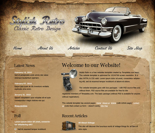
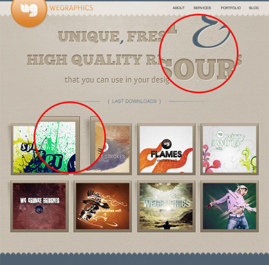
    We Go Retro Create Stylish Retro Website Template Using Photoshop

    Follow the steps of this tutorial and you’ll learn the designing tips and tricks of this elegant template. This is the advanced level tutorial.

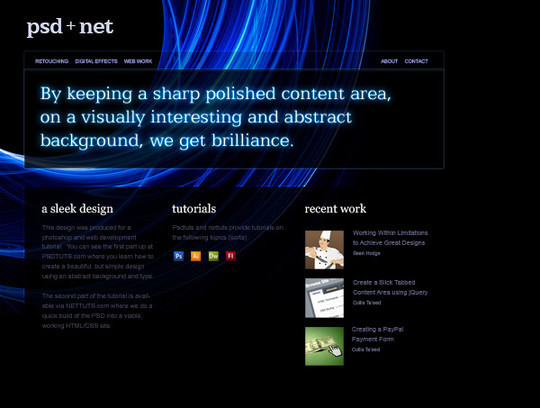
    Create a Sleek, High-End Web Design from Scratch

    In this tutorial, we’ll put together a high-end Web design using a crisp, thin font, gorgeous background images, and clever use of space and layout. You can easily use the technique to create your own unique designs.

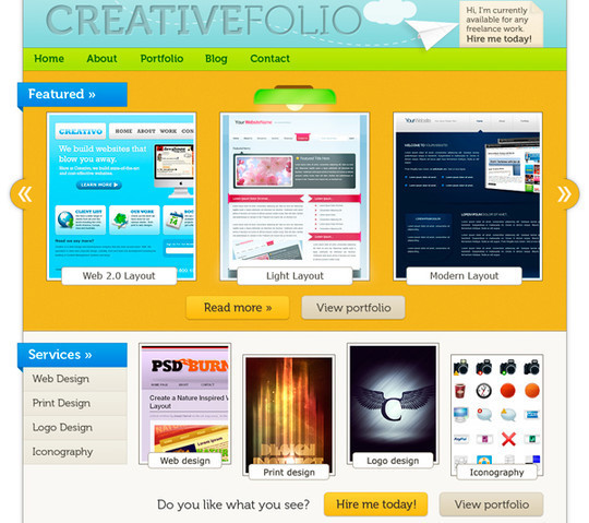
    Create a Professional Web 2.0 Layout

    In this Photoshop tutorial we’re going to learn how to create a web 2.0 layout, As we go through the tutorial we’ll deal with so many Photoshop techniques. Seems kind of long? that’s because it’s very detailed. I assure you’ll find easy to follow and to get done, just give it a try!

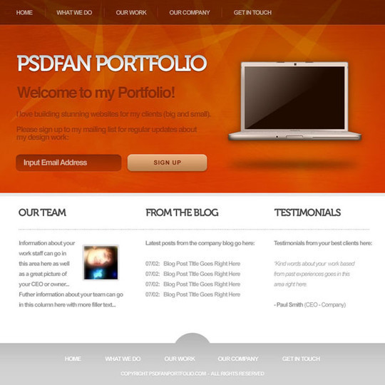
    Deep in Space Portfolio Layout Design in Photoshop

    In this tutorial we will teach you how to create an outer space website layout that could be used for a portfolio design. If you have any questions about this tutorial be sure to ask in the comments. Also, remember with all the tutorials, the psd is available for download.

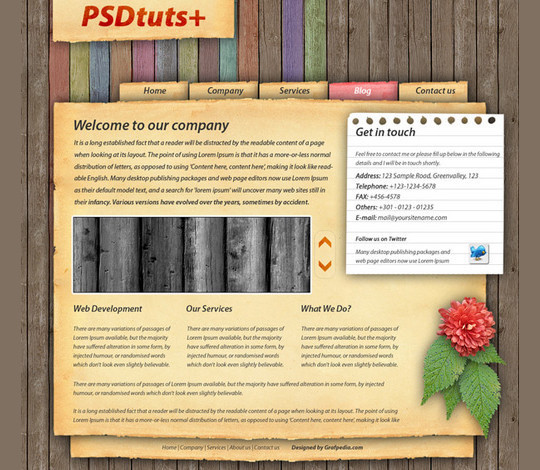
    How to Make a Highly-Textured Site Layout in Photoshop

    In this tutorial, we’ll create a textured site layout by layering multiple images. Creating highly-textured web design layouts is easier than you may think. You can learn to build image intensive designs rapidly. For intermediate Photoshop designers creating this design will take less than an hour, and you’ll learn some professional tips along the way. Let’s get started!

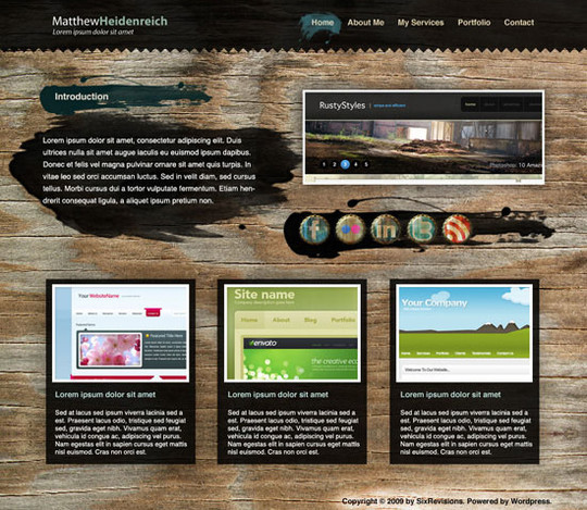
    Create a Wooden Grunge Portfolio Web Layout in Photoshop

    In this beginner-level web design tutorial, we will show you how to construct a portfolio web layout that has a fixed wooden background with Photoshop. We’ll also use some brushes to accent the design.

    How to Make a Vibrant Portfolio Web Design in Photoshop

    In this web design tutorial, we will create a beautiful and colorful portfolio layout using Photoshop. We will show you many techniques for creating different things like bended paper corners, dashed lines, image carousels, 3D bars, and more! We will walk you through each step in exact detail so you won’t be left guessing how to do a certain technique. We will use the 960 Grid System to create this layout.

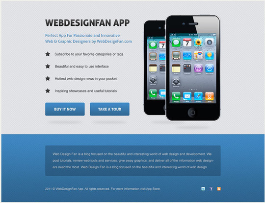
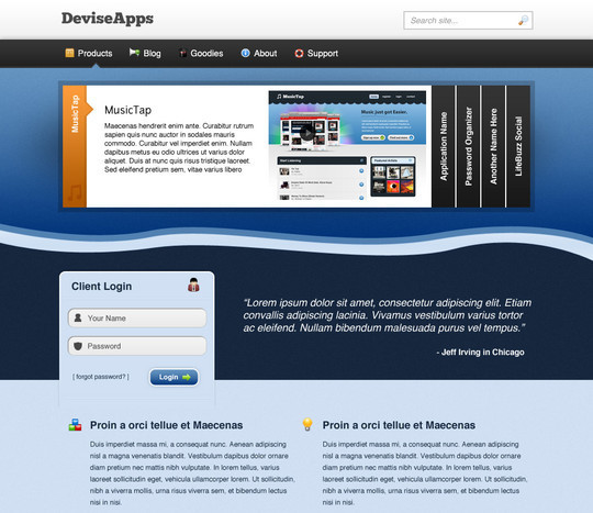
    Design a Clean Mobile App Website in Photoshop

    In this tutorial i would like to show you how to create a clean mobile app website in Photoshop. You will see how to create a detailed background, trendy call to action buttons and how to stylize web typography. Hope you will find this tutorial useful and you will learn something new. Please share your opinion about this tutorial in comments section below.

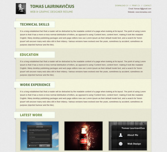
    Create a Minimal Resume Website Design in Photoshop

    In this tutorial you will learn how to create a minimal resume website design in Photoshop. We will be using simple techniques to achieve clean and professional final result. You will discover how to create simple detailed background, trendy 3D elements also you will see how to effectively stylize web typography.

    Create an Awesome Black Portfolio Layout

    Here we will show you how to create a nice portfolio layout. It will have a nice 2.0 look. More and more webmasters are aiming to create simple layouts. The scope of web 2.0 layouts is that users will see faster what you want to offer

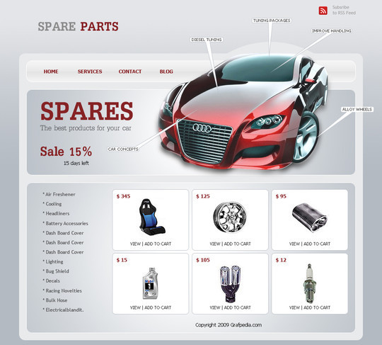
    Create an Ecommerce Web Layout

    In this tutorial we will create a spare parts ecommerce layout. It can be used for magento, oscommerce, or any e-commerce cms you want.

    Create a Grungy, Translucent Web Portfolio Design

    In this tutorial you will learn how to create a Grungy, Translucent Web Portfolio Design.

    Design a Cool Textured Portfolio Website

    In this tutorial you will learn how to Design a Cool Textured Portfolio Website.

    Create a Clean Business Web Layout in Photoshop

    In this tutorial we would like to show you how to design a clean and solid fictional business layout. Following the steps in this tutorial you will learn how to use guides, how to create a detailed background using patterns and filters, how to create transparent buttons, 3D elements and how to stylize web typography. Hope you will find this tutorial useful and techniques shown in this tutorial will help you in future projects.

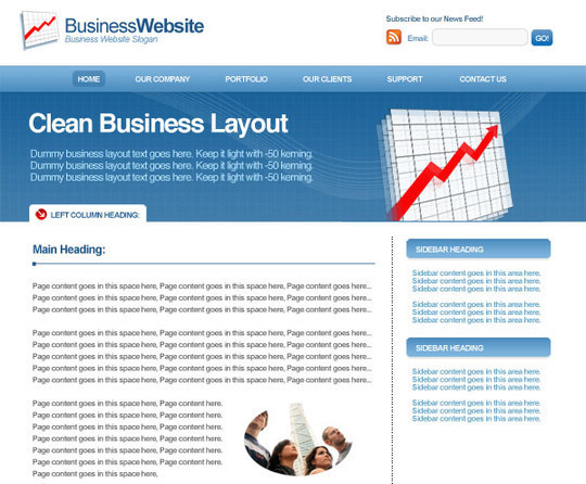
    Design a Clean Business Layout

    Grunge layouts may be all the rage right now, but they aren’t suitable for every kind of website. For this tutorial we are going to show you how to make a professional, clean business layout. This kind of design is perfect for companies or business related blogs.

    Portfolio Gallery Layout

    In this tutorial you will learn how to create a portfolio styled layout for your design studio gallery. If you have any questions about this tutorial be sure to ask in the comments. Also, remember with all the tutorials, the psd is available for download.

    Creative Studio Web Page

    In this detailed tutorial we will learn how to create impressive layout for Creative Studio.

    Portfolio Layout

    Welcome to another portfolio layout tutorial, in this tutrial il show you how to create a cool blue portfolio layout.

    Create a Slick and Minimalist Web Layout in Photoshop

    In this Photoshop web design tutorial, we’re going to learn how to create a slick and minimal-looking website layout. We will use the 960 Grid System as a template to make it easy to align the design elements on the layout.

    Design a Dark Business Layout

    In this tutorial we will use only a few colors to create a dark business layout. With small modifications this layout can be used also as an wordpress blog. It is very important to use patterns in your layouts. We have a set with 200 seamless pixel patterns, and this little piece of graphics can change the look of the website very much.

    How to create a web hosting layout

    Today will show you how to create another eye catching hosting layout. In this tutorial we will use only 2-3 colors, with small variations, and you can use this layout for any internet business you have. of course you need to make small changes.

    Design a Bold and Vibrant Portfolio

    In this tutorial we will learn how to design a Bold and Vibrant Portfolio.

    Design a Modern, Textured Portfolio Website

    In this tutorial we will learn how to design a Modern, Textured Portfolio Website.

    Design a Space Themed Portfolio Landing Page

    In this tutorial we will learn how to Design a Space Themed Portfolio Landing Page.

    Design a Creative Unusual Layout

    In this tutorial we will show you how to manipulate some simple shapes, to obtain a wonderful layout. As you have seen I am trying to create unusual layouts. I want to show you that it is possible to create also another type of layouts (not usual ones).

    Create a Stylish Business Layout in Photoshop

    In this tutorial we will show you how easy we will create a clean corporate layout. We wanted to create a website for a freelancer but after the first steps I’ve changed my mind.

    Create a Clean Elegant WordPress Theme

    In this tutorial we will show you how easy we will create a clean corporate layout.

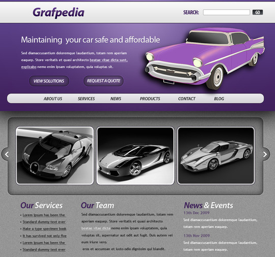
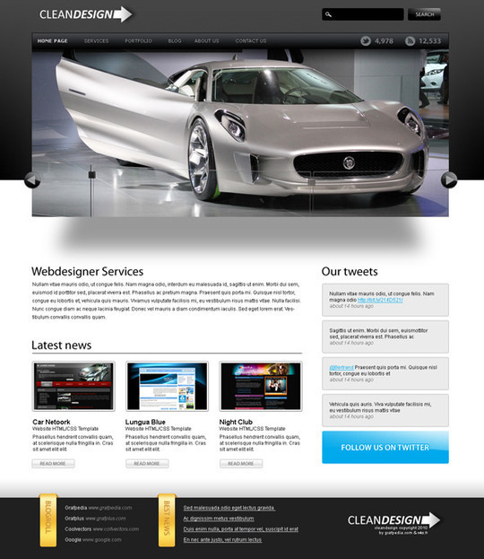
    Design a Car Dealer Website Layout with Photoshop

    Here we will show you how to create a car layout. This template can suite as a design for car dealers, communities dedicated to cars and other related topics. With some small modifications you can use this layout for a WordPress blog too.

    How to design a clean and beautiful portfolio webdesign

    This Photoshop tutorial teaches you how to create a website layout, from the beginning, creating a document under Photoshop, how to the publication in HTML5 and CSS3. This tutorial is really useful for people willing to create their own website as well as for web designers looking for inspiration or looking for graphics resources.

    Create a Grunge Personal Portfolio Layout

    In this tutorial we will show you how to create a grunge personal portfolio. With small modifications you can use this layout for a photography website or for a web design agency layout.

    Create a Grunge Photographer Layout

    In this tutorial we will show you how to create a grunge layout for a photographer. We will use some of the vectors we have already released in the past days, and we will show you how to manipulate them to create a nice looking layout. This layout can be used also for a portfolio layout.

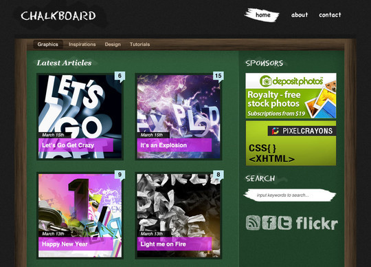
    Create a Chalkboard Style WordPress Layout in Photoshop

    In this tutorial you will learn how to create a unique and original WordPress style layout that looks like a chalkboard. If you have any questions about this tutorial be sure to ask in the comments. Also, remember with all the tutorials, the psd is available for download.

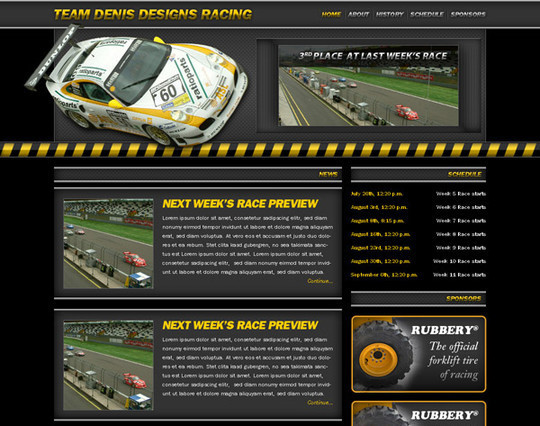
    Create a Racing Website

    We are going to create a racing website using Photoshop and a little imagination, along with a few stock images. In this tutorial we are going to learn to create an easy glossy type, quick color correction, several visual elements and the structure of a website.

    Create a simle layout for Architecture or Real Estate

    In this tutorial we will show you how to create a simple layout for architecture business. This layout can be used if you want a website for an architectural or building company or for real estate development, structural engineering, and architectural consulting.

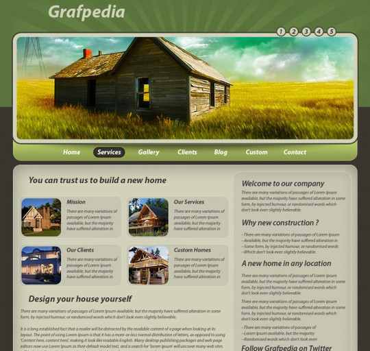
    Design an Elegant Rustic Layout

    Here we will create a layout for a hotel. This layout will work also if you have site related to the hotel industry: bed and breakfast, motels, and it will work very good for restaurants, cafes, pizzerias , bars, wineries layouts, etc.

    How to Create the Interior Design Layout

    In this tutorial you’ll learn how to create professional and glossy website layout for the Interior Design related company. Just follow the steps of this tutorial and you’ll find out that there is nothing so complicated in designing this stunning template.

    Design a Creative Design Studio Layout

    This PSD layout is aimed at design studios and agencies, designers, those involved in site design and software development, as well as graphic designers. With this design studio layout you can showcase your work or products in an easy way.

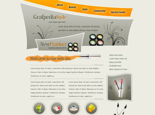
    Design a Creative Cosmetics Layout with Photoshop

    In this tutorial we will show you how to create a beauty layout based on some strange shapes. This PSD layout is aimed for building websites related to healthcare, medicine and health issues. It can be used for massage spa salons, spa resorts, body spa and facial spa accessories, spa equipment too.

    Learn How To Create A Clean Layout In Photoshop

    In this Photoshop tutorial we’ll learn how to create a clean looking website layout, we’ll also be using 960s grid system to keep everything aligned. This is very detailed tutorial, so if you have basic knowledge about Photoshop you should be able to easily keep up and let me guide you through this layout creation process.

    How to create a distinguishable textured web layout in Photoshop

    In this tutorial we will show you how to create a textured web layout, starting from the concept on paper to Photoshop design. We will discuss about site structure and will use the 960 grid to organize our contents. Also you will learn how to use layer styles to create an engraved text effect. Give it a try!

    Clean and Minimalistic Portfolio Layout in Photoshop

    In this tutorial you will learn how to create a clean and minimalistic portfolio layout in Photoshop. If you have any questions about this tutorial be sure to ask in the comments. Also, remember with all the tutorials, the psd is available for download.

    Create a Vibrant Professional Web Design in Photoshop

    Developing a workflow that lets you create web layouts quickly and easily while still satisfying your clients’ needs is crucial. In this Photoshop web design tutorial, I’ll show you a way to create a slick home page layout in the fastest time possible and with minimum web design skills. Let’s go!

    How to Create a Unique WordPress Theme

    Here we try to create another creative layout which can be converted very easy in a wordpress theme.

    Related posts:

    1. Best Of 2011: 45 Photoshop Web Design Layout Tutorials
    2. 50 Truly Eye-Catching And Detailed Web Layout Tutorials
    3. Fresh And High Quality Adobe Photoshop Tutorials
    4. Best Of 2011: Ultimate Collection Of High Quality Photoshop Tutorials


    Read more: http://www.smashingapps.com/2012/12/10/40-high-quality-photoshop-web-layout-tutorials.html#ixzz2EnViWBf1

    반응형
    반응형

    Font Custom is a tool that will generate custom icon webfonts from the comfort of the command line. It is very easy to use, all you have to do is create a directory for your svg and eps files. Then, on the command line, run: fontcustom watch /path/to/vectors
    Font Custom will then create the font and CSS file. It will also continue to run and watch the folder for changes, so you don't have to manually re-run it each time you update the vector set.
    Font Custom - Custom icon webfonts from the command line

    반응형
    반응형

    Chrome Dev Tools: Markup and Style

    브라우저, 개발자 도구, 스타일가이드

    http://net.tutsplus.com/tutorials/tools-and-tips/chrome-dev-tools-markup-and-style/


    Browser Developer Tools

    Before digging into Chrome’s developer tools, I want to give you just a brief look at the development tools provided by the major browsers. Note that this isn’t a comprehensive look at these tools and their features, but I do provide basic information for each tool.

    Chrome Developer Tools

    You can use the developer tools within Chrome, Chrome Canary and even Chromium.

    Safari WebKit Inspector

    Safari uses code from the Web Inspector repository; however, you may find that it’s not updated as often as Chrome.

    Firefox Developer Tools

    Firefox now comes with its own set of developer tools which has a nice focus on the visual side of things. For those who are used to Firebug, that’s still available as an add-on.

    Internet Explorer Developer Tools

    Opera Dragonfly

    Getting Started

    Note: this tutorial uses the Canary build of Chrome. Therefore, some features covered in this article may or may not be available in the beta or stable releases.

    Before taking a look at the contents of the Elements panel, let’s take some time to understand the little controls near the top and bottom. Please refer to the numbered list below the following image that explains the different UI elements in the tool window.

    1. Close Developer Tools.
    2. Buttons to select different tool panels (Elements is currently selected).
    3. A custom tool installed by a third-party extention (PageSpeed).
    4. Change the layout of the developer tools.
    5. Show the console (will be covered in a different tutorial).
    6. Select an element in the tool by clicking on it in the page.
    7. JavaScript errors in the page.
    8. Open the settings screen overlay.

    It’s good to choose a layout you are comfortable with. Click once on the bottom-left corner and notice how the developer tools pane detaches itself from the main window–perfect for multi-monitor setups. Clicking and holding on the bottom left icon allows you dock to the right, like this:


    Elements Panel

    The Elements panel lists the page’s markup as it is rendered in the browser. Any change made to the DOM via JavaScript is reflected in the elements found in this panel.

    Let’s get familiar with this panel. As before, refer to the list items below the following screenshot that identify the different parts of the Elements panel.

    The power given to us by the dev tools is nothing short than amazing.

    1. The elements as rendered within the document.
    2. The arrow indicates that the element has children. The position of the arrow signifies whether the element is collapsed or expanded.
    3. Elemental breadcrumbs starting with the document element (<html/>) and ending with the currently selected element. Hovering over each crumb highlights the respective element in the browser window.
    4. A movable divider to separate the elements list from the style information.
    5. Togglable panes that contain styling (and more) information.
    6. Computed Styles show the styling information the browser calculated for the selected element.
    7. Shows you the styles inherited from the browser’s default styles that are applied to the selected element.
    8. Show you user added styles, such as: styles retrieved from the page’s corresponding styles.css file, styles added via JavaScript, and styles added via the developer tools.
    9. The “New style rule” button. It creates a new style rule for the selected element.
    10. Toggle Element State lets you trigger user initiated states such as :hover (the user hovering over something with their mouse, :active, and more. The image shows the button in its “on” state; it is off by default.
    11. The font section displays only the fonts that the browser has had to download.

    12. Allows you to set the preferred format for color values. You can keep the default (“as authored”), change everything to hex, use RGB, or even set it to HSL.
    13. Visualizes the element’s box by taking margin, border, and padding into account.

    Extra Information

    • What: The Elements panel allows for viewing and editing elements and style information.
    • Where: It’s the first panel. You can also access it by right-clicking an element on the page and selecting Inspect element.
    • Why: There are a number of use cases. You may wish to modify the DOM by deleting a node or adding a new one. Markup aside, the elements panel is a great place to see the applied styles of a specific node. You can also add and remove styles, as well as create new rules to possibly add to your stylesheets.

    DOM Modifications

    Modifying the DOM within the Elements panel is a fairly straightforward process. To delete a node, simply right-click it and select Delete node. As you might expect, deleting a parent node also deletes its children. Handy tip: You can also press the delete key on your keyboard to delete the selected node.

    Changing an element’s type is possible by double clicking on the element name itself. For example: the p portion on a paragraph tag. Naturally, changing an element from one type to another causes both the opening and closing tags to change.

    renaming an element

    Viewing the page’s resources is essential for debugging.

    Adding attributes can be achieved by right-clicking on the element and selecting Add attribute. The cursor immediately positions itself where you would expect it to, and you can start typing the attributes you want to add to the element. For example: class="title". Pressing the tab key on your keyboard positions the cursor to the next attribute position.

    Editing attributes is similar to adding them. Find the attribute you want to edit, and double click either the attribute name or its value. The former highlights the attribute name, and the latter highlights the value.

    Raw HTML editing is enabled by right-clicking on an element and selecting Edit as HTML.

    Locating Elements

    The developer tools provide a few useful techniquies for locating elements in the document. Hovering over elements in the Elements pane causes the corresponding rendered elements to be highlighted in the page. This is a great way to find which element in developer tools matches corresponds with the element in the page.

    Hovering over elements in the panel to locate them on the page

    Naturally, we do not see elements outside of the browser’s viewport highlighted when hovering over the corresponding elements in the Elements pane. Fortunately, we do see a tooltip indicating the direction of the out-of-viewport element. The icing on the cake, however, is the Scroll into view feature found within an element’s context menu. It does exactly what its says: it scrolls the element into view.

    Scrolling an element into view

    The developer tools also has a search feature. While the dev tools pane has focus, press Control + f to open the search box. This is a simple text search box; so, typing “body” will find the first instance of the text “body” in the document.

    Viewing Style Information

    Before we get to the style panes (the right hand side) of the Elements tab, we can access some style information directly from an element if it has all three of margins, paddings and borders specified in the stylesheet. Hovering over one of these elements gives us a glimpse at its box model, like this:

    result of hovering over an element

    When you’re wondering why some floated elements are not behaving as expected, viewing the margin/padding information can help diagnose the problem. For example, you may find that an element is wider than what you expected due to extra padding.

    While on the subject of margins/paddings/borders, let’s shift over to the styles area of the Elements panel and check out the “Metrics” pane.

    the metrics pane

    This allows you to drill-down and identify possible problems as to why an element renders the way it does. It’s also a great learning tool; if you haven’t gotten your head around the CSS Box Model, then the Metrics diagram is a great visual aid.

    The Metrics pane lets you view element dimensions, padding, borders and margins. Notice how you can highlight over each individual portion to get a visual representation as to how it renders in the browser. The Metrics diagram also gives pixel based measurements for each portion of the element, e.g. a style rule of padding: 10px 5px (10px at the top and bottom, 5px right and left) will show the exact measurements for each side of the element.

    Setting Style Information

    Viewing style information is fun, but immediately tinkering with any page’s style ranks much higher on the ‘ol fun meter. Whether it’s to educate ourselves, experiment with a design, or even communicate ideas to our peers, the power given to us by the dev tools is nothing short than amazing.

    Ensure the Styles panel is expanded and click just to the right of the opening curly bracket. You’ll notice a cursor automatically positions itself so that you can write a style property. Type a property name, press tab to move the cursor to the value portion, and type the value. I’m going to add the following CSS:

    border: 1px solid green
    

    The Elements panel lists the page’s markup as it is rendered in the browser.

    When you start typing in the property name, Chrome provides suggestions, giving you the benefit of auto-completion. Awesome! Pressing tab selects the closest match to what you typed and moves the cursor to the value position. However, pressing the right arrow key causes the cursor to remain in the property portion but fills in the closest match to what you typed.

    Auto-completion also works with property values. For example, typing in “pos” *tab* “fi” *tab* creates a style property of position: fixed. When entering pixel/percentage based values, such as 15% or 10px, we can increment and decrement those values using the up and down arrow keys. To increment by 10, use shift + up arrow key.

    Modifying color values is a breeze thanks to the color picker. After entering a color value, single-click on the small, colored square to the left of the value to bring up the color picker tool. You can also toggle between color value formats by shift+clicking the small colored square.

    You can create a new style rule by clicking the small + icon in the styles pane. Markup which looks like:

    <h1 id="something">Hello</h1>
    

    Automatically generates the following style rule:

    #something { }
    

    Markup which looks like:

    <h1 class="some-class">Hello</h1>
    

    Automatically generates the following:

    .some-class { }
    

    Markup which looks like:

    <h1>Hello</h1>
    

    Generates:

    .h1 { }
    

    Markup which looks like:

    <h1 class="class1 class2 class3">Hi there</h1>
    

    Automatically generates:

    .class1.class2.class3 { }
    

    Of course, style rules can be modified to your liking.

    The Elements panel gives you a lot of power with the structure and style of the page, but the dev tools give us many more tools essential to our work.


    Resources Panel

    The Resources panel shows what resources a page uses. Let’s take a look at what it provides.

    The Metrics pane lets you view element dimensions, padding, borders and margins.

    1. The button to active the Resources panel.
    2. The category pane shows the various types of resources we can inspect. A resource header (such as “Frames” or “Session Storage”) may have an error next to it. This indicates there is more information, and clicking on the header reveals that information. This pane is resizable; so make it as large or small as you like.
    3. Page resources including fonts, images, JavaScript, CSS and the page itself can be found here. If the page uses multiple frames (for example using a frameset), then each frame appears as a separate folder within the parent “Frames” folder. This is useful for understanding the relationship between a frame and its resources.
    4. If Web SQL databases are used in the page, this shows their contents.
    5. Similar to Web SQL, IndexedDB displays the contents of the IndexedDB database.
    6. Displays the key/value pairs stored in localStorage.
    7. Displays the key/value pairs stored in sessionStorage.
    8. Lists the cookies created by the domain.
    9. Displays the assets cached according to the cache manifest. This section contains a lot of useful information. For example, a resource such as a JavaScript library will show the resource path, file size, and file type.
    10. Displays the details regarding the selected resource in the left-hand pane.

    Extra Information

    The developer tools also has a search feature.

    • What: The resources panel shows resources associated with the page.
    • Where: The second panel, directly after the Elements panel and before the Network panel.
    • Why: Viewing the page’s resources is essential for debugging. You might also be curious as to what information other websites store in localStorage, cookies, or any other data storage mechanism. Additionally, certain resources, such as localStorage can be modified via the developer tools.

    Viewing Individual Frame Contents

    Despite the lack of frames usage in today’s web sites, understanding how to inspect a page with multiple frames is a valuable skill to have. In the following screenshot, you’ll notice a columned page where each column represents a different frame:

    viewing multiple frames

    You can save a resource to your computer

    Each frame is placed inside its own folder. Each folder contains each page's assets, and you can click on each page to show their contents. Viewing the contents of an HTML page is helpful, but we can go dig deeper into each page and view its resources. JavaScript, CSS, images, and even fonts can be viewed! Assets that contain code are displayed in the developer tools' code viewer, which comes with syntax highlighting and line numbers.

    Fonts

    It's important to note that system fonts, such as Arial or Helvetica, are not listed under Fonts; the font section displays only the fonts that the browser has had to download.

    Viewing the fonts of a page

    The font scales so that it can fit within the resource content area; therefore, resizing the resource content area also resizes the asset!

    Images

    It's clear that some thought went into the image viewing UI.

    Images within a page from the resources panel

    The developer tools displays the image in the content area, and the image scales according to the content area's size. Images with transparency (like the one in the above screenshot) are shown with a checkerboard in the background, making it easier to view the image. Other useful information, such as the dimensions, file size, and MIME type are displayed below the image.

    Scripts

    The JavaScript! Clicking a script file displays its contents, but not much else.

    JavaScript that a page has loaded

    But don't despair; viewing assets is simply that: viewing assets. In a future tutorial, we'll look at the dev tools' JavaScript support and capabilities.

    Stylesheets

    You can view the different stylesheets that the browser loaded for the web page.

    Stylesheets from Chrome dev tools

    As with JavaScript files, you cannot do much with the stylesheet assets.

    Resources that Failed to Load

    Occasionally, the browser will be unable to load a particular resource due to network issues or developer error.

    A resource which has not been found

    When this happens, a small red notification appears to the right of the asset. The number states how many errors occurred, and the content pane provides more details about the error.

    Saving and Viewing Resources

    Each resource has a context menu; simply right-clicking on a resource shows a menu similar to this:

    the context menu shown for assets

    You can save a resource to your computer, open a resource in a new tab, and perform many other tasks. Double-clicking the resource opens the asset in a new tab.

    Cookies

    As I previously mentioned, you can view cookie information for a particular website. For example, navigating to Twitter while being signed in may present similar information to what is shown in this screenshot:

    viewing the cookies on a page

    Here, we see:

    When you’re wondering why some floated elements are not behaving as expected, viewing the margin/padding information can help diagnose the problem.

    • Name - the name of the cookie. For example, there's a name with "remember_checked" which has a value of 1. This is likely to state whether the user has checked a "Remember me" checkbox during the sign in process.
    • Value - the value of the cookie. For the "_twitter_sess" named cookie, there's a long encrypted session ID for the value.
    • Domain - the cookie's domain. .twitter.com allows for any sub-domain on twitter.com.
    • Path - similar to domain, the path field states valid paths. "/" allows for all paths.
    • Expires - the date the browser delete the cookie.
    • Size - the size of the cookie in bytes.
    • HTTP - force the cookie to only be accessed via the HTTP protocol. This prevents accessing of cookies via JavaScript and can help combat cookie stealing through cross site scripting.
    • Secure - instructs the browser to communicate cookie data only through encrypted connections such as HTTPS

    You can delete a cookie by right-clicking on a cookie and selecting Delete from the context menu.

    It's interesting to note how browsers use cookie information to determine whether you are an authenticated user. While logged in to Twitter, deleting the "auth_token" and "_twitter_sess" cookies prompts us to login after refreshing the page. Twitter likely stores our logged in status and other bits of sensitive information in those cookies.

    Local Storage

    Storing and viewing key/value pairs in localStorage is rather easy. Rather than storing our own keys, we'll use an existing website as an example. The following screenshot shows the local storage view of a Kitchen Sink Example App made with the mobile web application framework Sencha Touch.

    Viewing the local storage on a page

    When first viewing the page, the browser makes a request for a CSS file. Refreshing the page feels a lot snappier because Sencha stored the CSS in local storage. The kitchen sink app has some interesting key/value pairs. For example, one key looks like this:

    3a867610-670a-11e1-a90e-4318029d18bb-http://dev.sencha.com/deploy/touch/examples/production/kitchensink/resources/css/app.css
    

    The value for that key begins with this:

    /*45e6f4ffe818855b26f3dcbfc156025eca58e4f5*/code,pre,pre *{font-family:Menlo,Monaco,Courier,monospace}
    

    Steve Souders wrote about storing assets in local storage; it's an interesting and exciting use of local storage which can improve performance--especially on mobile devices.

    Application Cache

    The application cache tells the browser which resources it should cache, and the Application Cache category lets us view what has been cached.

    the application cache view in the resources panel

    There are three columns with this view:

    • Resource - the full path of the resource. File extensions are typically assets and HTML files. One of the resources is the manifest file itself!
    • Type - can vary. The "Manifest" type is a unique type given to the manifest file itself. Another type is explicit: resources that are explicitly defined in the manifest file. The type of fallback indicates a resource that acts as a fallback for another resource. The Master type is the resource which initiated the cache: the page itself.
    • Size - the size of the resource in kilobytes or bytes.

    See this tutorial if you're not familiar with HTML5 application cache.


    반응형

    + Recent posts