40 Fresh jQuery Plugins To Make Your Website User Friendly
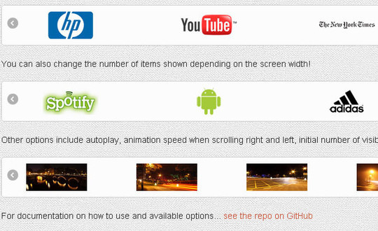
Flexisel – Responsive Carousel Plugin
( Demo | Download )
Resize your browser window to see how you the plugin can adjust to the window width. Flexisel will adapt responsively as the screen width gets smaller…
Swipebox – A Touchable jQuery Lightbox
( Demo | Download )
Swipebox is a jQuery “lightbox” plugin for desktop, mobile and tablet.

Sidr – Creating Facebook-Like Side Menus
( Demo | Download )
The best jQuery plugin for creating side menus and the easiest way for doing your menu responsive.

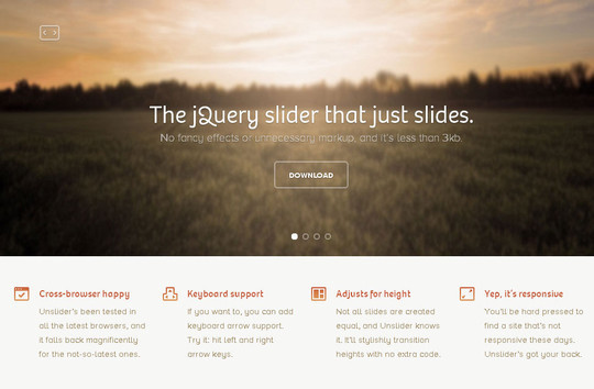
Unslider – A ‘Super-Tiny’ jQuery Slider
( Demo | Download )
The jQuery slider that just slides. No fancy effects or unnecessary markup, and it’s less than 3kb.
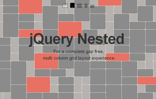
jQuery Nested – Create Multi-Column, Dynamic Grid Layouts
( Demo | Download )
Nested is a jQuery plugin which allows you to create multi-column, dynamic grid layouts.
jResponsive – Super-Smooth Transition Layouts
( Demo | Download )
JResponsive will organize your content in an efficient, dynamic and responsive layout. It can be applied to a container element and it will arrange its children in a layout that makes optimal use of screen space, by “packing” them in tightly. One of the very famous website that using this type of layout is Pulse.
MultiDialog
( Demo | Download )
MultiDialog utilizes jQuery UI Dialog Widget for a full featured Modalbox / Lightbox application.

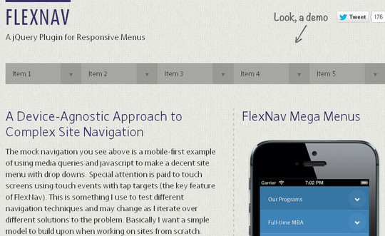
FlexNav – Flexible, Device Agnostic Navigation
( Demo | Download )
A jQuery Plugin for Responsive Menus.
Flaunt.js – Responsive Navs with Nested Click-To-Reveal
( Demo | Download )
Flaunt.js is a jQuery script that allows you to create a responsive, nested navigation out the box. Flaunt was built to overcome responsive design challenges which faced a huge percentage of websites. This challenge was to show nested navigation items on click-demand, without the event taking you through to the page you’ve pressed…
SlideToucher – Touch Enabled jQuery Plugin for Content Swiping
( Demo | Download )
SlideToucher, touch enabled jQuery plugin for content swiping. Supports vertical and horizontal swipes.

LiquidSlider – A Responsive jQuery Content Slider
( Demo | Download )
A Responsive jQuery Content Slider.

Dropdown.dot.js – Flexible Dropdowns Based on dot.js Templates
( Demo | Download )
A JQuery Plugin for super-flexible Dropdowns based on dot.js Templates.

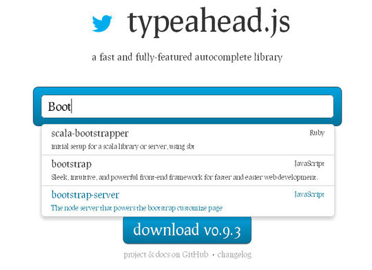
Typeahead.js – A Fully-Featured Autocomplete Library
( Demo | Download )
A fast and fully-featured autocomplete library.
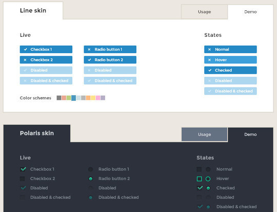
iCheck – Customize Checkboxes & Radio Buttons
( Demo | Download )
iCheck plugin works with checkboxes and radio buttons like a constructor.
Chardin.js – Simple Overlay Instructions for Apps
( Demo | Download )
Simple overlay instructions for your apps.

jQuery Alpha Image Plugin
( Demo | Download )
This plugin can change selected colours to transparent on your image and give result as image or imagedata. This plugin works on IE9+, Chrome, Firefox, Safari. I didn’t try in opera.

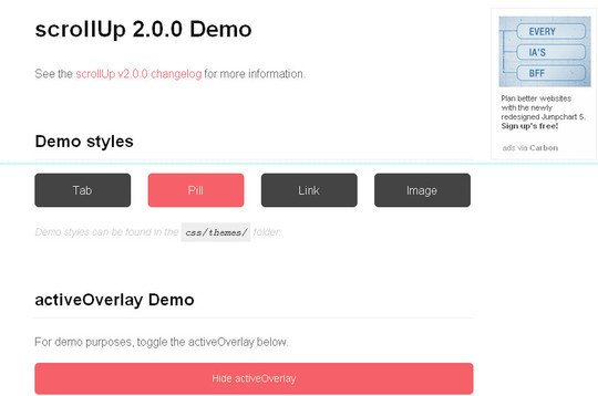
ScrollUp
( Demo | Download )
A Lightweight Plugin for Creating a Customisable “Scroll-to-Top”.
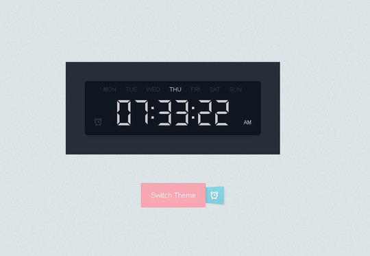
Adding Alarms to the Digital Clock
( Demo | Download )
Adding Alarms to the Digital Clock.
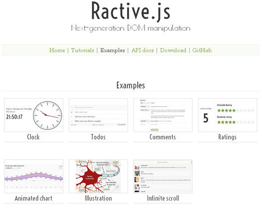
Ractive.js
( Demo | Download )
Ractive.js is different. It solves some of the biggest headaches in web development – data binding, efficient DOM updates, event handling – and does so with almost no learning curve.
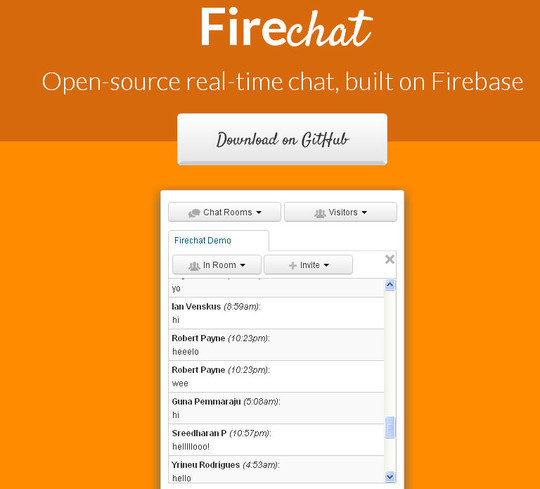
Firechat
( Demo | Download )
Firechat is an open-source, real-time chat widget built on Firebase. It offers fully secure multi-user, multi-room chat with flexible authentication, moderator features, user presence and search, private messaging, chat invitations, and more.
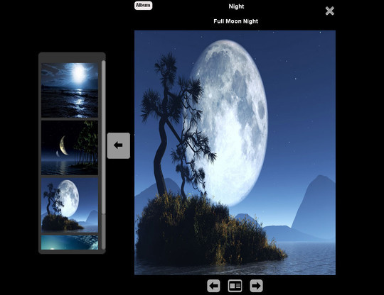
Albumize
( Demo | Download )
Albumize is a jQuery plugin that lets you manage collection of images in the web page as albums. With albumize, you can browse albums, add cover image to albums and switch between albums.
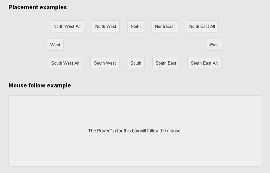
PowerTip – A jQuery Hover Tooltip Plugin
( Demo | Download )
PowerTip features a very flexible design that is easy to customize, gives you a number of different ways to use the tooltips, has APIs for developers, and supports adding complex data to tooltips. It is being actively developed and maintained, and provides a very fluid user experience.
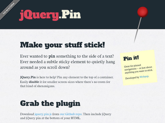
jQuery Pin – Pin Any Element Within a Container
( Demo | Download )
Query.Pin is here to help! Pin any element to the top of a container. Easily disable it for smaller screen-sizes where there’s no room for that kind of shenanigans.
Perfect-Scrollbar – A jQuery Scrollbar Plugin
( Demo | Download )
Tiny but perfect jQuery scrollbar plugin.

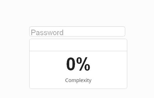
Complexify
( Demo | Download )
Complexify aims to provide a good measure of password complexity for websites to use both for giving hints to users in the form of strength bars, and for casually enforcing a minimum complexity for security reasons.
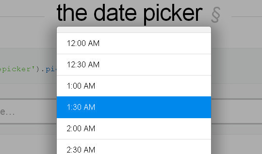
Pickadate.js
( Demo | Download )
The mobile-friendly, responsive, and lightweight jQuery date & time input picker.
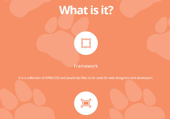
Cool Kitten
( Demo | Download )
It is a collection of HTML/CSS and JavaScript files to be used for web designers and developers.
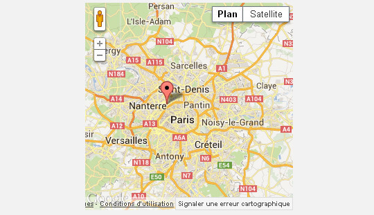
Google Map
( Demo | Download )
A jQuery Plugin allows you to easely manipulate the Google Map API. You are now able to create maps, add some markers et create routes.
qTip2 – Pretty powerful tooltips
( Demo | Download )
The second generation of the advanced qTip plugin for the ever popular jQuery framework.

Magnific Popup
( Demo | Download )
Fast, light, mobile-friendly and responsive lightbox and modal dialog plugin. Open inline HTML, ajax loaded content, image, form, iframe (YouTube video, Vimeo, Google Maps), photo gallery. In/out animation effects are added with CSS3 transitions.

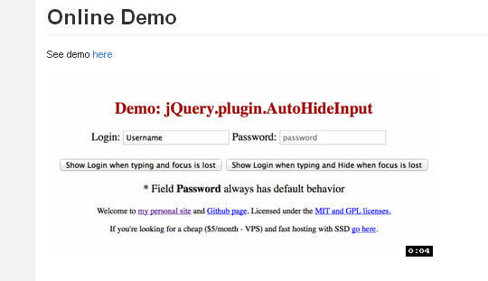
AutoHideInput
( Demo | Download )
AutoHideInput is a simple jQuery plugin that hides and shows the information entered by the user.
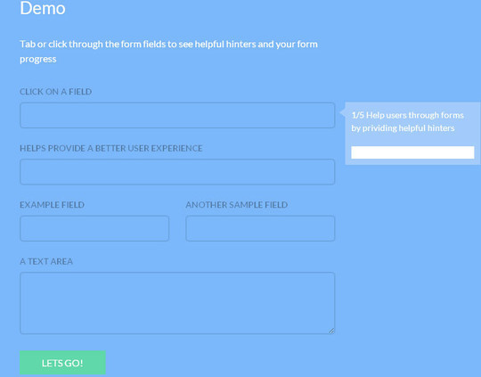
Progression.js
( Demo | Download )
A jQuery plugin that gives users real time hints & progress updates as they complete forms.
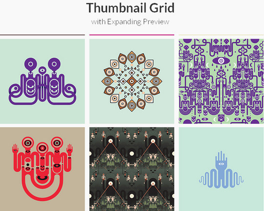
Thumbnail Grid with Expanding Preview
( Demo | Download )
A tutorial on how to create a thumbnail grid with an expanding image preview similar to the effect seen on Google Images.
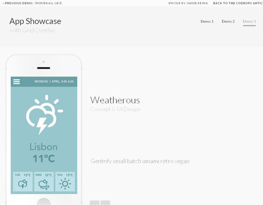
App Showcase with Grid Overlay
( Demo | Download )
A tutorial about creating a simple grid overlay with subtle transitions for an app showcase.
jQuery TourBus
( Demo | Download )
A light weight jQuery plugin that is a must have for any developer to easily create modal windows. Put focus on important elements by applying a mask to your page and opening a customizable pop up modal window.
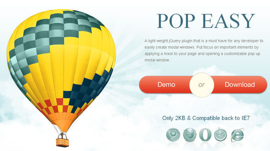
Pop Easy
( Demo | Download )
A light weight jQuery plugin that is a must have for any developer to easily create modal windows. Put focus on important elements by applying a mask to your page and opening a customizable pop up modal window.
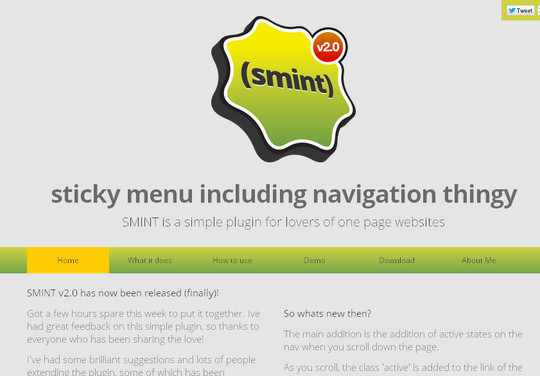
Smint : Sticky Menu with Smooth Scroll
( Demo | Download )
SMINT is a simple plugin for lovers of one page websites.
FlipClock
( Demo | Download )
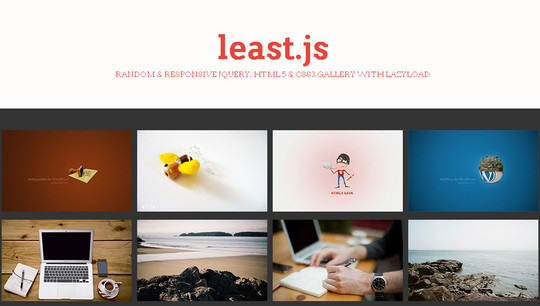
Least.js
( Demo | Download )
Random & Responsive jQuery, Html5 & Css3 Gallery with Lazyload.
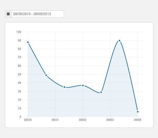
Making Chart
( Demo | Download )
Make Pretty Charts For Your App with jQuery and xCharts.
Read more: http://www.smashingapps.com/2013/09/10/40-fresh-jquery-plugins-to-make-your-website-user-friendly.html#ixzz2edYdgf3K


