
Most Popular jQuery Plugins of March 2013
http://www.moretechtips.net/2013/05/most-popular-jquery-plugins-of-march.html
1. jQuery-menu-aim

menu-aim is a jQuery plugin for dropdown menus that can differentiate between a user trying hover over a dropdown item vs trying to navigate into a submenu's contents.
2. iCheck

Highly customizable checkboxes and radio buttons with jQuery and Zepto. It provides Identical inputs across different browsers and devices and support for Touch devices.
3. windows

loosely-coupled jQuery plugin for full-screen scrolling windows.
4. Maplace.js
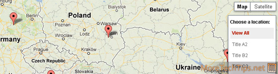
Maplace.js helps you to embed Google Maps into your website, quickly create markers and controls menu for the locations on map.
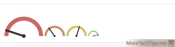
5. Donuts
6. MagicSuggest
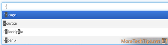
Auto-suggest combo box with bootstrap theme using jQuery.
7. Unslider

Unslider is a very simple jQuery Slider, still it comes with a range of options to customise it.
8. jQuery.Pin
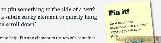
jQuery.Pin helps to pin any element to the top of a container. It can be also disabled for smaller screen-sizes where there's no room for it.
9. Photoset Grid

A simple plugin to arrange images into a flexible grid, based on Tumblr's photoset feature.
10. HCaptions

HCaptions enables you to display caption overlays with cool effects over images, div's, ect..
11. Navi.js
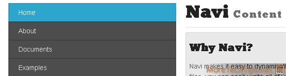
Navi makes it easy to dynamically display content on your sites. Instead of cluttering up your site tree with extra files, you can easily write all of your html code for multiple pages in one file.
12. JResponsive
JResponsive will organize your content in an efficient, dynamic and responsive layout. It can be applied to a container element and it will arrange its children in a layout that makes optimal use of screen space, by "packing" them in tightly.
13. Selecter

A plugin to replace default select elements with something a little nicer.
14. Trip.js
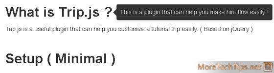
A light-weight jQuery plugin that can easily customize a 'tutorial trip'.
'프로그래밍 > Script' 카테고리의 다른 글
| [WEB] 20 jQuery Plugins for Creative Web Typography (0) | 2013.05.14 |
|---|---|
| [WEB] Ultimate Resources For Mobile Web Application Design (0) | 2013.05.12 |
| [WEB] Maplace.js - A small Google Maps Javascript helper. (0) | 2013.05.10 |
| JSDares — Learn JavaScript by programming games (0) | 2013.05.07 |
| [WEB] jQuery $(‘body’).on() vs $(‘document’).on() (0) | 2013.05.06 |


