OAuth는 OpenAPI로 개발된 표준 인증 방식으로, 각종 애플리케이션에서 사용자 인증을 거칠때 활용될 수 있다.
OAuth가 사용되기 전에는 인증방식의 표준이 없었기 때문에 기존의 기본인증인 아이디과 비밀번호를 사용하였는데, 이는 보안상 취약한 구조이다.
기본인증이 아닐 경우는 각 애플리케이션들이 각자의 개발한 회사의 방법대로 사용자를 확인하였다. 예를 들면 구글의 AuthSub, AOL의 OpenAuth, 야후의 BBAuth, 아마존의 웹서비스 API 등이 있다.
OAuth는 이렇게 제각각인 인증방식을 표준화한 인증방식이다. OAuth를 이용하면 이 인증을 공유하는 애플리케이션끼리는 별도의 인증이 필요없다. 따라서 여러 애플리케이션을 통합하여 사용하는 것이 가능하게 된다.
OAuth에 관련된 용어들
⊙ 사용자(user): 서비스 공급자와 소비자를 사용하는 계정을 가지고 있는 개인
⊙ 소비자(consumer): Open API를 이용하여 개발된 OAuth를 사용하여
서비스 제공자에게 접근하는 웹사이 트 또는 애플리케이션
⊙ 서비스 공급자(service provider): OAuth를 통해 접근을 지원하는 웹 애플리케이션
(Open API를 제공하는 서비스)
⊙ 소비자 비밀번호(consumer secret) : 서비스 제공자에서 소비자가 자신임을 인증하기 위한 키
⊙ 요청 토큰(request token) : 소비자가 사용자에게 접근권한을 인증받기 위해 필요한 정보가 담겨있으며
후에 접근 토큰으로 변환된다.
⊙ 접근 토큰(access token) : 인증 후에 사용자가 서비스 제공자가 아닌 소비자를 통해서 보호된 자원에
접근하기 위한 키를 포함한 값.
OAuth인증은 소비자와 서비스 공급자 사이에서 일어나는데 이 인증 과정은 다음과 같다.
1.소비자가 서비스제공자에게 요청토큰을 요청한다.
2.서비스제공자가 소비자에게 요청토큰을 발급해준다.
3.소비자가 사용자를 서비스제공자로 이동시킨다. 여기서 사용자 인증이 수행된다.
4.서비스제공자가 사용자를 소비자로 이동시킨다.
5.소비자가 접근토큰을 요청한다.
6.서비스제공자가 접근토큰을 발급한다.
7.발급된 접근토큰을 이용하여 소비자에서 사용자 정보에 접근한다.
http://oauth.net/
An open protocol to allow secure authorization in a simple and standard method from web, mobile and desktop applications.
Read the OAuth 2 specification »
The OAuth 2.0 authorization framework enables a third-party application to obtain limited access to an HTTP service.
For Consumer developers...
If you're building...
- web applications
- desktop applications
- mobile applications
- Javascript or browser-based apps
- webpage widgets
OAuth is a simple way to publish and interact with protected data. It's also a safer and more secure way for people to give you access. We've kept it simple to save you time.
For Service Provider developers...
If you're supporting...
- web applications
- mobile applications
- server-side APIs
- mashups
If you're storing protected data on your users' behalf, they shouldn't be spreading their passwords around the web to get access to it. Use OAuth to give your users access to their data while protecting their account credentials.
http://helloworld.naver.com/helloworld/24942
OAuth와 로그인
OAuth와 로그인은 반드시 분리해서 이해해야 한다. 일상 생활을 예로 들어 OAuth와 로그인의 차이를 설명해 보겠다.
사원증을 이용해 출입할 수 있는 회사를 생각해 보자. 그런데 외부 손님이 그 회사에 방문할 일이 있다. 회사 사원이 건물에 출입하는 것이 로그인이라면 OAuth는 방문증을 수령한 후 회사에 출입하는 것에 비유할 수 있다.
다음과 같은 절차를 생각해 보자.
나방문씨(외부 손님)가 안내 데스크에서 업무적인 목적으로 김목적씨(회사 사원)를 만나러 왔다고 말한다.
안내 데스크에서는 김목적씨에게 나방문씨가 방문했다고 연락한다.
김목적씨가 안내 데스크로 찾아와 나방문씨의 신원을 확인해 준다.
김목적씨는 업무 목적과 인적 사항을 안내 데스크에서 기록한다.
안내 데스크에서 나방문 씨에게 방문증을 발급해 준다.
김목적씨와 나방문씨는 정해진 장소로 이동해 업무를 진행한다.
위 과정은 방문증 발급과 사용에 빗대어 OAuth 발급 과정과 권한을 이해할 수 있도록 한 것이다. 방문증이란 사전에 정해진 곳만 다닐 수 있도록 하는 것이니, '방문증'을 가진 사람이 출입할 수 있는 곳과 '사원증'을 가진 사람이 출입할 수 있는 곳은 다르다. 역시 직접 서비스에 로그인한 사용자와 OAuth를 이용해 권한을 인증받은 사용자는 할 수 있는 일이 다르다.
OAuth에서 'Auth'는 'Authentication'(인증)뿐만 아니라 'Authorization'(허가) 또한 포함하고 있는 것이다. 그렇기 때문에 OAuth 인증을 진행할 때 해당 서비스 제공자는 '제 3자가 어떤 정보나 서비스에 사용자의 권한으로 접근하려 하는데 허용하겠느냐'라는 안내 메시지를 보여 주는 것이다. 다음의 화면 두 개는 각각 네이버와 미투데이에 접근 권한 요청이 있음을 알려 주는 화면이다. 미투데이의 경우에는 OAuth 인증 방식을 사용하지 않지만 인증 절차에 대한 예시 정도로 생각해 주기 바란다.

그림 1 네이버 OAuth 접근 권한 요청 화면

그림 2 미투데이 접근 권한 요청 화면
OAuth를 이용하여 사용자를 인증을 하는 과정을 OAuth Dance라고 한다. 두 명이 춤을 추듯 정확하게 정보를 주고받는 과정을 재미있게 명명한 것이다.
OAuth를 이해하려면 몇 가지 용어를 먼저 알아 두어야 한다. 다음 표에 OAuth의 대표 용어를 정리해 보았다.
표 2 OAuth 1.0 대표 용어
|
용어 |
설명 |
|
User |
Service Provider에 계정을 가지고 있으면서, Consumer를 이용하려는 사용자 |
|
Service Provider |
OAuth를 사용하는 Open API를 제공하는 서비스 |
|
Consumer |
OAuth 인증을 사용해 Service Provider의 기능을 사용하려는 애플리케이션이나 웹 서비스 |
|
Request Token |
Consumer가 Service Provider에게 접근 권한을 인증받기 위해 사용하는 값. 인증이 완료된 후에는 Access Token으로 교환한다. |
|
Access Token |
인증 후 Consumer가 Service Provider의 자원에 접근하기 위한 키를 포함한 값 |
다음은 OAuth 인증 과정을 그림으로 표현한 것이다.
OAuth 인증 과정을 그림으로 표현한 것이다.
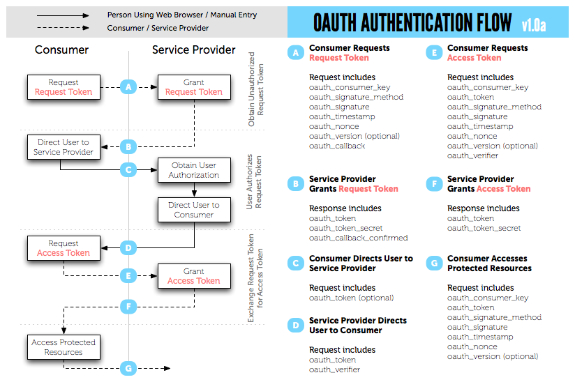
그림 3 OAuth 1.0a 인증 과정(원본 출처: http://oauth.net/core/diagram.png)
OAuth 인증 과정을 앞에서 설명한 회사 방문 과정과 연결하면 다음 표와 간다.
표 3 회사 방문 과정과 OAuth 인증 과정
|
회사 방문 과정 |
OAuth 인증 과정 |
|
1. |
나방문씨가 안내 데스크에서 업무적인 목적으로 김목적씨를 만나러 왔다고 말한다. |
Request Token의 요청과 발급 |
|
2. |
안내 데스크에서는 김목적씨에게 나방문씨가 방문했다고 연락한다. |
사용자 인증 페이지 호출 |
|
3. |
김목적씨가 안내 데스크로 찾아와 나방문씨의 신원을 확인해 준다. |
사용자 로그인 완료 |
|
4. |
김목적씨는 업무 목적과 인적 사항을 안내 데스크에서 기록한다. |
사용자의 권한 요청 및 수락 |
|
5. |
안내 데스크에서 나방문 씨에게 방문증을 발급해 준다. |
Access Token 발급 |
|
6. |
김목적씨와 나방문씨는 정해진 장소로 이동해 업무를 진행한다. |
Access Token을 이용해 서비스 정보 요청 |
위의 표에 따르면, Access Token은 방문증이라고 이해할 수 있다. 이 방문증으로 사전에 허락된 공간에 출입할 수 있다. 마찬가지로 Access Token을 가지고 있는 Consumer는 사전에 호출이 허락된 Service Provider의 오픈 API를 호출할 수 있는 것이다.
Request Token
OAuth에서 Consumer가 Request Token 발급을 요청하고 Service Provider가 Request Token을 발급하는 과정은 "저 나방문입니다. 김목적씨를 만날 수 있을까요?"라고 말하는 절차에 비유할 수 있다.
Request Token을 요청하는 Request 전문을 살펴보자. 다음은 네이버의 OAuth API로 Request Token을 요청하는 예이다.
|
1
2
3
4 |
GET /naver.oauth?mode=req_req_token&oauth_callback=http:
Accept-Encoding: gzip, deflate
Connection: Keep-Alive
Host: nid.naver.com
|
보기 쉽도록 위의 내용을 아래와 같이 매개변수를 기준으로 정리했다.
|
1
2
3
4
5
6
7
8 |
GET http:
oauth_callback=http:
oauth_consumer_key=WEhGuJZWUasHg&
oauth_nonce=zSs4RFI7lakpADpSsv&
oauth_signature=wz9+ZO5OLUnTors7HlyaKat1Mo0=&
oauth_signature_method=HMAC-SHA1&
oauth_timestamp=1330442419&
oauth_version=1.0 HTTP/1.1
|
Request Token 발급 요청 시 사용하는 매개변수는 다음 표와 같다.
표 4 Request Token 발급 요청 시 사용하는 매개변수
|
매개변수 |
설명 |
|
oauth_callback |
Service Provider가 인증을 완료한 후 리다이렉트할 Consumer의 웹 주소. 만약 Consumer가 웹 애플리케이션이 아니라 리다이렉트할 주소가 없다면 소문자로 'oob'(Out Of Band라는 뜻)를 값으로 사용한다. |
|
oauth_consumer_key |
Consumer를 구별하는 키 값. Service Provider는 이 키 값으로 Consumer를 구분한다. |
|
oauth_nonce |
Consumer에서 임시로 생성한 임의의 문자열. oauth_timestamp의 값이 같은 요청에서는 유일한 값이어야 한다. 이는 악의적인 목적으로 계속 요청을 보내는 것을 막기 위해서이다. |
|
oauth_signature |
OAuth 인증 정보를 암호화하고 인코딩하여 서명 값. OAuth 인증 정보는 매개변수 중에서 oauth_signature를 제외한 나머지 매개변수와 HTTP 요청 방식을 문자열로 조합한 값이다. 암화 방식은 oauth_signature_method에 정의된다. |
|
oauth_signature_method |
oauth_signature를 암호화하는 방법. HMAC-SHA1, HMAC-MD5 등을 사용할 수 있다. |
|
oauth_timestamp |
요청을 생성한 시점의 타임스탬프. 1970년1월 1일 00시 00분 00초 이후의 시간을 초로 환산한 초 단위의 누적 시간이다. |
|
oauth_version |
OAuth 사용 버전. 1.0a는 1.0이라고 명시하면 된다. |
oauth_signature 만들기
OAuth 1.0에서는 oauth_signature를 생성하는 것이 가장 까다로운 단계이다. 당연히 Consumer와 Service Provider가 같은 암호화(signing) 알고리즘을 이용하여 oauth_signature를 만들어야 한다.
oauth_sinature는 다음과 같이 네 단계를 거쳐 만든다.
1. 요청 매개변수를 모두 모은다.
oauth_signature를 제외하고 'oauth_'로 시작하는 OAuth 관련 매개변수를 모은다. POST body에서 매개변수를 사용하고 있다면 이 매개변수도 모아야 한다.
2. 매개변수를 정규화(Normalize)한다.
모든 매개변수를 사전순으로 정렬하고 각각의 키(key)와 값(value)에 URL 인코딩(rfc3986)을 적용한다. URL 인코딩을 실시한 결과를 <key>=<value> 형태로 나열하고 각 쌍 사이에는 &을 넣는다. 이렇게 나온 결과 전체에 또 URL 인코딩을 적용한다.
3. Signature Base String을 만든다.
HTTP method 명(GET 또는 POST), Consumer가 호출한 HTTP URL 주소(매개변수 제외), 정규화한 매개변수를 '&'를 사용해 결합한다. 즉 '[GET|POST] + & + [URL 문자열로 매개변수는 제외] + & + [정규화한 매개변수]' 형태가 된다. 이 예제에서는 'http://nid.naver.com/naver.oauth'을 URL로 사용하고, 이 URL에 URL 인코딩을 적용한 값을 사용했다.
4. 키 생성
3번 과정까지 거쳐 생성한 문자열을 암호화한다. 암호화할 때 Consumer Secret Key를 사용한다. Consumer Secret Key는 Consumer가 Service Provider에 사용 등록을 할 때 발급받은 값이다. HMAC-SHA1 등의 암호화 방법을 이용하여 최종적인 oauth_signature를 생성한다.
사용자 인증 페이지의 호출
OAuth에서 사용자 인증 페이지를 호출하는 단계는 '안내데스크에서 김목적씨에게 방문한 손님이 있으니 안내 데스크로와서 확인을 요청하는 것'에 비유할 수 있다. Request Token을 요청하면, Service Provider는 Consumer에 Request Token으로 사용할 oauth_token과 oauth_token_secret을 전달한다. Access Token을 요청할 때는 Request Token의 요청에 대한 응답 값으로 받은 oauth_token_secret을 사용한다. Consumer가 웹 애플리케이션이라면 HTTP 세션이나 쿠키 또는 DBMS 등에 oauth_token_secret를 저장해 놓아야 한다.
oauth_token을 이용해 Service Provider가 정해 놓은 사용자 인증 페이지를 User에게 보여 주도록 한다. 네이버의 경우 OAuth용 사용자 인증 페이지의 주소는 다음과 같다.
여기에 Request Token을 요청해서 반환받은 oauth_token을 매개 변수로 전달하면 된다. 예를 들면 다음과 같은 URL이 만들어 지게 되는 것이다. 이 URL은 사용자 인증 화면을 가리킨다.
로그인 화면을 호출하는 단계까지가 '안내 데스크에서 김목적씨에게 전화하는 단계'라 보면 되겠다. 이제 김목적씨가 안내 데스크로 와서 나방문씨를 확인해야 한다. 정말 나방문씨가 맞는지 아닌지 확인하는 과정이 필요할 것이다. 이 과정이 OAuth에서는 Service Provider에서 User를 인증하는 과정이라고 볼 수 있다.
인증이 완료되면 앞에서 말한 바와 같이 어떤 권한을 요청하는 단계에 이르게 된다. "업무 약속이 있어 오셨으니 나방문씨가 출입할 수 있게 해 주세요"와 같은 것 말이다.
인증을 마치면 Consumer가 oauth_callback에 지정한 URL로 리다이렉트한다. 이때 Service Provider는 새로운 oauth_token과 oauth_verifier를 Consumer에 전달한다. 이 값들은 Access Token을 요청할 때 사용한다.
Access Token 요청하기
OAuth에서의 AccessToken은 나방문 씨에게 지급할 방문증과 같다.
Access Token을 요청하는 방법은 Request Token을 요청하는 방법과 거의 같다. 다만, 사용하는 매개변수의 종류가 약간 다르고 oauth_signature를 생성할 때 사용하는 키가 다르다. Access Token 을 요청할 때에는 매개변수 oauth_callback는 없고, oauth_token와 oauth_verifer가 있다.
Request Token 발급을 요청할 때에는 Consumer Secret Key를 사용해 oauth_token_secret를 생성했다. Access Token 발급을 요청할 때에는 Consumer Secret Key에 oauth_token_secret을 결합한 값(Consumer Secret Key + & + oauth_token_secret)을 사용해 oauth_token_secret를 생성한다. 암호화 키를 변경하여 보안을 더 강화하는 것이다.
Access Token 발급을 요청할 때 사용하는 매개변수는 다음 표와 같다.
표 5 Access Token 발급 요청을 위한 OAuth 매개변수
|
매개변수 |
설명 |
|
oauth_consumer_key |
Consumer를 구별하는 키 값. Service Provider는 이 키 값으로 Consumer를 구분한다. |
|
oauth_nonce |
Consumer에서 임시로 생성한 임의의 문자열. oauth_timestamp의 값이 같은 요청에서는 유일한 값이어야 한다. 이는 악의적인 목적으로 계속 요청을 보내는 것을 막기 위해서이다. |
|
oauth_signature |
OAuth 인증 정보를 암호화하고 인코딩하여 서명 값. OAuth 인증 정보는 매개변수 중에서 oauth_signature를 제외한 나머지 매개변수와 HTTP 요청 방식을 문자열로 조합한 값이다. 암화 방식은 oauth_signature_method에 정의된다. |
|
oauth_signature_method |
oauth_signature를 암호화하는 방법. HMAC-SHA1, HMAC-MD5 등을 사용할 수 있다. |
|
oauth_timestamp |
요청을 생성한 시점의 타임스탬프. 1970년1월 1일 00시 00분 00초 이후의 시간을 초로 환산한 초 단위의 누적 시간이다. |
|
oauth_version |
OAuth 사용 버전 |
|
oauth_verifier |
Request Token 요청 시 oauth_callback으로 전달받은 oauth_verifier 값 |
|
oauth_token |
Request Token 요청 시 oauth_callback으로 전달받은 oauth_token 값 |
위의 표에 정의한 매개변수를 상황에 맞게 정의한 다음 Access Token을 요청하면 oauth_token과 oauth_token_secret을 전달받게 된다. Service Provider에 따라 사용자의 아이디나 프로필 정보 같은 것들이 반환되기도 한다.
Access Token 사용하기
드디어 방문증이 발급됐다. 이제 출입문을 통과하는 일만 남았다. 방문증을 가지고 출입문을 통과한다는 것은 User의 권한으로 Service Provider의 기능을 사용하는 것과 비슷하다. 다시 말해, 권한이 필요한 오픈 API를 호출할 수 있게 되는 것이다.
가령 네이버 카페에서 게시판 목록을 가져온다고 한다면 호출해야 하는 URL은 다음과 같다.
특정 User의 권한을 가지고 카페 게시판 목록 반환 URL을 요청해야 해당 User가 가입한 카페의 게시판 목록을 반환받을 수 있을 것이다. 이 URL을 호출할 때는 OAuth 매개변수를 함께 전달해야 한다.
다음은 Access Token을 사용해 오픈 API를 요청하는 예이다. HTTP 헤더에 Authorization 필드를 두었고, Authorization 필드의 값 부분에 OAuth 매개변수 적는다. Access Token을 사용할 때는 GET이나 POST가 아닌 HEAD 방식을 사용한다.
|
1
2
3
4
5
6 |
POST /cafe/getMenuList.xml HTTP/1.1
Authorization: OAuth oauth_consumer_key="dpf43f3p2l4k3l03",oauth_token="nSDFh734d00sl2jdk"
,oauth_signature_method="HMACSHA1",oauth_timestamp="1379123202",oauth_nonce="chapoH",oauth_signature="MdpQcU8iPSUjWoN%2FUDMsK2sui9I%3D"
Accept-Encoding: gzip, deflate
Connection: Keep-Alive
Host: http:
|
보기 쉽도록 Authorization 필드를 아래와 같이 매개변수를 기준으로 정리했다.
|
1
2
3
4
5
6 |
Authorization: OAuth oauth_consumer_key="dpf43f3p2l4k3l03",
oauth_token="nSDFh734d00sl2jdk",
oauth_signature_method="HMACSHA1",
oauth_timestamp="1379123202",
oauth_nonce="csrrkjsd0OUhja",
oauth_signature="MdpQcU8iPGGhytrSoN%2FUDMsK2sui9I%3D"
|
Access Token을 사용해 오픈 API를 호출할 때 사용하는 매개변수는 다음 표와 같다.
표 6 Access Token을 사용해 오픈 API를 호출 할 때 필요한 OAuth 매개변수
|
매개변수 |
설명 |
|
oauth_consumer_key |
Consumer를 구별하는 키 값. Service Provider는 이 키 값으로 Consumer를 구분한다. |
|
oauth_nonce |
Consumer에서 임시로 생성한 임의의 문자열. oauth_timestamp의 값이 같은 요청에서는 유일한 값이어야 한다. 이는 악의적인 목적으로 계속 요청을 보내는 것을 막기 위해서이다. |
|
oauth_signature |
OAuth 인증 정보를 암호화하고 인코딩하여 서명 값. OAuth 인증 정보는 매개변수 중에서 oauth_signature를 제외한 나머지 매개변수와 HTTP 요청 방식을 문자열로 조합한 값이다. 암화 방식은 oauth_signature_method에 정의된다. |
|
oauth_signature_method |
oauth_signature를 암호화하는 방법. HMAC-SHA1, HMAC-MD5 등을 사용할 수 있다. |
|
oauth_timestamp |
요청을 생성한 시점의 타임스탬프. 1970년1월 1일 00시 00분 00초 이후의 시간을 초로 환산한 초 단위의 누적 시간이다. |
|
oauth_version |
OAuth 버전 |
|
oauth_token |
oauth_callback으로 전달받은 oauth_token |
주의
Access Token을 이용해 요청할 때, Service Provider에 따라 realm이라는 매개변수를 사용해야 하는 경우도 있다. realm은 optional 매개변수인데, WWW-Authenticate HTTP 헤더 필드에서 사용하는 값이다.
OAuth 2.0
OAuth 1.0은 웹 애플리케이션이 아닌 애플리케이션에서는 사용하기 곤란하다는 단점이 있다. 또한 절차가 복잡하여 OAuth 구현 라이브러리를 제작하기 어렵고, 이런저런 복잡한 절차 때문에 Service Provider에게도 연산 부담이 발생한다.
OAuth 2.0은 이러한 단점을 개선한 것이다. OAuth 1.0과 호환성이 없고, 아직 최종안이 발표된 것은 아니지만 여러 인터넷 서비스 기업에서 OAuth 2.0을 사용하고 있다.
OAuth 2.0의 특징은 다음과 같다.
- 웹 애플리케이션이 아닌 애플리케이션 지원 강화
- 암호화가 필요 없음
HTTPS를 사용하고 HMAC을 사용하지 않는다.
- Siganature 단순화
정렬과 URL 인코딩이 필요 없다.
- Access Token 갱신
OAuth 1.0에서 Access Token을 받으면 Access Token을 계속 사용할 수 있었다. 트위터의 경우에는 Access Token을 만료시키지 않는다. OAuth 2.0에서는 보안 강화를 위해 Access Token의 Life-time을 지정할 수 있도록 했다.
이외에도 OAuth 2.0에서 사용하는 용어 체계는 OAuth 1.0과 완전히 다르다. 같은 목적의 다른 프로토콜이라고 이해는 것이 좋다. 하지만 아직 최종안이 나오지 않았기 때문에, 현재로서는 OAuth 2.0의 특징만 파악하는 것으로도 충분할 듯 하다.


