
반응형
토실토실 익어간다

반응형
'아침편지' 카테고리의 다른 글
| '거대한 가속'의 시대 (0) | 2024.10.08 |
|---|---|
| 두려울 게 없다 (1) | 2024.10.07 |
| 집단지성이 필요한 이유 (1) | 2024.10.04 |
| '돈이면 다'라고 생각하는 사람 (0) | 2024.10.04 |
| 내가 나를 의심하면 (0) | 2024.10.02 |
토실토실 익어간다
| '거대한 가속'의 시대 (0) | 2024.10.08 |
|---|---|
| 두려울 게 없다 (1) | 2024.10.07 |
| 집단지성이 필요한 이유 (1) | 2024.10.04 |
| '돈이면 다'라고 생각하는 사람 (0) | 2024.10.04 |
| 내가 나를 의심하면 (0) | 2024.10.02 |
"사람들은 당신이 무슨 말을 했는지, 무슨 일을 했는지 기억하지 못할 것이다. 그러나 당신이 그들에게 어떤 감정을 느끼게 했는지 기억할 것이다."
I've learned that people will forget what you said, people will forget what you did, but people will never forget how you made them feel.
미국의 시인 마야 안젤루 Maya Angelou
| 경험은 소와 같다. - 마우리시오 포체티노 (0) | 2024.12.26 |
|---|---|
| 존윅 4 명대사 (1) | 2024.11.19 |
| 진실이 거짓을 이기리라 (1) | 2024.09.30 |
| "인생은 자전거를 타는 것과 같습니다. 균형을 유지하려면 계속 움직여야 합니다." (1) | 2024.09.23 |
| " 웃어라, 세상이 너와 함께 웃을 것이다, / 울어라, 너 혼자만 울 것이다." - Old Boy (2) | 2024.09.12 |
대한민국 사회의 대립과
갈등의 진폭이 갈수록 커지는 이유 가운데
하나는 바로 쓰레기 정보와 가짜 뉴스에 휘둘리는
사람이 많아졌기 때문이다. 시민과 대중의 각성은
반드시 필요하다. 누구나 생각할 수 있는 권리가 있고,
그 생각을 표현할 수 있는 권리 또한 헌법에 보장되어
있다. 그러나 나쁜 의도로 퍼뜨리는 지식과 정보의
습득에 매몰되어 그것을 근거로 인식할 때
문제가 심각해진다.
- 김경집의《6I 사고 혁명》중에서 -
* 우리 사회의 큰 병폐가
이른바 쓰레기 정보와 가짜 뉴스입니다.
더 큰 문제는 그에 휘둘리는 사람들이 많다는
사실입니다. 여기에 더해 가짜를 열심히 퍼나르는 것을
업처럼 여기는 사람들도 많아졌습니다. 우리 사회의
기본 자산인 신뢰를 멍들게 하는 일입니다.
이제야 말로 깊은 성찰이 필요합니다.
더 멍들기 전에 집단지성이
발휘되어야 합니다.

| 두려울 게 없다 (1) | 2024.10.07 |
|---|---|
| 밤송이 (0) | 2024.10.07 |
| '돈이면 다'라고 생각하는 사람 (0) | 2024.10.04 |
| 내가 나를 의심하면 (0) | 2024.10.02 |
| 어린아이처럼 숨쉬기 (0) | 2024.10.01 |
살아있다는 것은
그 시간들을 통해 변화한다는 것입니다.
그 변화는 '나아짐'일 수도 있고 '나빠짐'일
수도 있습니다. 사람은 환경의 지배를 받는다고들
하는데 그래서인지 요즘 부쩍 '돈이면 다'라고 생각하는
사람이 많아지고 있습니다. 어떤 사람이 어떤 일을
한다고 할 때 그 사람이나 그 일을 궁금해하기보다
그 일을 하면 돈을 얼마나 버는가
궁금해하는 사람이 많습니다.
- 김흥숙의《쉿 (포스트코로나 시대의 성찰1)》중에서 -
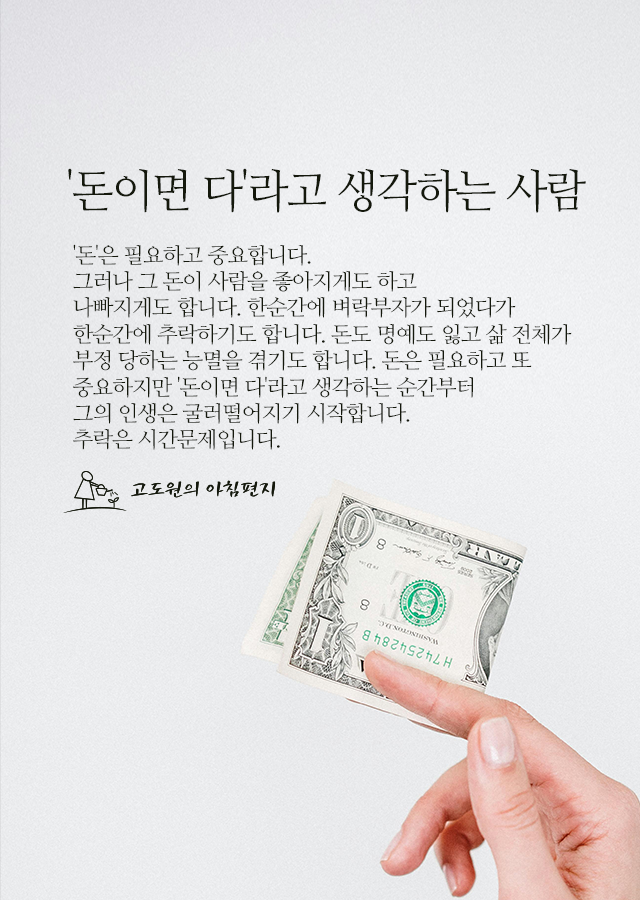
* '돈'은 필요하고 중요합니다.
그러나 그 돈이 사람을 좋아지게도 하고
나빠지게도 합니다. 한순간에 벼락부자가 되었다가
한순간에 추락하기도 합니다. 돈도 명예도 잃고 삶 전체가
부정 당하는 능멸을 겪기도 합니다. 돈은 필요하고 또
중요하지만 '돈이면 다'라고 생각하는 순간부터
그의 인생은 굴러떨어지기 시작합니다.
추락은 시간문제입니다.
| 밤송이 (0) | 2024.10.07 |
|---|---|
| 집단지성이 필요한 이유 (1) | 2024.10.04 |
| 내가 나를 의심하면 (0) | 2024.10.02 |
| 어린아이처럼 숨쉬기 (0) | 2024.10.01 |
| 배울 만한 독일의 진로 교육 (0) | 2024.09.30 |
네이버가 올해 11월부터 네이버플러스 멤버십 회원 대상으로 넷플릭스 이용권을 제공한다고 30일 밝혔다.

사진 제공 : 네이버
네이버와 넷플릭스의 제휴를 통해 네이버 멤버십 회원은 월 4900원의 구독료로 디지털 콘텐츠 혜택 중 하나로 '넷플릭스 광고형 스탠다드 요금제'를 선택해 이용 가능하다. ‘넷플릭스 광고형 스탠다드 이용권’은 Full HD, 동시 접속 2인, 모바일 게임 무제한, 콘텐츠 저장 등 스탠다드 요금제와 품질은 같으면서 콘텐츠 시청 시 일부 광고를 시청하게 되는 상품으로, 네이버플러스 멤버십 회원은 넷플릭스 광고형 스탠다드와 동일한 품질로 다양한 장르의 콘텐츠를 시청할 수 있다.
또한 네이버플러스 멤버십 회원에게는 넷플릭스 상품과 마찬가지로 업그레이드할 수 있는 옵션도 함께 제공된다. 구체적으로 8600원 추가 지불 시 스탠다드 요금제로 업그레이드, 12100원 추가 지불하는 경우 프리미엄 요금제으로 업그레이드 가능하다.
양사는 이번 제휴로 다양한 시너지 효과를 기대하고 있다. 네이버는 멤버십 회원에게 콘텐츠를 다수 제공하여 사용자 효용 가치를 높이고, 넷플릭스 네이버 멤버십 회원과 콘텐츠 상품의 접점을 확보하겠다는 전략이다.
네이버는 보도자료를 통해 “국내 IT 플랫폼 멤버십 서비스 중 넷플릭스 이용권을 제공하는 것은 네이버플러스 멤버십이 최초”라고 설명했다. 네이버와 넷플릭스는 사용자들의 만족도를 극대화하기 위한 다양한 협업도 모색할 계획이다.
네이버멤버십 정한나 리더는 “네이버 멤버십의 다양하고 유연한 혜택 설계는 사용자들의 선택권을 확대하고 체감 혜택을 향상시켜 높은 리텐션을 유지할 수 있는 배경으로, 이는 협업 파트너와 함께 성장하는 시너지로도 이어지고 있다”라며 “넷플릭스와 협력을 통해 멤버십 서비스의 콘텐츠 경쟁력과 다양성을 보다 강화하겠다”라고 말했다.
한편, 네이버플러스 멤버십과 넷플릭스 협업은 ▲배달 ▲영화관 ▲편의점에 이어 올해 네 번째 외부 제휴로, 네이버는 사용자들의 로열티 강화를 위해 외연 확장을 통한 혜택 다변화를 지속하고 있다. 네이버에 따르면, 네이버플러스 멤버십의 구독 유지율은 95%이다. https://www.ciokorea.com/news/351558
| 뛰어난 IT 임원을 구분 짓는 ‘무형’의 기술 6가지 (2) | 2024.10.10 |
|---|---|
| 장외채권 매도 (1) | 2024.10.08 |
| 메가존클라우드, 하나투어에 맞춤형 AI 챗봇 서비스 구현 발표 (3) | 2024.10.02 |
| “IT 임원직 면접을 앞둔 이들이 준비할 사항은...” 전문가들의 10가지 조언 (4) | 2024.10.02 |
| “AI 코딩 도구, 생산성 효과 거의 없다 번아웃에도 마찬가지”··· 업레벨 보고서 ‘눈길’ (0) | 2024.10.02 |
메가존클라우드가 생성형 AI 기술 기반 서비스로 하나투어의 고객 상담을 고도화하는 프로젝트를 성공적으로 완수했다고 30일 밝혔다.
하나투어는 지난 7월 메가존클라우드의 ‘GenAI360’을 적용해 'AI 채팅 상담 서비스'의 시범 운영을 개시한 바 있다. 이번 프로젝트는 해당 서비스를 고객 맞춤형 상담이 가능하도록 고도화하는 작업이다.
30일 정식 서비스에 들어간 이번 ‘AI 채팅 상담 서비스’는 고객들의 실제 예약 정보를 기반으로 맞춤 상담이 가능하도록 하는데 중점을 둔다. AI가 고객의 구체적 예약 정보를 바탕으로 상담을 이어갈 수 있도록 한다는 설명이다.
예를 들어 패키지 여행상품 예약 고객이 자신의 항공편이나 숙박, 여행일정, 출입국 정보, 여행지 날씨 등에 대해 문의할 경우 고객의 구체적 예약 정보를 통해 그에 해당하는 답변을 제공하는 방식이다. 이 서비스를 활용하면 여행중에도 언제든 다음 여행 일정, 숙소에서 제공하는 식사 메뉴 및 환승 교통 등을 AI 채팅을 통해 확인할 수 있다.
또, 기존에는 예약된 항공편을 취소할 때 발생하는 수수료 문의를 받을 경우 하나투어 웹사이트에 게시된 ‘예약 변경 및 취소/환불 통합 안내’ 페이지 링크를 답변으로 제공했으나 이번 고도화 작업의 결과로 고객의 예약 항공권에 대한 항공사 환불규정에 해당하는 구체적 환불 금액을 답변으로 제공할 수 있게 됐다.
이번 고도화 작업을 위해 메가존클라우드는 GenAI360 플랫폼을 적용해 하나투어의 방대한 데이터를 통합했다. 아울러 질문 의도 파악과 검색결과 정확도를 높이기 위해 AWS의 생성형 AI 플랫폼인 아마존 베드록(Amazon Bedrock)을 기반으로 앤스로픽의 클로드3 하이쿠(Anthropic Claude3 Haiku)와 소넷(Sonnet) 모델을 활용했다.
특히, 검색증강(RAG·Retrieaval-Augmented Generation) 기술을 적용해 패키지, 항공, 호텔 등 세부 예약정보와 함께 기존 채팅 상담 대화 이력을 연계 검색함으로써 답변 정확도를 크게 높였다고 메가존클라우드는 강조했다. 고
하나투어 관계자는 “지난 7월 이후 시범서비스를 이용한 3만명 이상의 질의를 바탕으로 데이터 학습을 강화하고 기능을 개선하면서 초개인화된 AI 채팅 서비스로 고도화할 수 있었다”라고 말했다.
메가존클라우드 AI&데이터 애널리틱스 센터 공성배 센터장은 “기존 인프라와 AI 기술을 통합함으로써 고객 맞춤형 AI 채팅 상담 서비스를 고도화할 수 있었다“라며 "고객 만족도와 서비스 효율성을 극대화하기 위해 AI 기술 기반 상담 서비스를 지속적으로 발전시켜 나갈 것”이라고 말했다. https://www.ciokorea.com/news/351530
| 장외채권 매도 (1) | 2024.10.08 |
|---|---|
| “구독 유지율 95%” 네이버플러스 멤버십··· 넷플릭스 이용권 무료 제공으로 외연 확장 (3) | 2024.10.02 |
| “IT 임원직 면접을 앞둔 이들이 준비할 사항은...” 전문가들의 10가지 조언 (4) | 2024.10.02 |
| “AI 코딩 도구, 생산성 효과 거의 없다 번아웃에도 마찬가지”··· 업레벨 보고서 ‘눈길’ (0) | 2024.10.02 |
| “아마존 직원 73%, 사무실 복귀 명령으로 이직 고려” 블라인드 조사 (0) | 2024.10.02 |