일부 과학자들은 항생제에 내성을 가진 감염 때문에 2050년까지 3억 명의 인구가 목숨을 위협받고 세계 경제에 100조 달러의 부담을 안길 것이라 예상한다. 박테리아는 그저 항생제에 저항하기만 하는 게 아니라 그것을 먹잇감으로 삼는 경향까지 보인다. 어떻게 그럴까?
- 프레드 프로벤자의 《영양의 비밀》 중에서 -
* 박테리아 같은 미생물들은 인간이 생각하는 것보다 휠씬 무섭고 '지혜로운' 존재인 듯합니다. 그들은 고도의 의식 체계를 갖추고 있으며, 어쩌면 우리보다 한걸음 더 빨리 진화하고 있는지도 모릅니다. 그러니 그들을 싹 없애야 하는 적으로 간주할 것이 아니라 함께 공생해 가는 길을 모색할 필요가 있지 않을까 생각해 봅니다.
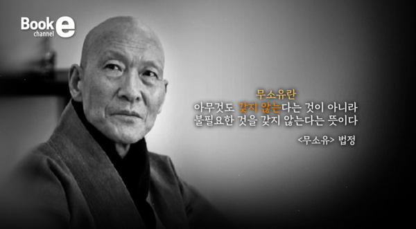
무소유란 아무것도 갖지 않는다는 것이 아니다. 궁색한 빈털털이가 되는 것이 아니다 무소유란 아무것도 갖지 않는 것이 아니라 불 필요(과욕 ,욕심)한것을 갖지 않는다는 뜻이다 무소유의 진정한 의미를 이해할 때 우리는 보다 홀가분한 삶을 이룰 수 있다.
우리가 선택한 맑은 가난은 넘치는 부보다 훨씬 값지고 고귀한 것이다. 이것은 소극적인 생활태도가 아니다. 지혜로운 삶의 선택이다.
우리가 만족함을 모르고 마음이 불안하다면 그것은 우리가 살고있는 세상과 조화를 이루지 못하기 때문이다. 내마음이 불안하고 늘 갈등상태에서 만족할줄 모른다면그것은 내가 살고있는 이세상과 조화를 이루지 못하기 때문이다.
우리는 우리주위에 있는 모든 것의 한부분이다. 저마다 독립된 개체가 아니라 전체의 한 부분이다. 우리 한사람 한사람이 세상의 한 부분이다. 세상이란 말과 사회란 말은 추상적인 용어이다. 구체적으로 살고있는 개개인의 구체적인 사회이고 현실이다.
우리는 보이든 보이지않든 혈연이든 혈연이 아니든 관계 속에서 서로 얽히고 설켜서 이루러진 것이다. 그것이 우리의 존재이다.
이 세상에서 영원한 것은 아무것도 없다. 어떤 어려운일도 어떤 즐거운일도 영원하지 않다 모두 한 때이다.
한 생애를 통해서 어려움만 지속된다면 누가 감내하겠는가 다 도중하차 하고 말 것이다. 모든 것이 한 때이다 좋은일도 그렇다 좋은일도 늘 지속되지는 않는다. 그러면 사람이 오만해진다.
어려운 때일 수록 낙천적인 인생관을 가져야 한다. 덜 가지고도 더많이 존재할 수 있어야 한다. 이전에는 무심히 관심갖지않던 인간관계도 더욱 살뜰이 챙겨야 한다.
더 검소하고 작은 것으로써 기쁨을 느껴야 한다. 우리 인생에서 참으로 소중한 것은 떤 사회적이 신분이나 지위, 소유물이 아니다. 우리들 자신이 누구인지를 아는 일이다.
나는 누구인가? 스스로 물어야 한다. 이런 어려운 시기를 당했을 때 도대체 나는 누구지? 나는 누구인가 스스로 물어야 한다.
우리가 지니고있는 직위나 돈이나 재능이 중요한 것이 아니라 그것으로써 우리가 어떤일을 하며 어떻게 살고있는가에 따라서 삶의가치가 결정된다.
잡다한 정보와 지식의 소음에서 해방되려면 선 침묵의 의미를 알아야 한다. 침묵의 의미를 알지못하고는 런 복잡한 얽힘에서 벗어날 길이 없다. 나 자신이 침묵의 세계에 들어가 봐야한다. 우리는 얼마나 일상적으로 불필요한 말을 많이 하는가 미없는 말을 하루동안 수없이 남발하고있다.
친구를 만나서 예기할 때 유익한 말보다는 하지않아도 말들을 얼마나 많이 하는가 말은 가능한한 적게 하여야 한다. 한마디로 충분할 때는 두마디를 피해야한다.
인류 역사상 사람답게 살아간 사람들은 모두 결같이 침묵과 고독을 사랑한 사람들이다 그렇지 않아도 시끄러운 세상을 우리들 자신마져 소음이 되어 시끄럽게 할 필요는 없는 것이다.
많은 사람들이 무엇인가 열심히 찾고 있으나 묵속에 머무는 사람들만이 그것을 발견한다. 말이 많은사람은 누구를 막론하고 그가 어떤일을 는 사람이든간에 그 내부는 비어있다.
경영진이 긴 프로젝트 일정, 불명확한 요구사항, 마감 기한 미준수에 지쳐 있을 때, 애자일은 더 빠른 구현, 높은 유연성, 비즈니스 요구사항과의 긴밀한 연계를 보장해 전략을 신속히 실현하고 ROI를 높일 해결책처럼 보였다. 하지만 현재 많은 기업이 가시적인 성과 부족에 실망하며 애자일 팀을해체하고 있다.
애자일의 실패는 방법론 자체의 문제가 아니었다. 진짜 문제는 조직 내부 깊숙이 자리 잡은 전략과 실행의 불일치였다. 전략과 실행을 연계하지 못하면 애자일, 워터폴, 하이브리드 등 어떤 구현 방식도 근본적인 문제를 해결할 수 없다. 애자일이나 다른 접근 방식의이점을 누리려면 기업은 전략을 정의하고 실행하는 방식부터 개선해야 한다. 조직의 애자일 전환이 실패하는 5가지 이유를 소개한다.
방법론에 치중하고 전략에 소홀
애자일 전환을 시도하는 대부분의 조직은 데일리 스탠드업, 스프린트 계획, 회고, 제품 백로그와 같은 방법론에 지나치게 집중한다. 이런 애자일 관행은 이니셔티브 수행 구조를 제공하지만 더 깊은 문제는 해결하지 못한다. 진정한 과제는 실행 방법이 아니라 전략과 실행을 연계해 목표 비즈니스 성과를 달성하도록 보장하는 일이다.
애자일은 잘못 설정된 전략이나 리더십 팀의 전략 표현 및 실행 연계 능력을 개선할 수 없다. 전통적인 프로젝트 관리처럼 애자일은 단순히 도구이자 수단일 뿐, 그 자체가 목적이 아니다. 전략이 명확하지 않고, 우선순위가 정해지지 않았으며, 제대로 전달되지 않는다면 아무리 의도가 좋은 애자일 팀도 어려움을 겪을 수밖에 없다. 이들은 경영진이 기대하는 비즈니스 가치를 창출하지 못한 채 끊임없이 반복한다. 문제는 일하는 방식이 아니라 일하는 내용에 있다.
잘못된 우선순위와 리소스 혼란
사람들은 흔히 애자일이 리소스 충돌과 팀 효율성 문제를 자동으로 해결해 준다고 오해한다. 하지만 리더십이 전략적 우선순위를 명확하게 설정하지 않으면 애자일은 오히려 혼란을 가중시킨다.
애자일 팀이 스프린트 단위로 결과물을 내더라도, 조직이 이니셔티브의 우선순위를 정하지 않으면 리소스는 여전히 중요도가 낮은 프로젝트에 분산된다. 팀은 끊임없이 작업을 전환하고 새로운 우선순위를 쫓아다니며 실제로 작동하지 않는 결과물을 제공하기 쉽다.
애자일은 이 문제를 해결할 수 없다. 어떤 방법론도 마찬가지다. 해결책은 리더십의 명확한 우선순위 설정이다. 다시 말해 어떤 프로젝트가 중요하고 어떤 프로젝트를 기다릴 수 있는지 결정해야 한다. 이는 리소스 관리가 아니라 우선순위 설정 문제다. 모든 일을 한꺼번에 하려고 하면 어느 하나도 제대로 할 수 없다.
완벽주의의 함정
애자일 팀은 반복에 갇혀 실질적인 진전 없이 프로세스나 기능을 개선하는 데 매몰될 위험이 있다. 완벽한 코드 작성이나 요구사항 목록 완성과 같은 산출물에 집착하다 보니 비즈니스 가치 창출이 지연된다.
많은 팀이 애자일 전문성을 인정받아 채용됐기 때문에 결과 도출보다는 방법론을 따르는 데 가치가 있다고 믿는다. 진정한 성공이 무엇인지 명확하게 이해하지 못하면 프로세스 완벽주의의 순환에 빠진다. 그러면 애자일이 의미 있는 성과를 달성하기보다는 프레임워크를 준수하는 데만 치중하게 된다.
사고방식 전환의 부재
애자일이나 다른 방법론의 진정한 잠재력을 끌어내려면 사고방식의 명확한 전환이 필요하다. 리더는 조직이 달성하려는 목표를 분명히 해야 한다. 프로젝트가 완료됐을 때 성공이란 어떤 모습이며, 비즈니스 목표에 미칠 영향은 무엇일지 파악해야 한다. 핵심 성과 목표를 정의하면 유능한 팀은 획일적인 프로세스를 따르지 않고도 목표에 도달하는 최선의 방법을 찾아낼 수 있다.
전략과 실행의 분리
애자일은 전략과 실행을 분리해 생각하지 않을 때만 효과가 있다. 하지만 대부분의 조직은 이를 별개의 단계로 취급한다. 전략은 경영진이 정의하고 이를 딜리버리 팀에게 전달해 실행하게끔 한다. 처음부터 연계가 없다면 아무리 좋은 구현 방법이라도 성공하기 어렵다. 전략이 명확히 정의되고, 효과적으로 전달되며, 생산적인 방식으로 실현되도록 하는 데 아무도 집중하지 않기 때문이다.
애자일이 성공하려면 전략, 실행, 실현을 연속 및 반복되는 프로세스로 통합해야 한다. 비즈니스 목표를 명확히 정의하고, 실행에 참여하는 모든 사람이 목표를 이해하며, 프로세스가 아닌 결과로 성공을 측정해야 한다. 모든 구성원이 성과를 중심으로 하면, 애자일은 실행을 간소화하고 더 빠르게 가치를 창출할 수 있다.