20 Resources for Beginner Designers & Developers
http://webdesignledger.com/resources/20-resources-for-beginner-designers-developers
Getting started in the world of design can be both thrilling and intimidating. Sometimes, you feel like you just don’t have the tools or skills you need to complete even the most basic projects. At other times, your mind is just buzzing with a multitude of ideas, but you may not have the best way to organize them. Yet, throughout the process of becoming a designer you will grow and expand both as a person, artist and designer.
Design is the method of putting form and content together. Design, just as art, has multiple definitions; there is no single definition. Design can be art. Design can be aesthetics. Design is so simple, that’s why it is so complicated. – Paul Rand
The key to starting out a successful career in design, is creating your own toolkit. This toolkit should be an array of design resources that help you transform a blank canvas into something incredible. Today, we’ve compiled 20 of the best design resources out there for anyone starting out in the world of design. Here you’ll find design tools, as well as useful websites to help you complete design projects, gain inspiration, and become an awesome designer.
1. Lorem Ipsum Generators: For many of your design projects you’re going to want to know how text is going to look. You’ll normally see lorem ipsum text on website designs available for use and purchase so you can see how text would look on the site. Will the color scheme work well? Can you see the text? Is the text big enough? A lorem ipsum generator gives you a large amount of text to incorporate in your designs so you don’t have to come up with it yourself.
Here are some useful and funny lorem ipsum generators you can use for testing out the look and feel of your designs:
Hipster Ipsum

Cupcake Ipsum

One-Click Lorem Ipsum Generator

2. Icon Sets: As a designer, you’re going to need to be both versatile and quick when it comes to designing for clients. Sometimes you might not have the time to craft something entirely yourself, or may find that you’re missing a certain element. Having icon sets can help you create ads, banners, blog headers, campaign images, and web design in a snap. Use the icons to highlight important information, as part of background images, and for CTAs.
You should start out by playing around with icon sets from a single bundle and try coming up with all the ways you can use them. From there, try using icon sets of different styles and figuring out ways of incorporating them into different designs.
Cosmos Set (1471 Icons) by IcoJam

600 Stroke Vector Icons by Zlate

Flatties

The Ultimate Pack

UI Icons

Hand-Drawn Icons

3. Color Scheme and Color Palette Resources: When you’re just starting out with design you’re going to want to understand how colors work together, and which colors are right for certain projects.
Here are some sites to help you better understand how to use color in your designs:
- COLOURlovers: Browse palettes and create your own, discover new colors, and cool color combinations all in one site.
- HEX to RBG Converter: Know how to convert your colors for different purposes and color schemas.
- 0 to 255: This tool lets you select a color, or find a random color and then find variations of that color.
- Colorrrs: Discover random colors with the click of a button.

Interested in learning more about color? Check out these articles:
- Inspiring Examples of Color in Web Design: Greens and Blues
- Making Color Considerations for Mobile Design
Recommended books to help you better understand color and design:
- Color Design Workbook: A Real World Guide to Using Color in Graphic Design
- Design Elements, Color Fundamentals: A Graphic Style Manual for Understanding How Color Affects Design
4. Smashing Magazine: If you’re interested in coding, mobile design, web design, and UX/UI Smashing Magazine is a great place for beginners and veteran designers. You’ll find new articles every day related to design and development, along with books, workshops and a job board.

Here, are some articles you may enjoy from Smashing Magazine:
- Introducing Responsive Web Typography With FlowType.JS
- Designing For Emotion With Hover Effects
- 50 New Useful CSS Techniques, Tools and Tutorials
5. Bounce: This tool lets you look at different elements of any webpage and make comments, highlight a specific area, and share with others. It’s a great way to look at what other people are doing on the web and state what you like, what you don’t like, and what you would change. Bounce let’s you better understand other people’s websites so you can make your sites optimized for whatever you need.

6. Useful Design Checklists: It’s hard to put these items into one section, but I think one very important tool for beginning designers is having a checklist. A checklist can help you make sure that you’ve done everything you’ve needed for a project, that your design is user friends, that your design looks good, and more. Here are some of my favorites:
- Questions to ask clients before designing a website
- 22 Questions to Ask Before Developing a Website
- 42 Questions Every Freelancer Should Ask Their Clients
- How to Create an Effective Web Design Questionnaire
- Web Design Best Practices Checklist
- Quick Usability Checklist
- 25-point Website Usability Checklist
- A Website Design & Development Project Checklist / Template
- 15 Essential Checks Before Launching Your Website
- 50 Questions to Evaluate the Quality of Your Website
7. Moqups: Need help with wireframing? Moqups is an HTML 5 app that can be used for wireframing, mockups, and laying out user interface elements. Moqups also features collaboration tools that allow others to look at what you’ve created, offer advice and crticism and help your project become even better.

8. Take Courses: If you’re just starting out in the world of design and development, sometimes taking a course can help you fill in any gaps in your knowledge and help get you started to being able to create and design the things you’ve only ever dreamed of.
There are numerous places to take courses, and you can look at your nearest college or university, or you can check out these resources to learn online:
- CodeAcademy: Learn to code, interactively online.
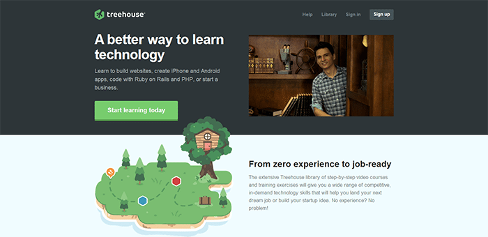
- Treehouse: Take courses in web design and development, learn to build websites and smartphone apps, and even start your own freelance business with Treehouse.
- Teach Yourself Graphic Design: An online self-study course to help you learn the basics of graphic design.
- HOW Design University: Online courses and workshops for budding designers and freelancers.
- Udemy Design Courses: Select graphic design courses based on what you want to learn and be able to create.
9. Objects and Illustrations: Every designer, especially those just starting out needs resources to help create designs faster that look incredible. You can incorporate ready-made design resources like arrows, flourishes, banners, and borders to decrease the amount of work you have to do.
Here are some of our favorite resources:

 120 Decorative Shapes for PS and AI


10. Pattern Tap: Ever just want to look at what other people are doing when it comes to different areas of their website. Pattern Tap showcases everything from buttons to UI to headers and footers. It’s a great way to browse what other people are doing around the web to get inspiration for your own designs.
11. Firebug: At some point during your process of growing and developing as a designer you’re going to want to check out what other people are doing when it comes to web design and development. Firebug is a free tool that integrates with Firefox, and lets you inspect and edit the HTML of websites. For example, you may wonder what’s making a website look a certain way. Firebug lets you inspect the code that creates the look and feel of a web page. It’s a handy tool every beginning designer should become familiar with.

12. Superhero.js: Both the creation and maintenance of expansive Javascript code can be difficult. Superhero.js has curated a number of resources to help you get on your way when it comes to Javascript. It’s a great resource for beginners and helpful to get you started.

13. Harvest: It’s extremely important to manage your time, keep track of hours, and be accurate with expense reporting when you’re just starting out. If you start out by using a software or program to monitor the work you’ve done, you’re more likely to stay organized and manage your work for clients well in the future. Harvest helps you manage your projects, track the time spent doing certain parts of your project, and helps you with invoicing clients.
14. Primer: This is a great tool for beginning designers looking to get into development. Primer allows you to copy and paste HTML into a doc, and then click the button and you get a basic CSS sheet based on the styles and classes you used in your HTML. It’s a great way to learn CSS and understand HTML vs CSS.

15. Tools for Responsive Design: You’re going to need to understand and be able to create responsive friendly designs if you’re going to world in the world of the internet. Having tools to help you create responsive design is important. Check out 12 Helpful Tools for Responsive Web Design and Top 10 Responsive Web Design Tools to get your designs responsive-ready.
16. Google Fonts: If you’re looking to use fonts on your website, or just understand how fonts work on the internet, Google Fonts is a great tool to see trending fonts, understand how fonts look on the web check out what text looks like with different typefaces.
17. Background, Texture, and Pattern Sets: When it comes to design you’re going to need a wide variety of backgrounds and textures to incorporate into your designs. It’s good to have hundreds of items that you can use and change for different design projects. You can combine backgrounds and textures to create new looks, and incorporate patterns into different areas of print and web design. Here are some of our favorite sets for your design use:
 Textured Watercolor Backgrounds

 200 Blurred & Noisy Backgrounds

18. Gridwax: This easy to use bookmarklet allows you to add a grid overlay to your website to help you make sure everything is aligned and looks just how you want it to.

19. Launchlist: It’s important to make sure you have everything finished, complete, and ready to go when you’re about to publish a new design or submit something to a client. Launchlist is a tool that helps people in the area of web design and development to check their work before publishing. When you’re just starting out, it’s important to make sure you have all your bases covered and that you know your designs are complete. This tool will help you make sure you complete your projects with ease, and that you didn’t forget anything.

20. Font Resources for Designers: Every designer, no matter what skill level, should have a number of fonts in their design toolkit. When you’re just starting out, you’ll want to spend a lot of time playing with fonts, seeing fonts look combined together, and what fonts look best for print and web.
You’re going to want your toolkit to contain fonts of different styles including: display fonts, script fonts, serif fonts, san-serif fonts, and unique fonts to play with and get used to using together in your designs.
Here are some fonts to get your toolkit started:
Stay Gold Script & Web Font by Decade Type Foundry

Lunchbox by Kimmy Design

Nueva York by Ed J Brown

Mocha Mattari

Church in the Wildwood

Black Velvet

Dirty Flamingo

'프로그래밍 > Style & Design' 카테고리의 다른 글
| Google Web Designer (0) | 2013.10.02 |
|---|---|
| Listamatic: Browsers support chart . UL - style . 브라우저 적용별로 정리되어있는 사이트 (0) | 2013.09.27 |
| 페르소나, 퍼소나 (persona) (0) | 2013.09.27 |
| http://html5hub.com/ (0) | 2013.09.25 |
| [HTML] HTML5: A Look Behind the Technology Changing the Web (0) | 2013.09.25 |