반응형
반응형
Device maker resolution X resolution Y X x Y
KindleFire HD Amazone 800 1280 800 x 1280
iPhone 3 GS Apple 320 480 320 x 480
iPhone 4, 4S 640 960 640 x 960
iPhone 5 640 1136 640 x 1136
iPad 768 1024 768 x 1024
iPad 2 768 1024 768 x 1024
iPad 3(New iPad) 1536 2048 1536 x 2048
Nexus one Google 480 800 480 x 800
Nexus 7 800 1280 800 x 1280
Desire Pop, htc legend htc 320 480 320 x 480
Desire, Desire HD 480 800 480 x 800
Optimus one LG 320 480 320 x 480
Optimus Z, Q, Mach 480 800 480 x 800
Optimus G 768 1280 768 x 1280
motoroi ( QRTY, GLAM, DEFY) motorola 480 854 480 x 854
Vega racer 2, 3 pantech 720 1280 720 x 1280
Galaxy S, S2, U, K, A Samsung 480 800 480 x 800
Galaxy S2 LTE 480 800 480 x 800
GalaxyTab 600 1024 600 x 1024
Galaxy S2 LTE HD 720 1280 720 x 1280
Galaxy S3 720 1280 720 x 1280
GalaxyNote 2 720 1280 720 x 1280
GalaxyNote 800 1280 800 x 1280
GalaxyNote 10.1 800 1280 800 x 1280
GalaxyTab 10.1 800 1280 800 x 1280
GalaxyTab 7.7 LTE 800 1280 800 x 1280
GalaxyTAb 8.9 800 1280 800 x 1280
Galaxy S4 1080 1920 1080 x 1920
Vega, SIRIUS, miracle, iZar SKY 480 800 480 x 800
Xperia X10 mini, pro Sony 240 320 240 x 320
Xperia X10 480 854 480 x 854
해상도 GCD 비율 X 비율 Y
1080 x 1920

120

9

16

1536 x 2048

512

3

4

240 x 320

80

3

4

320 x 480

160

2

3

480 x 800

160

3

5

480 x 854

2

240

427

600 x 1024

8

75

128

640 x 1136

16

40

71

640 x 960

320

2

3

720 x 1280

80

9

16

768 x 1024

256

3

4

768 x 1280

256

3

5

800 x 1280

160

5

8


반응형
반응형

The answer is simple – Responsive Web Design

For those who are totally new to the concept, Responsive Web Design is a design technique that thoroughly focuses on a user’s environment and behavior based on the orientation and size of his screen as well as the platform. This methodology integrates a blend of cleverly laid out grids and images combined with the smart usage of CSS Media Queries. What happens is that, when a user switches from his desktop or laptop screen to his iPad or iPhone, the website will automatically itself to fit the device’s screen.

In a nutshell, you could say you are empowering a website with a kind of artificial intelligence which lets it respond to the user’s environment. Responsive Web Design has gained tremendous popularity in the Web Design World as it eliminates the need of having different development and design phases for every different gadget in the Industry.

So if you are looking for inspiration for your next website, you should look at these fresh and stylish responsive design layouts (in no particular order) which cover a wide range of companies and design strategies. Here, we will focus on the mobile side of these responsive websites and try to take a look at what practices make these websites an inspiration to everyone who’s looking to transform their web design to function across multiple platforms and devices.

1. Sony

%tutke

Sony manages to get everything right in their elegantly designed website. My favorite part of their responsive design approach was seeing the way their navigation bars change when switching from desktop to mobile devices. On a mobile device, the main navigation menu will change places with the social media buttons. The menus also compact themselves into a single drop down button where the different pages can be accessed easily.

2. Starbucks

%tutke

Starbucks is unarguably one of the biggest retailers in the world and it was one of the first to make the jump to responsive web design. The minute you switch to mobile from desktop on this website, you get the feeling that they have a sizable team with a substantial budget working on the transformation. The first noticeable thing was that the initial breakpoint arrives at the 769px mark (I assume this has been done to accommodate the portrait orientation of tablets). The best thing about the design is that the navigation adapts itself automatically across different breakpoints. For example, at the largest breakpoint, the top level menu allows you to jump across two levels of navigation for viewing a page.

3. Aids.gov

aids.gov

Aids.gov‘s website is probably the first US government website that has made the switch to responsive web design. I noticed that they use the HTML5 doctype without the use of any additional HTML5 elements like articles, headers or sections. Specific attention has been paid to the website for how it is viewed by users on Windows IE Mobile 7. Aids.gov employs the standard responsive web design approach as the website was redesigned from scratch. The theory lies in working with the smallest screen size and resolution first and then building up the additional required CSS code as the breakpoints are increased. Responsive images have been incorporated to make the website more visually appealing with special emphasis on how the script dynamically recalculates the appropriate height and width of each image based on the screen size.

4. Dairy Queen

dairyqueen

If you want to feast your eyes on one of the most perfect examples of responsive web design, head over to the Dairy Queen’s official website. One of the best things about the design is the fluid slider motion for mobile devices. There is a strong emphasis on how visible the content is to users across multiple devices and screen sizes. The main navigation menu wraps up into a smart drop down box at the first breakpoint allowing users to easily navigate the different food categories. All in all, the website is a visual treat and a perfect execution of elegant and efficient responsive web design.

5. Alsacreations

alsacreations

This is one website that has taken a different responsive web design approach than most websites present on the Internet. Alsacreations doesn’t worry about maintaining all their elements and aspects of their desktop website when a reader switches to tablet or mobile. Instead, Alsacreations drops their image slider from widescreen display to square and even more, when the readers switch to mobile they will not be able to see any of the original elements except for the About button and the Email form in addition to the links for all other elements. This has been done keeping the views of the specific target audience in mind where the creators have kept in mind that most users opening websites from their mobile devices do it to get the brief company information only.

6. Gravitate

gravitate

It wouldn’t be fitting to have a design studio website without responsive website design on their own page, right? Even if you are a lone freelancer, you would want your website to reflect your design skills and portfolio and this is exactly the approach that Gravitate Design Studio has incorporated into their website. They have kept and simple yet elegant design without going over the top on borders or shadowing or other flashy elements. The menu buttons on the top compact and nicely re-arrange themselves when you switch to mobile giving users to access to every page on the website.

7. Spigot

spigot

This is another web design and development company that has flawlessly perfected the art of responsive web design for their website. Going through the pages, you cannot deny the fact that the entire layout has been designed to work without any errors on desktop and mobile devices. You would expect that the shifting and animated icons would lose their touch on mobile devices, but this is not the case with Spigot. Although it would have been difficult to make this design work across all devices yet they have pulled it off magnificently setting a truly inspiring example for others in the field.

8. Disney

disney

Entertainment giants Disney have a website which is a perfect example of coherent designing across all devices and platforms. Smaller resolution doesn’t necessarily mean that you have to compromise on content. The beauty of this responsive design is that the focus stays always on the content that matters. Photos and Videos are the main focus of attention whether you open it on a mobile device, tablet or your PC. However the only drawback from usability point of view on mobile devices is that the navigation doesn’t have direct access in mobile version and you have to make up for it with an extra click.

9. Food Sense

food-sense

Another excellent example of sharp responsive web design techniques is Food Sense. It uses wide screen resolutions to the maximum but when limited by width on mobile devices, it adjusts brilliantly by managing to still maintain its smooth flow and tidy outlook. However, one drawback I noticed with the Mobile version was the loss of the latest Tweets and Facebook plugin which can be seen on the full version under the navigation bar on the side column.

10. Skinny Ties

skinny-ties

There is no better definition of perfect responsive web design execution than Skinny Ties. The design is even more impressive considering that it was a complex website – an ecommerce one. You will find a unique navigation experience across all breakpoints and viewpoint resolutions but the best thing about is its exceptionally responsive handling on mobile devices. Despite the use of the hovering function on touch devices, all visual aspects remain intact.

11. Coca Cola

coca-cola

Soft Drinks giant Coca-Cola made their entry into the fast changing web design world with one of the most complicated responsive web designs I have come across so far. One of the noticeable features is how the content boxes on the right hand side automatically align themselves below the slider so the user has no viewing problems. One drawback I came across however was some minor bugs with the navigation on 240×480 portrait screens.

12. Clean Air Challenge

cleanairhanller

First thing you notice about Clean Air Challenge are the moving clouds in the background. Like many, I expected the website to lose this animation on mobile devices, but amazingly the animation stays smooth and balanced. In addition to that, the website intelligently transforms into a vertical format while still maintaining its other aesthetic elements for example you will lose the images of the main navigation icons when you move to your mobile device but when you scroll down, they will be visible to you in the footer.

13. Contents Magazine

contentsmagazine

Contents Magazine gives one of the best illustrations of how effective responsive web designing can keep the content of the website at the center and front at all times – regardless of the device or platform used. The designers have managed to create a near perfect design where the pre-issued illustrations dynamically wrap around depending on the different breakpoints. The best thing about the design is that a reader will find genuine pleasure in reading the various content on his mobile site as the responsive images adjust themselves and never act as a distraction.

14. Crayola

crayola

Crayola gives us a perfect example of how cleverly used responsive web design can lead to navigation and content being scaled down for users operating a mobile device. When you look at the desktop version, the website has loads of tabs for navigation but when you switch to a mobile device, you get to see only the important ones whereas a user-friendly accordion pops up to accommodate the main navigation bar.

15. Time

time

In this day and age, it has become essential for every news site to have a responsive web design since they have to cater to the needs of a large population of their readers who want access to all the latest news and stories on the go. Time gives us an example of a minimalistic responsive web design approach while at the same time it sets an example for other News websites and companies on how to design grids and menus for easy viewing on a mobile device.

16. Smashing Magazine

smashing

Smashing Magazine sets the example for absolutely perfect responsive web designing where they demonstrate how the original design and content of a website does not need to be sacrificed on mobile devices. The developers of this website have paid attention to accommodating virtually every single screen size and resolution. One of the best things about viewing this website in your mobile device is that the ads simply disappear. The left side bar and the main navigation bar all wrap up into a drop down menu giving a mobile user easy accessibility to all pages of the site. One drawback is the absence of the social media buttons and the RSS feeds subscription button which are only visible in the desktop version.

17. Polygon

polygone

Polygon stands out from the rest of the crowd in the Gaming websites industry combining stunning artwork and responsive web design architecture for a superb display across desktop and mobile devices. But one very obvious drawback is that the social media buttons disappear when you switch from desktop to mobile.

18. Ableton

ableton

Even if you have a relatively heavy sight, Abelton demonstrates that with intelligently written code, you can still deliver a vibrant color combination with a mix of bold imagery across all platforms and devices. With the need to incorporate both video and music, Abelton have managed to do keep the focus on the content while making sure the design is not sacrificed.

19. Burton

burton

Although Snowboard retail giant Burton have incorporated responsive web design nicely for most elements of their page, there is still a lot left to be desired. For instance, the main menu navigation bar on a mobile device is nothing but a simple drop down button. The Board Finder tool is also missing which would have been a great feature for customers who are on the go and who want to find the perfect snowboard for themselves.

20. Abduzeedo

abduzeedo

Although Abduzeedo has a lot going on for itself on the Desktop, it doesn’t quite live up to the same expectations on a Mobile device. For starters, the posts automatically align themselves on the grid which makes them look clustered and improper. Regarding the sticky navigation on the Desktop, it has become more of a trend these days although there are two different opinions regarding this.

반응형
반응형

dic.daum.net 에서 글자검색 -  http://dic.daum.net/word/view.do?wordid=ekw000055763&q=enhance


모바일, 패드, PC웹 구분으로 나누어 진다.


CSS 파일은 페이지 위에서 아래로 Override 된다.


모바일 - max-width : 686px

패   드 - 686px < width <= 1000px

PC웹   - 1000px 이상


Pad

   : <link rel="stylesheet" media="screen and (min-width: 687px) and (max-width: 1000px)" type="text/css" href="http://s1.daumcdn.net/svc/attach/U0301/cssjs/language/4905/css/mediaq_pad.css">


mobile

  : <link rel="stylesheet" media="screen and (max-width: 686px)" type="text/css" href="http://s1.daumcdn.net/svc/attach/U0301/cssjs/language/4905/css/mediaq_m.css">


반응형
반응형

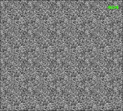
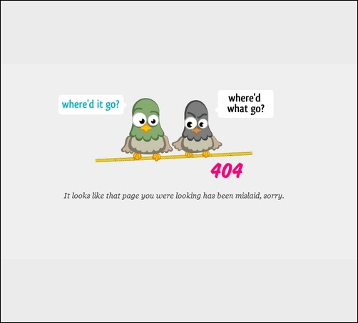
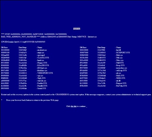
40+ Seriously Creative 404 File Not Found Pages


http://creativecan.com/2013/04/creative-404-file-not-found-pages/


404 에러 페이지를 각 사이트의 특성에 맞게 디자인한 것들 중 좋은 것들.


404-south-park

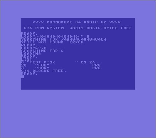
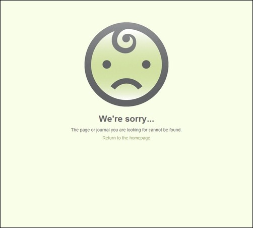
When a requested page is not found and it typically means there is a link with a broken URL somewhere. In this case, it is best practice for a website to show a 404 page to the visitor. The 404 – page not found error is common and every Internet user get it now and then. Reason is that most websites change regularly, while external links remain the same. It is hard if not impossible to maintain external links and require a lot of work so the best thing you can do is to make 301 permanent redirects when you change an URL for a page. In WordPress you can automate this using plugins like Redirection. This plugin detect changes and create redirects to avoid links to be broken.

Even if you maintain your links like this you cannot avoid situation where a visitor types in a wrong URLs or clicks on a broken links to your website. It is possible to look into website stats, find typical 404 pages, and then redirect these to meaningful pages. Still you can expect some visitors to hit your 404, probably every day, and I am sure you want to give them the best experience and try to keep them on the site. Therefore, it is a good idea to have a fun illustration and some options for the visitors to move on into your site.
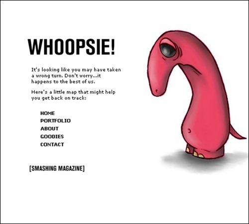
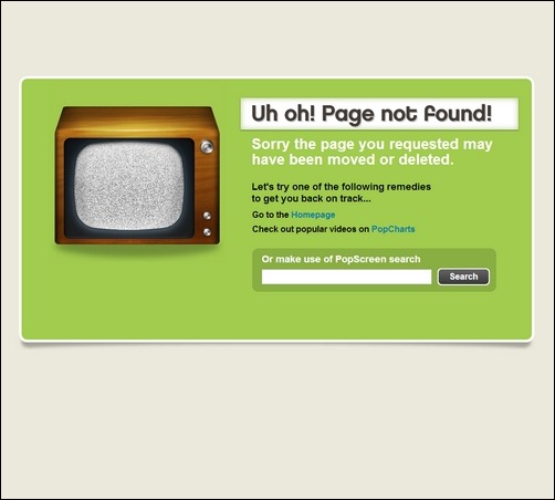
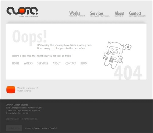
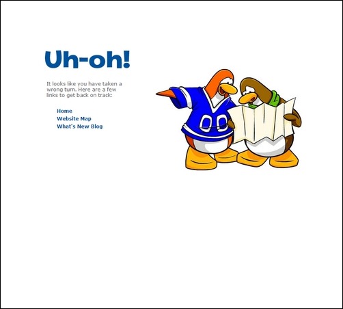
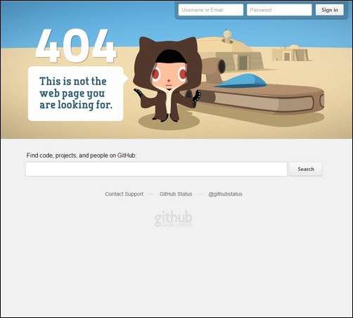
In this article, I am sharing some really creative examples of how 404 pages can be designed. Check them out and use them as inspiration for your own site.

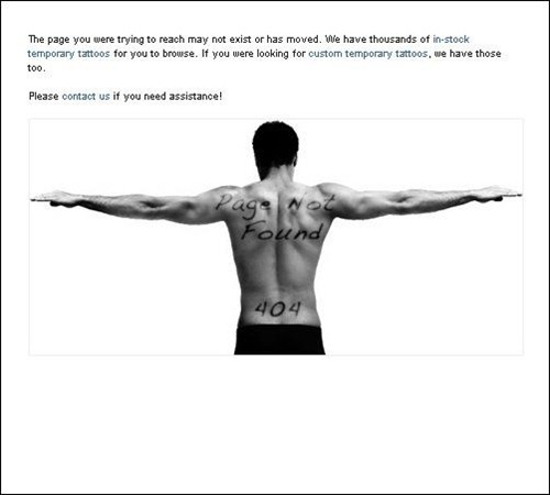
TattooSales – MORE INFO

tattoosales-404-page-not-found

Suspended Animations – MORE INFO

suspsneded

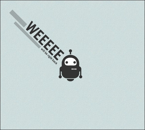
Be Right Back – MORE INFO

will-be-right-back

Funned – MORE INFO

funned

Seecoy – MORE INFO

seecoy

Twurn – MORE INFO

twurn

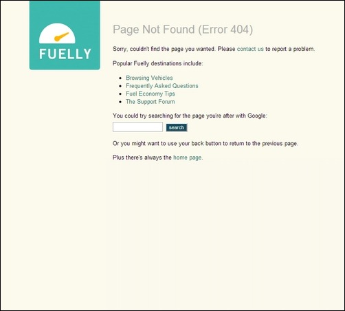
Fuelly – MORE INFO

fuelly

Huml – MORE INFO

huml

GDZLLA – MORE INFO

gdzlla

Lileks – MORE INFO

lileks

b3ta – MORE INFO

b3ta

Deviantart – MORE INFO

deviantart

Abduzeedo – MORE INFO

abduzeedo

Scar.atspace – MORE INFO

scar-atspace

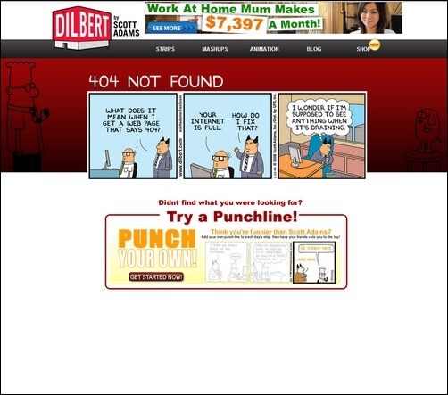
Dilbert – MORE INFO

dilbert

CSS – Tricks – MORE INFO

css-tricks

CSS Remix – MORE INFO

css-remix

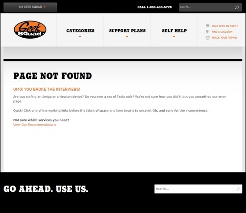
Geek Squad – MORE INFO

geeksquad

Amorphia Apparel – MORE INFO

amorphia-apparel

Open Ended Adventure – MORE INFO

open-ended-adventure

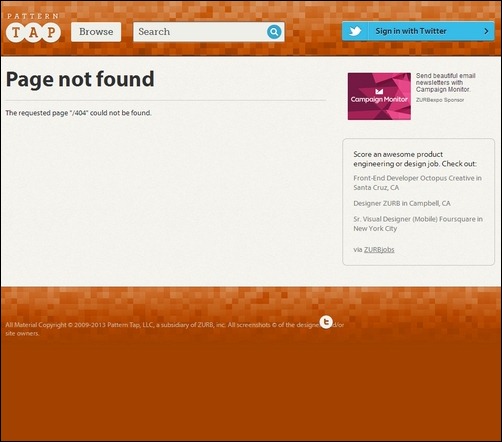
Pattern Tap – MORE INFO

pattern-tap

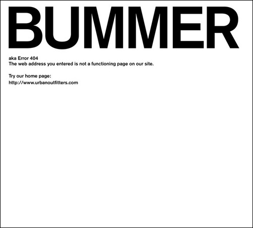
Urban Outfitters – MORE INFO

urban-outfitters

D20srd – MORE INFO

d20srd

The Web Motel – MORE INFO

the-web-motel

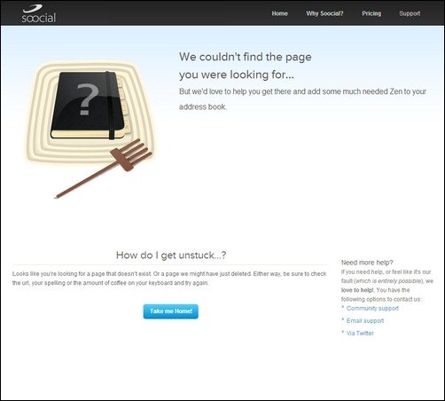
Soocial – MORE INFO

soocial

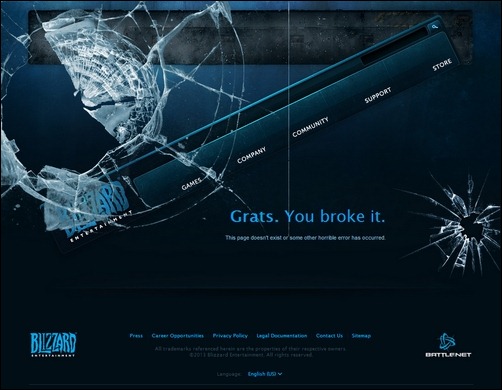
Blizzard – MORE INFO

blizzard

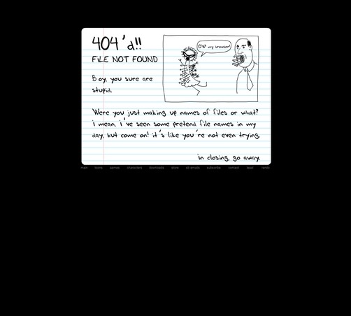
Home Star Runner – MORE INFO

home-star-runner

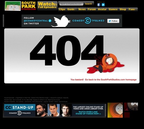
South Park Studios – MORE INFO

south-park-studios

I Folder Links – MORE INFO

i-folder-links

Henrik Hedegard – MORE INFO

henrik-hedegard

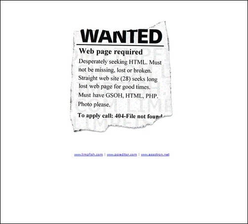
Limp Fish – MORE INFO

limp-fish

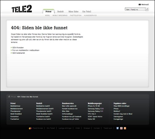
Tele2 – MORE INFO

tele2

Klaus – MORE INFO

klaus

Kidmondo – MORE INFO

kidmondo

DDZ – MORE INFO

ddz-net

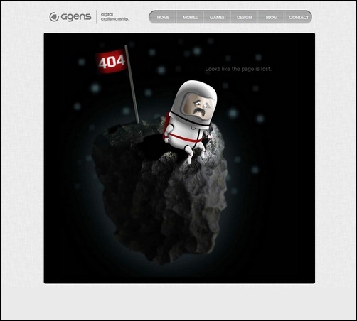
Agens – MORE INFO

agens

Ferdaze – MORE INFO

ferdaze

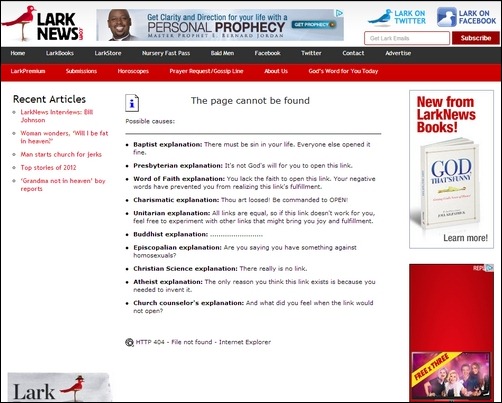
Lark News – MORE INFO

lark-news

Cuoma – MORE INFO

couma

Club Penguin – MORE INFO

club-penguin

Github – MORE INFO

github


반응형
반응형

최신 에러 페이지 모음


http://ui-patterns.com/explore/collections/error-pages


반응형
반응형

더 나은 웹 사이트를 만드는 데 도움을 줄 수있는 25 웹 개발 자원

25 Web development resources to help you create better websites


http://www.developerdrive.com/2013/03/25-web-development-resources-to-help-you-create-better-websites/


25 Web development resources to help you create better websites Developer Drive.mht

#1. Columnal

The Columnal CSS grid system is a “remix” of a couple others with some custom code thrown in. The elastic grid system is borrowed from cssgrid.net, while some code inspiration (and the idea for subcolumns) are taken from 960.gs.

#2. Initializr

Initializr is here to kick-start the development of your new projects. It generates templates based on HTML5 Boilerplate by allowing you to choose which parts you want or don’t want from it. A responsive template has also been added to start from a basic design instead of a blank page.

#3. Button CSS3 UI

This new CSS3 Framework buttons is perfect for your websites, blogs and web projects.
It’s now possible to integrate custom buttons easy to use and understand.

#4. Bootstrap v.2.0 from Twitter

A 12-column responsive grid, dozens of components, JavaScript plugins, typography, form controls, and even a web-based Customizer to make Bootstrap your own.Built at Twitter by @mdo and @fat, Bootstrap utilizes LESS CSS, is compiled via Node, and is managed through GitHub to help nerds do awesome stuff on the web. Bootstrap was made to not only look and behave great in the latest desktop browsers (as well as IE7!), but in tablet and smartphone browsers via responsive CSS as well.

#5. Normalize.css

Normalize.css makes browsers render all elements more consistently and in line with modern standards. It precisely targets only the styles that need normalizing. Normalize.css is a small CSS file that provides better cross-browser consistency in the default styling of HTML elements. It’s a modern, HTML5-ready, alternative to the traditional CSS reset.

#6. Adobe Edge Free Web Fonts

Edge Web Fonts gives you access to a vast web font library made possible by contributions from Adobe, Google, and designers around the world. The fonts are served by Typekit, so you can be sure of high performance and stability. Plus, it’s free!

#7. dabblet – A Playground for Testing CSS and HTML

dabblet is an interactive playground for quickly testing snippets of CSS and HTML code. It uses -prefix-free, so that you won’t have to add any prefixes in your CSS code. You can save your work in Github gists, embed it in other websites and share it with others.

#8. CSS3 Shapes

CSS3 Shapes provide a list of mainly geometric shapes you can perform using CSS3. Whether you need a circle, triangle or some other shape I am sure you will find something useful here.

#9. Mobile Boilerplate

HTML5 Boilerplate helps you build fast, robust, and adaptable web apps or sites. Kick-start your project with the combined knowledge and effort of 100s of developers, all in one little package.

#10. CSS3 Patterns Gallery

CSS3 Patterns Gallery offers exactly what the title says, a large selection of CSS3 patterns. On the front page you will see all the different patterns, then when you click on one it will give you the code needed to recreate this pattern on your site.

#11. Modernizr

Modernizr is a JavaScript library that detects HTML5 and CSS3 features in the user’s browser. Modernizr runs quickly on page load to detect features; it then creates a JavaScript object with the results, and adds classes to the html element for you to key your CSS on. Modernizr supports dozens of tests, and optionally includes YepNope.js for conditional loading of external .js and .css resources.

#12. The Semantic Grid System

Set column and gutter widths, choose the number of columns, and switch between pixels and percentages. All without any .grid_x classes in your markup. Oh, and did we mention it’s responsive? Runs on LESS, SCSS, or Stylus.

#13. Moqups – HTML5 App For Creating Wireframes

Moqups is a nifty HTML5 App used to create wireframes, mockups or UI concepts, prototypes depending on how you like to call them. If you ever wanted to create a wireframe of a website then this is the program that will help you do exactly that.

#14. Sencha CSS3 Animator & HTML5 Animations

Captivate your audience. Engage your customers. Standards-based CSS3 animation has never been so easy. With the power of Sencha Animator, use CSS3 animations to build the next generation rich-media ads. Animate text and images with smooth transitions, design buttons with gradients, and embed analytics. All backed by the strength of web standards. It does cost $99 but it is really worth it.

#15. Css2Less – CSS to LessCSS converter

This tool has been thought for front-end developers who are tired of working with CSS. Here you can quickly convert your old CSS files to fresh new LESS files. As easy as copy/paste. You can also convert files locally by install the css2less RubyGems.

#16. prefixMyCSS

You can now use powerful CSS3 techniques, and don’t waste your time writing each properties. First, write your code for your loved browser. Then, come here, paste your CSS code in the first block, and prefix! All vendor prefixes are added to your code. You can safely replace your old code.

#17. RWD Grid

rwdgrid is just another Grid system based on popular 960grid , which is responsive and ranges from mobile, tablet, laptops and wide screen displays. Naming convention of this grid system is similar to 960 grid system, where underscore is replaced by hyphen (increases readabilty).rwdgrid is having different Grid system made for 1200px+ Displays, 960px+ Displays, 720px+ Displays and Mobile screens.

#18. Foundation

The most advanced responsive front-end framework in the world. Foundation is made by ZURB, a product design company in Campbell, California. They have more than 15 years of experience building web products, services and websites into this framework.

Foundation is a rock-solid, responsive framework for rapidly prototyping and iterating into production code. It includes a 12-column, future-friendly grid and tons of great tools and elements that’ll get you up and running in no time.

#19. CSS Lint

CSS Lint helps point out problems with your CSS code. It does basic syntax checking as well as applying a set of rules to the code that look for problematic patterns or signs of inefficiency. The rules are all pluggable, so you can easily write your own or omit ones you don’t want.

#20. Buzz

Buzz is a small but powerful Javascript library that allows you to easily take advantage of the new HTML5 audio element. It degrades silently on non-modern browsers.

#21. HTML Email Boilerplate

This website and its sample code creates a template of sorts, absent of design or layout, that will help you avoid some of the major rendering problems with the most common email clients out there — Gmail, Outlook, Yahoo Mail, etc

#22. Mozilla Thimble

Thimble makes it ridiculously simple to create your own web pages. Write and edit HTML and CSS right in your browser. Instantly preview your work. Then host and share your finished pages with a single click. Easy, huh?

#23. Fluid Baseline Grid

The Fluid Baseline Grid System is an HTML5 & CSS3 development kit that provides a solid foundation to quickly design websites with ease.

The FBG system was built with typographic standards in mind and combines principals of fluid-column layouts, baseline grids and mobile-first responsive design into a resolution independent and device agnostic framework. It is packed with CSS normalization, beautiful typographic standards, corrected bugs, common browser inconsistencies and improved usability. You can finally have your cake and eat it too, all while making awesome websites.

#24. Sprite Cow

Sprite Cow helps you get the background-position, width and height of sprites within a spritesheet as a nice bit of copyable css.

Automated spritesheet generators are pretty cool, but I prefer the control over optimisation and compression you get by making them manually. However, copying all the positions & sizes from graphics apps wasted a ton of my time, so the guys behind Sprite Cow made this!

#25. holmes.css

holmes.css is useful for checking the quality of your code (up to W3C HTML5 standards), nitpicking over ensuring markup is valid and semantic and accessility guidelines are met, and when you are tasked to fix up and debug an old, OLD website. It has a simple implementation and a mostly unobtrusive effect on your page. Not recommended for live enviroments.

반응형

+ Recent posts