반응형
반응형

responsive Template


http://themeforest.net/item/smartstart-responsive-html5-template/full_screen_preview/1674915?ref=themespotters&ref=themespotters&clickthrough_id=92244147&redirect_back=true


반응형
반응형

Multi Screen & Density

안드로이드는 다양한 해상도와 density를 지원하는 여러 기기에서 동작하고 있다.

기본적으로 각각의 기기에 맞게 내부적으로 저절하지만, 이것을 최적화하는 것은 개발자의 몫이다.

안드로이드는 해상도가 다른 기기에서 별무리 없이 돌아갈 수 있도록 layout과 drawable 파일들을 옵션에  따라 분류해 해결하고 있다.

애플리케이션 구동시 안드로이드 시스템은 각 density에 알맞는 리소스를 선택하거나 이미 존재하고 있는

리소스를 불러온 후 이것을 조절해 각 디바이스마다 다른 density 문제를 해결한다.

 * http://developer.android.com/guide/topics/resources/drawable-resource.html


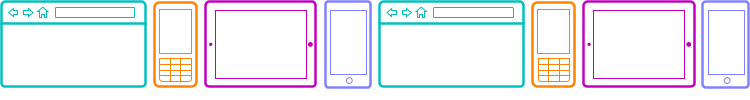
3.2 이전 버전에서는 보통 Screen size를 small, normal, large, xlarge로 구분해 layout파일을 알맞은 폴더에 배치하면, 안드로이드 시스템은 기기의 Screen에 맞게 알맞은 layout 리소스를 선택한다.

이떄 layout폴더 안에 들어가는 layout파일의 이름을 같게 하고, 배치되는 View의 id를 같게 할 경우 코드상에서는 단순히 하나의 layout파일을 보는 것과 같은 모습을 보여준다.  또한 이 폴더명에 land.port를 붙여 Screen orientation에 따른 layout도 세세하게 설정할 수 있다.

이 경우 프로그래머는 layout 파일을 수정해 여러 설정에 맞는 layout 파일을 만들고 디자이너는 drawable 리소스를 각각 만들어 여러 상황에서의 Multi Screens 환경을 구현할 수 있다.


 하지만 이 방법을 사용할 경우 7인치 태블릿의 경우 처리가 곤란하다. 7인치 태블릿의 large 영역에 위치하므로 5인치 정도의 기기와 동일한 영역에 위치하지만 사실상 태블릿으로서의 layout을 작성해야 한다.

 따라서 안드로이드는 추가로 3.2버전이 나오면서 좀더 세세하게 Screen size를 나눌 수 있는 방법을 제시했다.

dp를 활용해 그룹을 좀더 세밀하게 나누는 방식을로서 smallestWidth, Available screen width, Available screen height의 방법으로 설정할 수 있다.


 대표적인 Screen 크기에 대한 dp 분류표

 320dp

  일반적인 Screen (240 x 320 ldpi, 320 x 480 mdpi, 480 x 800 hdpi 등)

 480dp

   델의 streadk와 같은 테블릿의 중간 기기( 480 x 800 mdpi)

 600dp

   7인치 테블릿 (600 x 1024 mdpi)

 720dp

   10인치 태블릿 (720 x 1280 mdpi, 800 x 1280 mdpi 등)
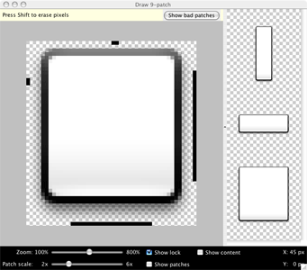
 

Nine patch

애플리케이션을 개발하다 보면 UI작업이 많은 프로젝트일 경우 리소스 파일이 커서 애플리케이션이 전체적으로 무거워지는 상황이 발생할 수 있다. 또한 이미지 형태를 동적으로 변화시켜야만 할 수 있으며 이때 Nine patch는 대안이 될 수 있다.

Nine patch는 일반 png파일의 가장자리 부분에 1픽셀씩 추가해 늘어가는 영역을 지정할 수 있다. 확장자는 .9.png가 되며 일반적으로 버튼이나 에디트 텍스트창에서 많이 사용된다.

 * http://developer.android.com/tools/help/draw9patch.html 


The Draw 9-patch tool allows you to easily create a NinePatch graphic using a WYSIWYG editor.

For an introduction to Nine-patch graphics and how they work, please read the section about Nine-patch in the 2D Graphics document.

Here's a quick guide to create a Nine-patch graphic using the Draw 9-patch tool. You'll need the PNG image with which you'd like to create a NinePatch.

  1. From a terminal, launch the draw9patch application from your SDK /tools directory.
  2. Drag your PNG image into the Draw 9-patch window (or File > Open 9-patch... to locate the file). Your workspace will now open.

    The left pane is your drawing area, in which you can edit the lines for the stretchable patches and content area. The right pane is the preview area, where you can preview your graphic when stretched.

  3. Click within the 1-pixel perimeter to draw the lines that define the stretchable patches and (optional) content area. Right-click (or hold Shift and click, on Mac) to erase previously drawn lines.
  4. When done, select File > Save 9-patch...

    Your image will be saved with the .9.png file name.

Note: A normal PNG file (*.png) will be loaded with an empty one-pixel border added around the image, in which you can draw the stretchable patches and content area. A previously saved 9-patch file (*.9.png) will be loaded as-is, with no drawing area added, because it already exists.

Optional controls include:

  • Zoom: Adjust the zoom level of the graphic in the drawing area.
  • Patch scale: Adjust the scale of the images in the preview area.
  • Show lock: Visualize the non-drawable area of the graphic on mouse-over.
  • Show patches: Preview the stretchable patches in the drawing area (pink is a stretchable patch).
  • Show content: Highlight the content area in the preview images (purple is the area in which content is allowed).
  • Show bad patches: Adds a red border around patch areas that may produce artifacts in the graphic when stretched. Visual coherence of your stretched image will be maintained if you eliminate all bad patches.


    안드로이드 개발자 사이트


    http://developer.android.com/

    http://developer.android.com/guide/topics/ui/overview.html

    반응형
    반응형

    Compass is an open-source CSS Authoring Framework.


    Why designers love Compass.

    1. Experience cleaner markup without presentational classes.
    2. It’s chock full of the web’s best reusable patterns.
    3. It makes creating sprites a breeze.
    4. Compass mixins make CSS3 easy.
    5. Create beautiful typographic rhythms.
    6. Download and create extensions with ease.

    Compass uses Sass.

    Sass is an extension of CSS3 which adds nested rules, variables, mixins, selector inheritance, and more. Sass generates well formatted CSS and makes your stylesheets easier to organize and maintain.


    반응형
    반응형

    Style : http://tympanus.net/codrops/

    Flipboard Effect
     : http://tympanus.net/Development/FlipboardPageLayout/?page=0

    Annotation Overlay Effect with CSS3
     : http://tympanus.net/Tutorials/CSS3AnnotationOverlayEffect/

    Animated 3D Bar Chart with CSS3
     : http://tympanus.net/Tutorials/Animated3DBarChart/

    3D Bouncing Ball with CSS3
     : http://tympanus.net/Tutorials/CSS3BouncingBall/

    Full Screen Slit Slider
     : http://tympanus.net/Tutorials/FullscreenSlitSlider/

    Vertical Showcase Slider
     : http://tympanus.net/Tutorials/VerticalShowcaseSlider/

    반응형
    반응형

    Create a Rating System With CSS, Web fonts and Sprites

    Quick Tip: Create a Rating System With CSS, Web fonts and Sprites

    http://webdesign.tutsplus.com/tutorials/htmlcss-tutorials/quick-tip-create-a-rating-system-with-css-web-fonts-and-sprites/


    http://webdesigntutsplus.s3.amazonaws.com/tuts/318_adi_QT/star_demo/index.html


    반응형
    반응형

    INTERFACE SKETCH http://interfacesketch.tumblr.com/

    스케치, http://enva.to/uxlzdf에 스케치를 얻을 수 있도록 인쇄 서식 파일의 전체 더미 인터페이스

    Free sketch templates for web, mobile and tablet.

    If you're designing a website or app, these simple templates are designed to help you sketch your ideas on paper.

    How to use

    Download a template. Print it out. Start sketching! You can print in colour or black-and-white; on laser or inkjet printer. All templates are in PDF (portable document format). Some of the templates contain a grid of dots to help with alignment when you sketch. These dots do not represent the pixel dimensions of the device or browser.

    Printing tip

    Some templates contain pages in landscape and portrait sizes. To print these templates correctly, look for the checkbox option in your print dialog box that states auto-rotate (in some PDF readers, it may say auto-rotate and center). Make sure this option is selected; this will ensure that pages are printed in their correct orientation.

    The templates (in PDF)

    These templates are hosted on Google Docs. When you click a link below, a preview of the template will open in your browser. To save the template to your computer as a PDF file, press Ctrl+S or click the File menu and then choose Download.

    Windows 8 phone


    반응형

    + Recent posts