더 나은 웹 사이트를 만드는 데 도움을 줄 수있는 25 웹 개발 자원
25 Web development resources to help you create better websites
http://www.developerdrive.com/2013/03/25-web-development-resources-to-help-you-create-better-websites/
 25 Web development resources to help you create better websites Developer Drive.mht
The Columnal CSS grid system is a “remix” of a couple others with some custom code thrown in. The elastic grid system is borrowed from cssgrid.net, while some code inspiration (and the idea for subcolumns) are taken from 960.gs.

Initializr is here to kick-start the development of your new projects. It generates templates based on HTML5 Boilerplate by allowing you to choose which parts you want or don’t want from it. A responsive template has also been added to start from a basic design instead of a blank page.

This new CSS3 Framework buttons is perfect for your websites, blogs and web projects.
It’s now possible to integrate custom buttons easy to use and understand.

A 12-column responsive grid, dozens of components, JavaScript plugins, typography, form controls, and even a web-based Customizer to make Bootstrap your own.Built at Twitter by @mdo and @fat, Bootstrap utilizes LESS CSS, is compiled via Node, and is managed through GitHub to help nerds do awesome stuff on the web. Bootstrap was made to not only look and behave great in the latest desktop browsers (as well as IE7!), but in tablet and smartphone browsers via responsive CSS as well.

Normalize.css makes browsers render all elements more consistently and in line with modern standards. It precisely targets only the styles that need normalizing. Normalize.css is a small CSS file that provides better cross-browser consistency in the default styling of HTML elements. It’s a modern, HTML5-ready, alternative to the traditional CSS reset.

Edge Web Fonts gives you access to a vast web font library made possible by contributions from Adobe, Google, and designers around the world. The fonts are served by Typekit, so you can be sure of high performance and stability. Plus, it’s free!

dabblet is an interactive playground for quickly testing snippets of CSS and HTML code. It uses -prefix-free, so that you won’t have to add any prefixes in your CSS code. You can save your work in Github gists, embed it in other websites and share it with others.

CSS3 Shapes provide a list of mainly geometric shapes you can perform using CSS3. Whether you need a circle, triangle or some other shape I am sure you will find something useful here.

HTML5 Boilerplate helps you build fast, robust, and adaptable web apps or sites. Kick-start your project with the combined knowledge and effort of 100s of developers, all in one little package.

CSS3 Patterns Gallery offers exactly what the title says, a large selection of CSS3 patterns. On the front page you will see all the different patterns, then when you click on one it will give you the code needed to recreate this pattern on your site.

Modernizr is a JavaScript library that detects HTML5 and CSS3 features in the user’s browser. Modernizr runs quickly on page load to detect features; it then creates a JavaScript object with the results, and adds classes to the html element for you to key your CSS on. Modernizr supports dozens of tests, and optionally includes YepNope.js for conditional loading of external .js and .css resources.

Set column and gutter widths, choose the number of columns, and switch between pixels and percentages. All without any .grid_x classes in your markup. Oh, and did we mention it’s responsive? Runs on LESS, SCSS, or Stylus.

Moqups is a nifty HTML5 App used to create wireframes, mockups or UI concepts, prototypes depending on how you like to call them. If you ever wanted to create a wireframe of a website then this is the program that will help you do exactly that.

Captivate your audience. Engage your customers. Standards-based CSS3 animation has never been so easy. With the power of Sencha Animator, use CSS3 animations to build the next generation rich-media ads. Animate text and images with smooth transitions, design buttons with gradients, and embed analytics. All backed by the strength of web standards. It does cost $99 but it is really worth it.

This tool has been thought for front-end developers who are tired of working with CSS. Here you can quickly convert your old CSS files to fresh new LESS files. As easy as copy/paste. You can also convert files locally by install the css2less RubyGems.

You can now use powerful CSS3 techniques, and don’t waste your time writing each properties. First, write your code for your loved browser. Then, come here, paste your CSS code in the first block, and prefix! All vendor prefixes are added to your code. You can safely replace your old code.

rwdgrid is just another Grid system based on popular 960grid , which is responsive and ranges from mobile, tablet, laptops and wide screen displays. Naming convention of this grid system is similar to 960 grid system, where underscore is replaced by hyphen (increases readabilty).rwdgrid is having different Grid system made for 1200px+ Displays, 960px+ Displays, 720px+ Displays and Mobile screens.

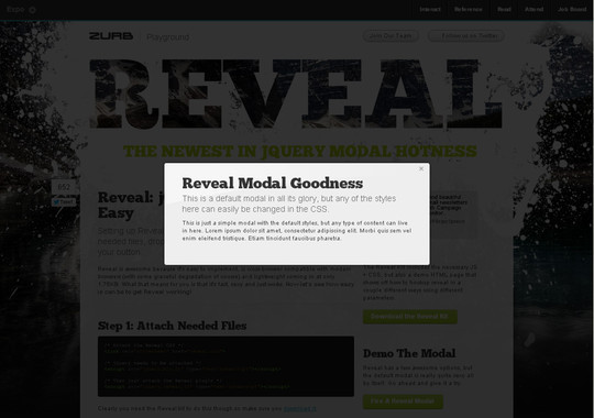
The most advanced responsive front-end framework in the world. Foundation is made by ZURB, a product design company in Campbell, California. They have more than 15 years of experience building web products, services and websites into this framework.
Foundation is a rock-solid, responsive framework for rapidly prototyping and iterating into production code. It includes a 12-column, future-friendly grid and tons of great tools and elements that’ll get you up and running in no time.

CSS Lint helps point out problems with your CSS code. It does basic syntax checking as well as applying a set of rules to the code that look for problematic patterns or signs of inefficiency. The rules are all pluggable, so you can easily write your own or omit ones you don’t want.

Buzz is a small but powerful Javascript library that allows you to easily take advantage of the new HTML5 audio element. It degrades silently on non-modern browsers.

This website and its sample code creates a template of sorts, absent of design or layout, that will help you avoid some of the major rendering problems with the most common email clients out there — Gmail, Outlook, Yahoo Mail, etc

Thimble makes it ridiculously simple to create your own web pages. Write and edit HTML and CSS right in your browser. Instantly preview your work. Then host and share your finished pages with a single click. Easy, huh?

The Fluid Baseline Grid System is an HTML5 & CSS3 development kit that provides a solid foundation to quickly design websites with ease.
The FBG system was built with typographic standards in mind and combines principals of fluid-column layouts, baseline grids and mobile-first responsive design into a resolution independent and device agnostic framework. It is packed with CSS normalization, beautiful typographic standards, corrected bugs, common browser inconsistencies and improved usability. You can finally have your cake and eat it too, all while making awesome websites.

Sprite Cow helps you get the background-position, width and height of sprites within a spritesheet as a nice bit of copyable css.
Automated spritesheet generators are pretty cool, but I prefer the control over optimisation and compression you get by making them manually. However, copying all the positions & sizes from graphics apps wasted a ton of my time, so the guys behind Sprite Cow made this!

holmes.css is useful for checking the quality of your code (up to W3C HTML5 standards), nitpicking over ensuring markup is valid and semantic and accessility guidelines are met, and when you are tasked to fix up and debug an old, OLD website. It has a simple implementation and a mostly unobtrusive effect on your page. Not recommended for live enviroments.