25+ Excellent jQuery Menu Plugins
http://creativecan.com/2013/02/jquery-menu-plugins/
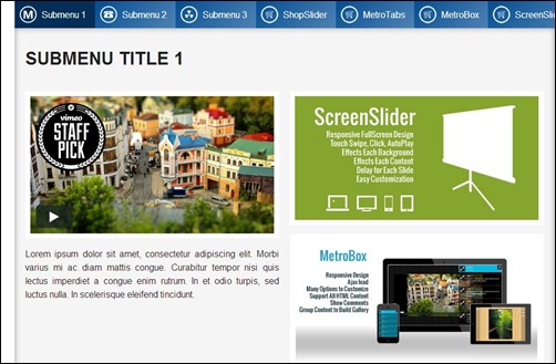
MenuStation – Real Unlimited Responsive Menu –
http://codecanyon.net/item/menustation-real-unlimited-responsive-menu/3076965?ref=andy4321&ref=andy4321&clickthrough_id=107725296&redirect_back=true
Metro Flexible Navigation –
http://codecanyon.net/item/-metro-flexible-navigation/full_screen_preview/2796746
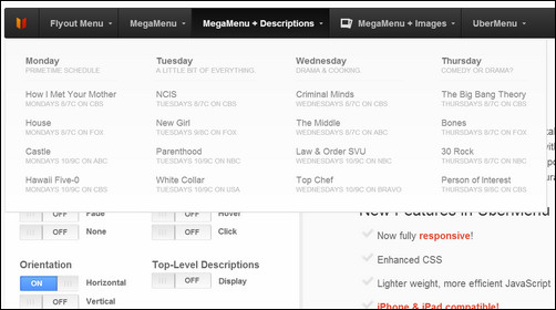
UberMenu – WordPress Mega Menu Plugin – MORE INFO

UberMenu is a user-friendly, highly customizable, responsive Mega Menu WordPress plugin. It works out of the box with the WordPress 3 Menu System, making it simple to get started but powerful enough to create highly customized and creative mega menu configurations.
MenuStation – Real Unlimited Responsive Menu – MORE INFO

This plugin features real unlimited menu, responsive design, and many colors to change. it is easy to customize and light weight.
Menu with CSS3 Effects and Notification Bubbles – MORE INFO

This Menu with CSS3 Effects and Notification Bubbles has everything you need. The functionality is divided in different parts and that makes it very powerful.
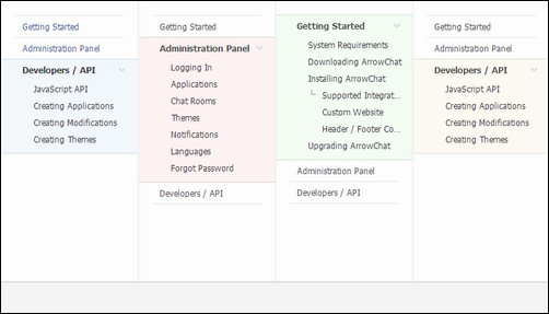
niceTree – JQuery Tree Plugin – MORE INFO

Get rid of that ugly tree menu on your site with niceTree. An easy to install JQuery plugin with more options than you’ll ever need. niceTree will take your HTML and turn it into a collapsible menu system with unlimited menus within menus.
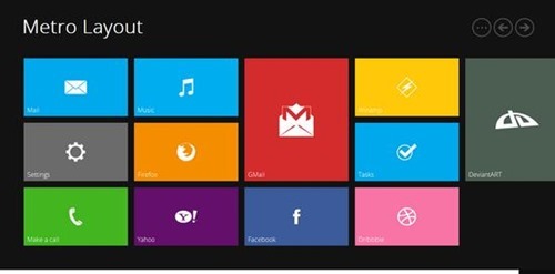
Metro Flexible Navigation – MORE INFO

The Metro Flexible Navigation is a simple, clean grid layout looking a lot like the new Windows 8 interface. It can be customized to be laid out horizontally or vertically. It’s scrollable and drag-able at the same time and contains useful sliding controls. Icons can be changed, there is a large collection available.

Main features include hide or show menu children, orientation adjustment and control screen width where the plugin activates. This plugin is easy to setup and configure and bundled with configurable CSS.
Memu – A simple CSS / JavaScript / JQuery Menu – MORE INFO

A small, solid jQuery plugin which is quite easy to use. It’s a menu which can be used with or without JQuery. It has feature so that when visitors are navigating your site, the selected item will stay highlighted.
Revolver – Sliding Website Plugin – MORE INFO

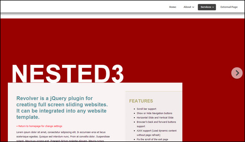
This is not a menu plugin actually, but it can do some powerful stuff and create a creative navigation on you website. Revolver is a jQuery plugin for creating full screen sliding websites. It can be integrated into any website template.
jQuery Animated Button & Menu – MORE INFO

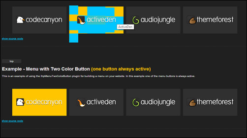
The animated button & menu jQuery plugin allows you to easily replace <a> links with animated buttons and grouping buttons into a menu (drop down menu).
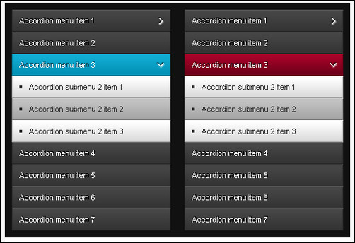
jAccordion – jQuery Accordion – MORE INFO

jAccordion is a complex and responsive jQuery plugin with powerful API, large amount of callbacks and options which let you customize it to suit your needs.
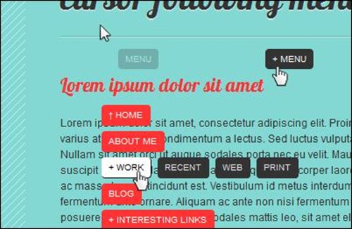
Cursor Following Menu – MORE INFO

This is a navigation menu that will always follow your cursor. It was generated using CSS and jQuery library, which is easy to configure and implement. The script features CSS styling, 2-level navigation and simple markup.
jQuery Drilldown Menu – MORE INFO

iPhone inspired drilldown menu. So easy. So powerful.
Sticklr WP – Sticky Side Panel WordPress Plugin – MORE INFO

Stickr WP, a sticky side panel menu WordPress plugin. Inspired by Envato site-switcher, after released as CSS3 +jQuery, due to popular demand I decided to create this WordPress plugin version. The features are similar with jQuery version, only WordPress version has an intuitively easy administration panel, so you don’t have to know the coding behind it.
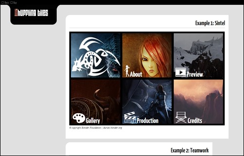
Shuffling Tiles jQuery Plugin – MORE INFO

Inspired by the step by step movements of the shuffle dance and the new Metro UI look, Shuffling Tiles combines elements from both and then some, producing a versatile, animated and compact webpage widget. Use it when you have lot’s of information that you want to fit in a small area, and you want to present it in a lively, original and interactive way.
jQuery iNav – Products Showcasing Navigation – MORE INFO

iNav it’s a jQuery plugin that let you create an amazing animated Menu (even with multiple menus) or Items Showcasing. Inspired by Apple products navigation, iNav can introduce in your website a very powerful javascript navigation! In order to work properly, iNav requires at least jQuery 1.4 or higher.
jQuery Live Menu – MORE INFO

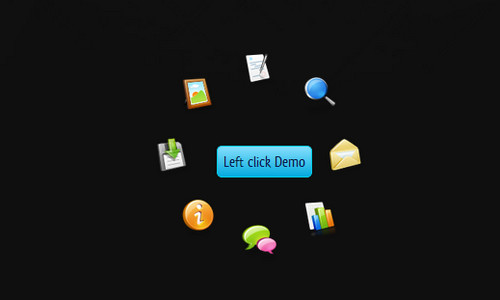
jQuery Live Menu is a jQuery plugin that allows you to create easily nice and animated menus. Menus are opened on left or right click on the defined target. You can customize layout, effects and the tooltip design by jQuery parameters .
PullOuts – jQuery Slide-out Widgets – MORE INFO

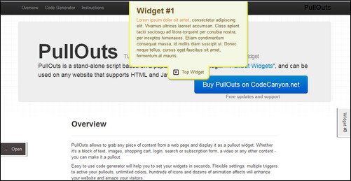
PullOuts allows to grab any piece of content from a web page and display it as a pullout widget. Whether it’s a block of text, images, shopping cart, login, search or subscription form, a video or any other content – you can make it a pullout.
jQuery Push Menu – MORE INFO

Now with hoverIntent integration. Cross Browser Compliant – IE9 , FF3+,Opera, Safari, Chrome. Mobile Ready – Works in mobile browsers. Sliding Sub menu level items.

Titan Menu, a fresh and powerfull menu solution.
Sticklr – Sticky Side Panel CSS3 + jQuery Plugin – MORE INFO

The latest version is version 1.4, made on January of 2012. Custom tab size option was added and the ability for a tab to act as link was improved.
Superfish – Free jQuery Menu Plugin - MORE INFO

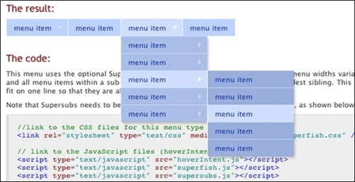
Superfish is a JQuery plugin especially dedicated to menus. It allows many improvement from what you can achieve with HTML and CSS as such as hover support for IE6, animations, keyboard accessibility and more.
Smooth Expandable Menu – MORE INFO

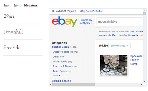
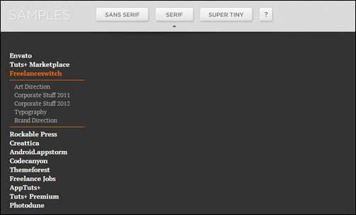
Smooth Expandable Menu is the definitive tool for building minimal vertical expandable menus, which can be easily customized due to its 17 built-in config parameters, directly from the html file / script call. The pack includes 3 samples (Serif, San Serif and Tiny), to make easier the integration on any web project. It uses Google Fonts library system, so you won’t need to integrate font files or @fontface scripts. It has been optimized for mobile devices.

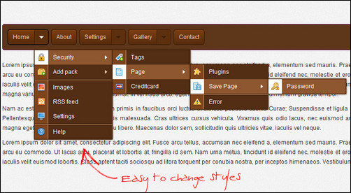
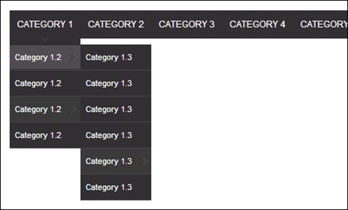
jMenu is a jQuery plugin that allows the creation of horizontal navigations with unlimited sub-menus. Besides jQuery, it also requires jQuery UI and supports all the effects of this library (like fadeIn or slideDown). The markup of the menu is pretty clean as it makes use of nested lists.
Navigation Menu Widget – MORE INFO

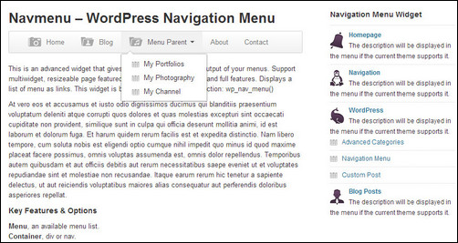
This is an advanced plugin that gives you total control over the output of your menus. Support shortcodes, widget and template function. Easy to customize, full features. and supports Twitter Bootstrap. Displays a list of menu as links. This plugin is based on the WordPress function: wp_nav_menu()
jPie jQuery Circular Menu – MORE INFO

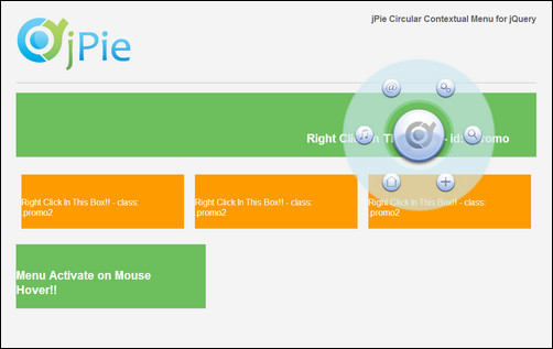
jPie is a Contextual Circular Menu for jQuery. You can create countless instances and each instance can be fully customizable using the attributes provided by the plugin.
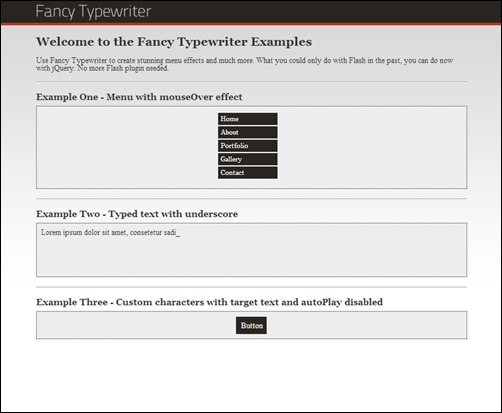
Fancy Typewriter – jQuery plugin – MORE INFO

Fancy Typewriter is a jQuery plugin for creating stunning menu effects and much more. Just add the plugin to any tag, which contains text. Check out the preview, which says more than words.

 DreamPie - The Python shell you've always dreamed about!


